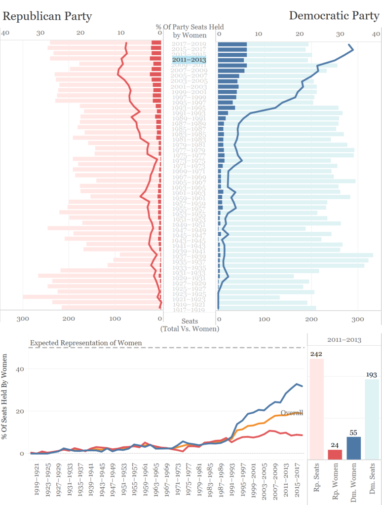
So I finally got round to redesigning my first ever viz on Tableau Public. Using Makeover Monday’s dataset on Women in the House of Representatives I went from this (published 15th October 2018)…
to this…
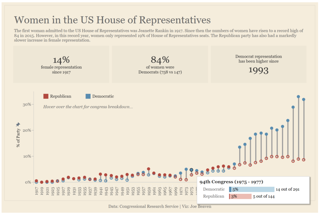
I trimmed down the dashboard to one chart, delivering a clearer message. To include some of the additional information without cluttering the dashboard (see my first attempt), I’ve used a viz in tooltip. For the main chart, I decided to use a barbell design to allow the viewer to quickly contrast the two parties but retain a sense of the net growth of female representation.
Overall the dashboard is less exploratory, but the clear message within the data is communicated in a more direct way which I think is more effective when the data shows obvious stories as in this case.
My second #justrevizit:
My second viz was also from Makeover Monday. The data looked at the price of beer at MLB grounds:
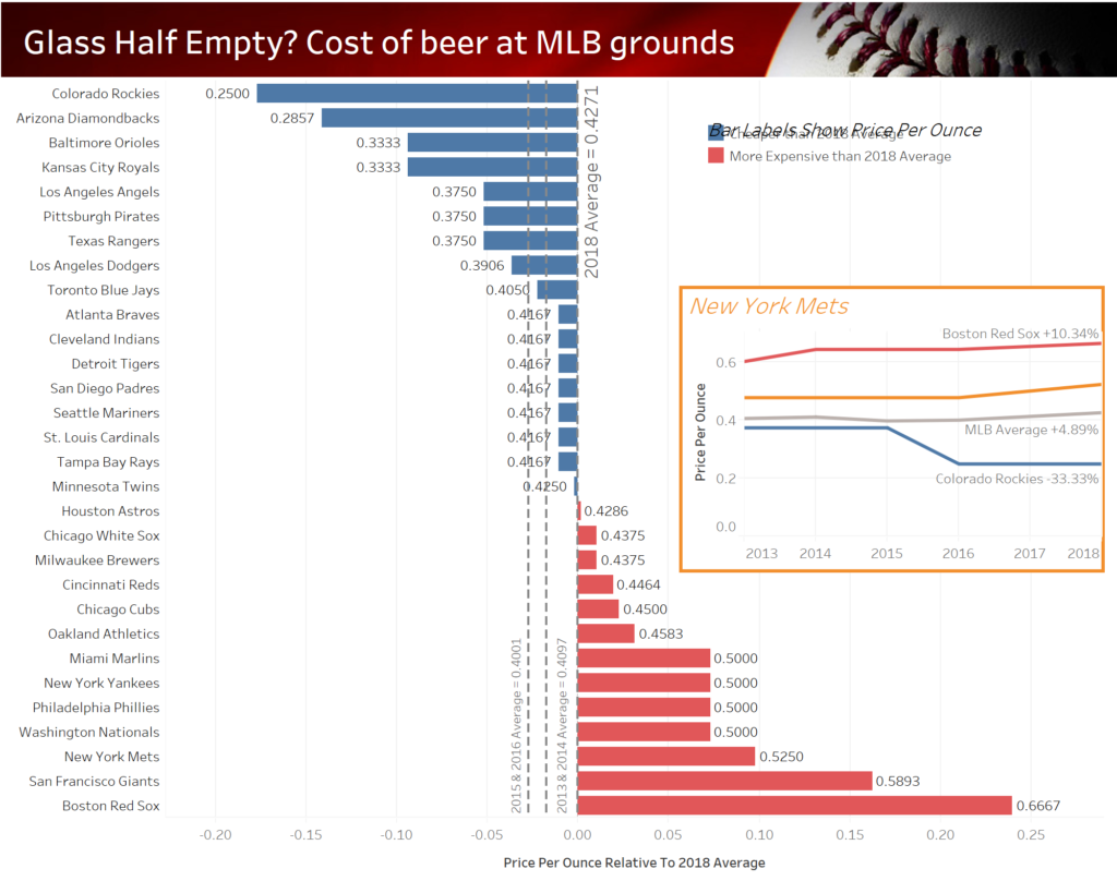
My initial thoughts:
- The diverging bar chart works nicely here but it isn’t immediately clear what the axis ‘diverges from’
- Less decimal places on labels
- A lot of chart junk – gridlines, axes etc.
- The other two reference lines for the 15/16 and 16/17 seasons clutter the chart and don’t add anything
- The time series allows exploration but the user isn’t guided to click on it
- Is the time series even that useful on this dashboard or are the two charts quite disjointed?
So, here’s my idea for how to reviz this dashboard:

I’ve gone for small multiples as a way to compare both the trend through time and comparison to average. I also want to maintain the comparison to average by showing an average line on all of the sparklines. This will probably be either average across all teams for 2018 or all years for each team.
As always, I welcome any feedback!
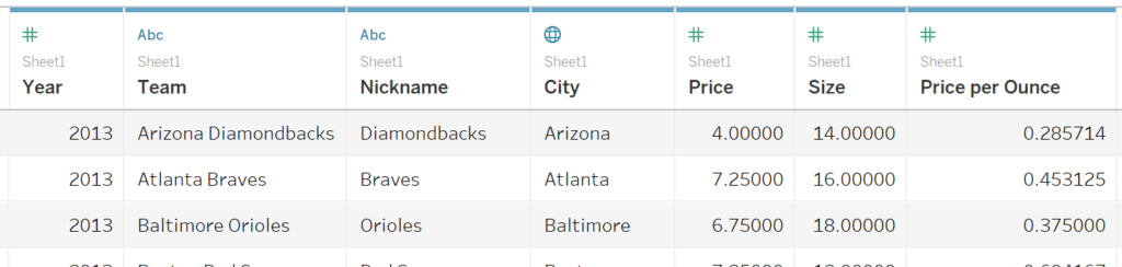
The original data looked like this:
Thanks!
Joe (@Joe_Tableau)