Due to limited space on dashboards, charts with many marks are often cut down to a view which shows the Top 10 or 20 marks. Sometimes we might want to investigate a mark outside of the Top N and see this included on our view.
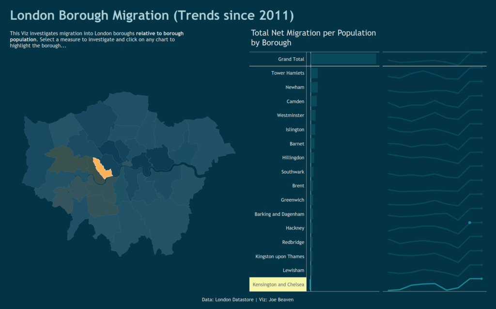
I had this problem when trying to build a dashboard for Makeover Monday which showed migration patterns in London broken down by borough. I showed the Top 15 boroughs for total net migration per population as both a bar chart and as sparklines. However, I wanted the user to be able to click any borough on the map of London and see that borough highlighted on my bar and sparkline, even if it was outside the top 15.
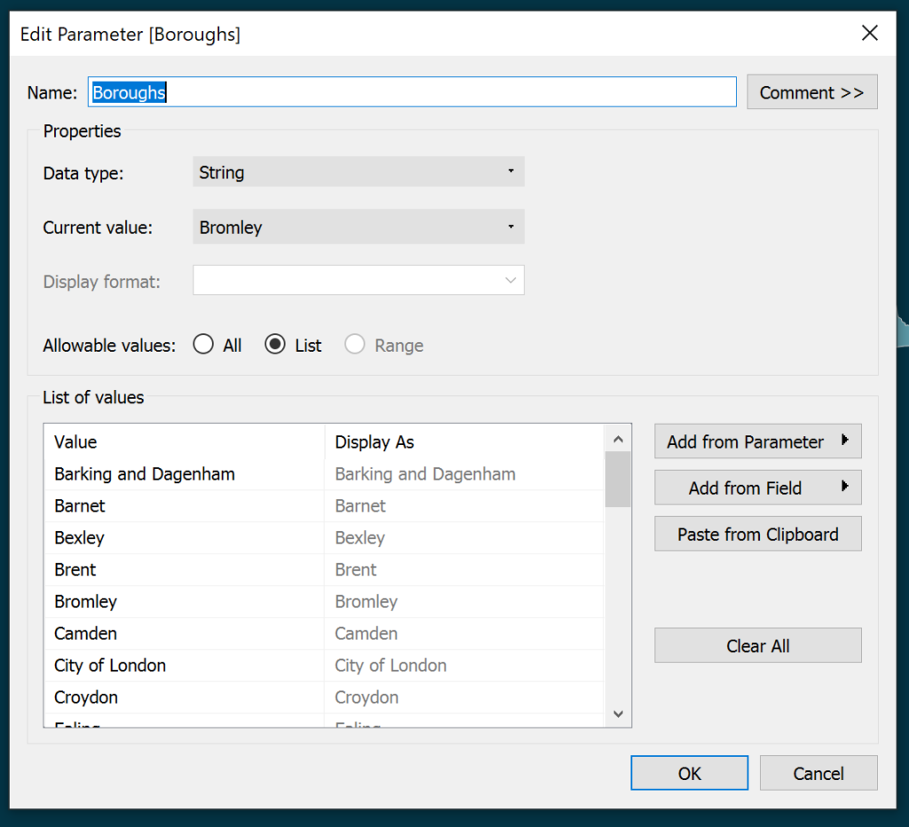
To solve this problem, first create a Parameter – this is a list of all boroughs:
The second step is to create an IF statement:
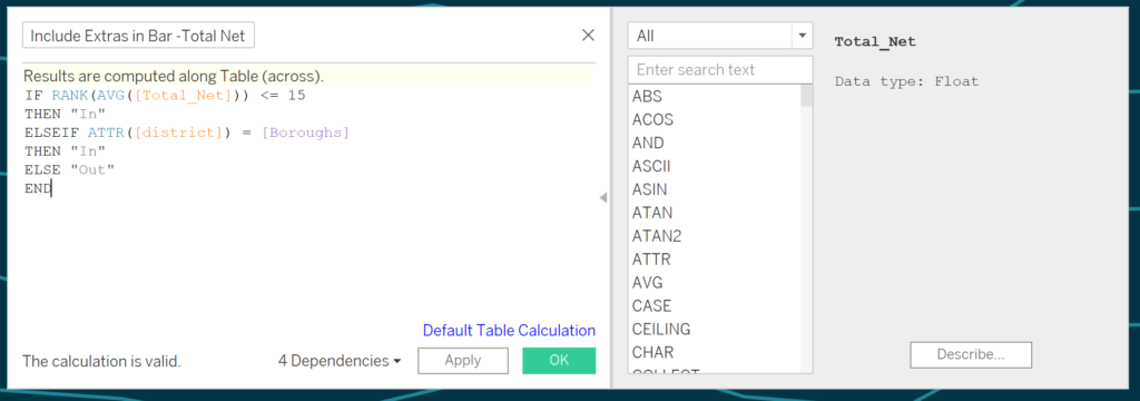
This statement says “if the borough is in the top 15 for total net migration then label it as ‘In’, otherwise if the borough is the same as the Borough Parameter then also label it as ‘In’, label everything else as ‘Out’.
The IF statement is dragged to filters and ‘In’ is selected. The first part of the statement above means the top 15 boroughs will always be shown as they will always be ‘In’. The other way for a borough to be shown on the view (ie ‘In’) is to have the same name as the Borough Parameter – this is how we show a selected borough outside of the Top 15…
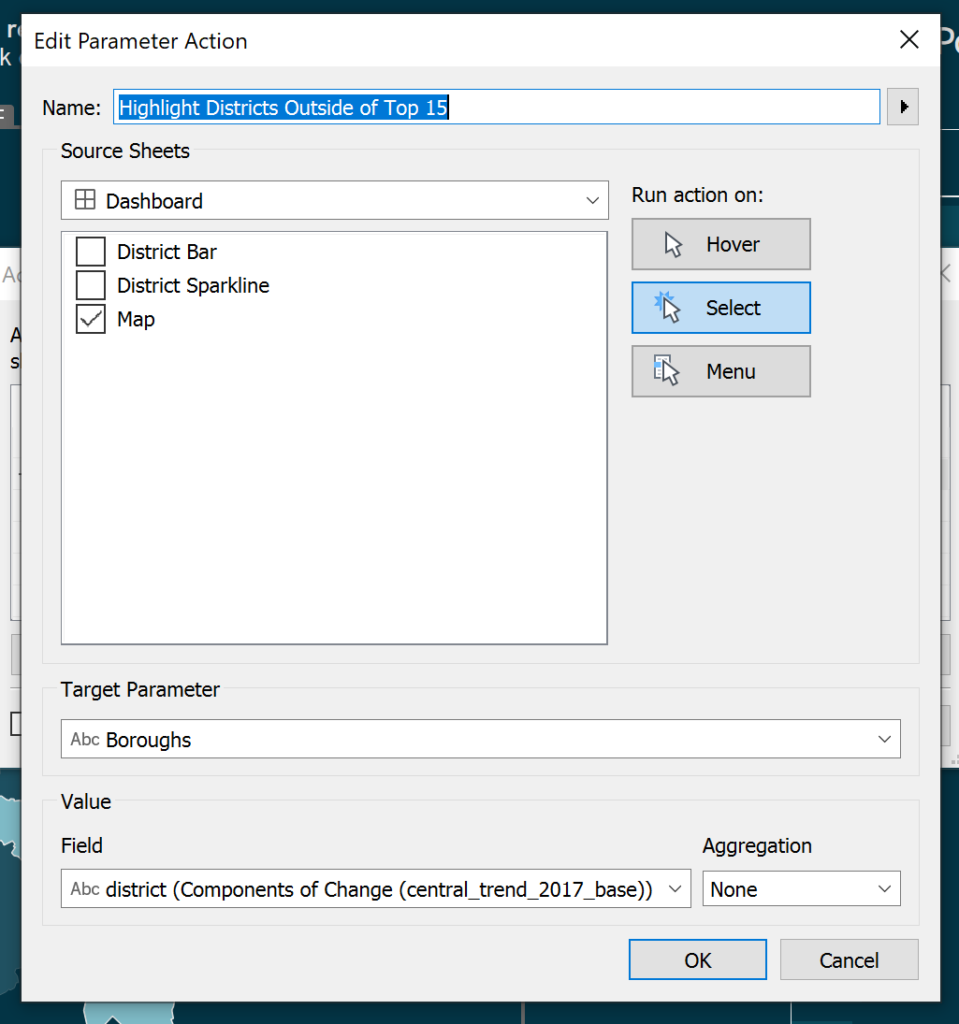
To allow a borough outside of the Top 15 to be shown, a Parameter Action can be used. Parameter Actions allow a user to update a Parameter by clicking on a mark on a worksheet. In this case, I wanted to select a borough on the map and for the Borough Parameter to be updated to the selected borough. The Parameter Action is set up as follows:
Now, when the user clicks on a borough outside of the Top 15, the Borough Parameter is set to the selected borough. This means that the selected borough is now labelled as ‘In’ according to the IF statement and therefore included on the bar chart.
Showing Boroughs Outside the Top 15 on the Sparklines
Showing boroughs outside the Top 15 on the Sparklines is less straightforward. Sparklines show the Total Net Migration per year as well as per borough – there is one mark per year per borough on the chart rather than just per borough. The IF statement logic is still correct however year must be ‘ignored’ in the [Total Net Migration] field calculation to reflect the boroughs overall picture throughout time as in the bar chart.
To do this, we can make use of the EXCLUDE LOD function:
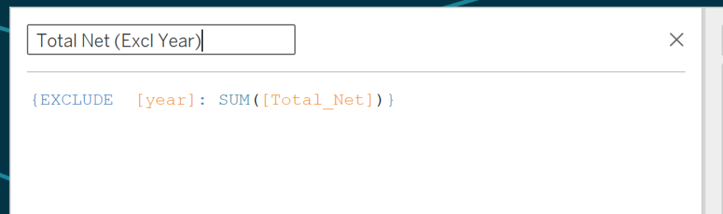
This function says, calculate the sum of Total Net Migration for each mark on the view but ignore the breakdown by year. Therefore, as we have both borough and year on the view, we return the Total Net Migration for the borough only.
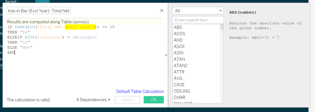
Then update a copy of the IF statement with the ‘Total Net (Excl Year)’ field and drag this to filters on the sheet containing the sparklines, selecting ‘In’. Importantly, when the calculation is dragged to filters it must be computed down the table – or the rank of each borough will be 1 and all boroughs will be ‘In’
The dashboard now allows the user to click on any borough on the map and see the borough selected displayed on both the bar chart and sparklines to the right. This powerful technique can be useful when dashboard space is limited – in this case it would be unclear to show all boroughs as separate rows in the bar chart and sparklines. Instead we can sample just one of the boroughs outside of the top 15 and bring it onto the view.
Thanks to Jamie for introducing me to the Rank calculation logic and to Andy for helping with the Sparkline challenge!