This week is the infamous Dashboard Week for DS16. Every day this week we will be given data at the start of the data. The challenge is to carry out any manipulation required in Alteryx, find a story and build a dashboard in Tableau which has to be published to Tableau Public along with writing this blog all before 9am – phew!
Today’s dataset was survey data from the Design industry. The Design Census 2019 surveyed around 10000 people working in the industry on their background, experience and current role.
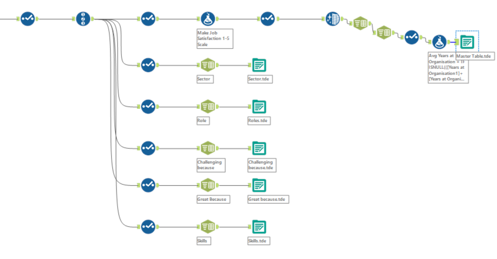
The first step was to investigate the data and pick out the interesting bits. I narrowed down 40 fields to 16 to get to grips with the data set. Another challenge in Alteryx was that several fields had multiple responses all separated by a pipe (‘|’). Although it was simple enough to split these to rows in Alteryx, the data would balloon out of control if this was carried out more than once in a flow.
For example one survey respondent might have suggested two answers for ‘My job is challenging because:’ and two for ‘My job is great because:’. Splitting each to rows already quadruples the amount of data and suddenly aggregating up when in Tableau becomes a challenge as the level of detail of the dataset can easily be lost.
To get around this I generated multiple outputs which I could join back to my data when needed in Tableau for fields with multiple responses recorded
My initial idea was to present an analysis of Job Satisfaction and to investigate which factors dominated job satisfaction. I therefore quickly came to a rough blueprint like this.
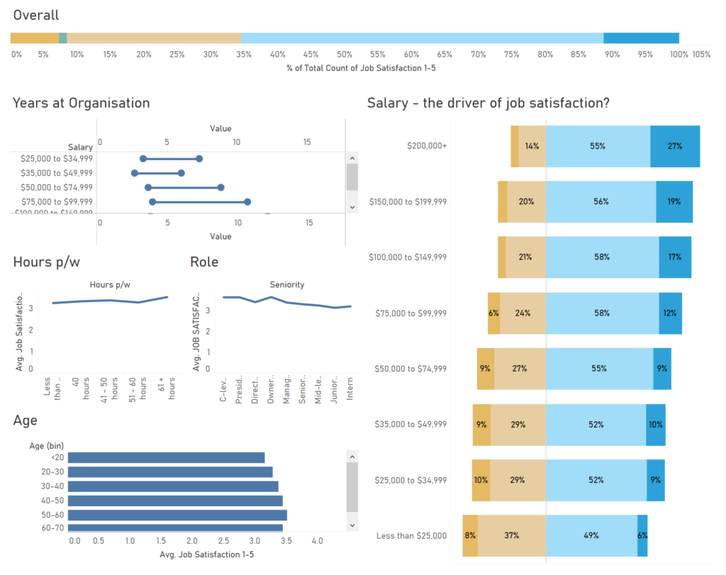
Although interesting, with a lot of clear trends, this viz always seemed like it was going to end up very static and chart heavy. I always aim to lead the user to investigate trends (in an exploratory viz) or simply tell them the answer I found. This design was too much to tell the answer but was not interactive.
Instead I decided to investigate Salary, given that it seems to show a strong link to job satisfaction. My idea was to encourage users to investigate the profile of each salary band using dashboard Filter Actions. This iterated design would reuse a lot of the metrics I had already looked at in my initial design. I also carried forward the layout of Salary big on one side as ‘the driver’ and other charts for deeper insights on the right.
Finally, after experimenting with dashboard design, I produced the following:
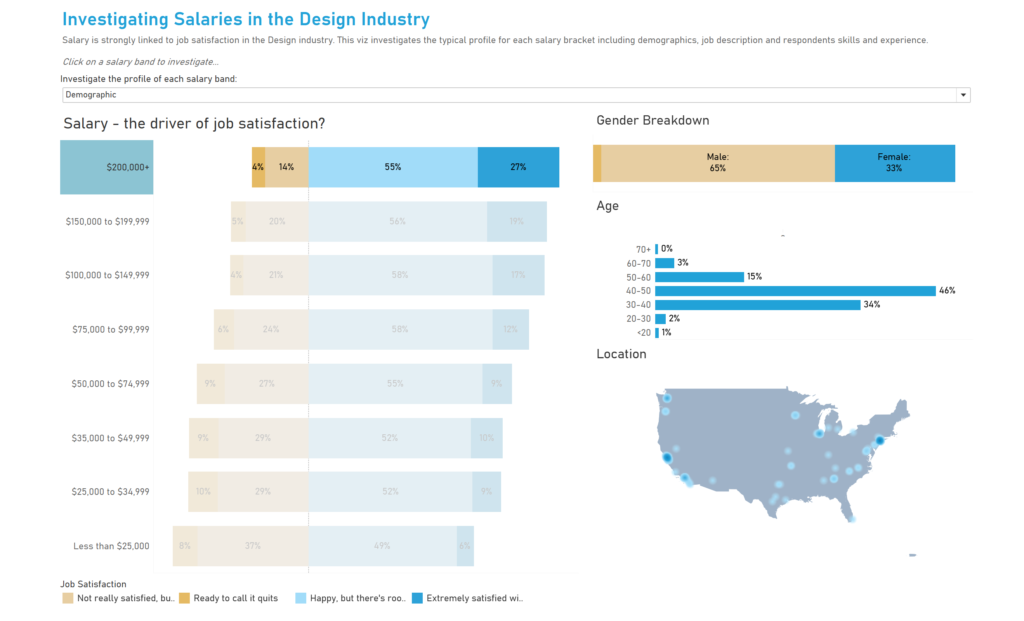
The user can select a salary band (I selected $200k above as an example) to produce a breakdown of the respondents with that salary. As well as demographic, I incorporated views on Role (Job title, contract type and sector) and Skills and Experience (Length of employment, hours worked per week and skills). This was produced using the parameter above.
Reflections for tomorrow:
- Sketch ideas before jumping into data prep to avoid doing data prep on fields that won’t be used
- Don’t obsess over getting a nice design in principle, focus on a simple design and build in complexity at a later stage
- Work faster!!
And, I’m out of time – see you tomorrow everyone!