


Day 2 of Dashboard week started with us being taught some important concepts around making dashboards more accessible. This included dealing with colour blindness, readibility, visibility and other issues that may affect people day to day.
Afterwards, we were tasked with building dashboards based on FixMyStreet data (Glasgow), whilst keeping accesibility at the forefront of our mind. As with other days this week, we had just 4 hours to build out dashboards.
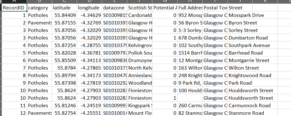
The data itself was quite simple, with a single row for each issue, categorized as either pothole or pavement
My plan was to build a dashboard that told you all the street issues in your area. For this I needed to bring in external postcode data for the Glasgow Area. I joined this on using a spatial intersect within Tableau.
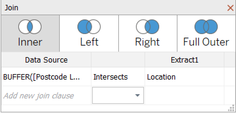
I actually chose to make the spatial points within Alteryx (using the create point tool) but this could also have been done in Tableau using MAKEPOINT() as we had Latitude and Longitude data.
My initial dashboard plan looked like this:
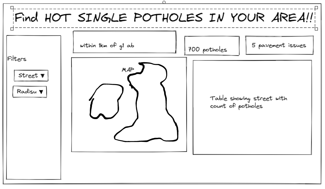
The design had BANs at the top that highlight the key points, a map to show location of street issues and a table view as this can be read by a screen reader for the visually impaired.
My final dashboard followed the plan mostly, with a few slight deviations:
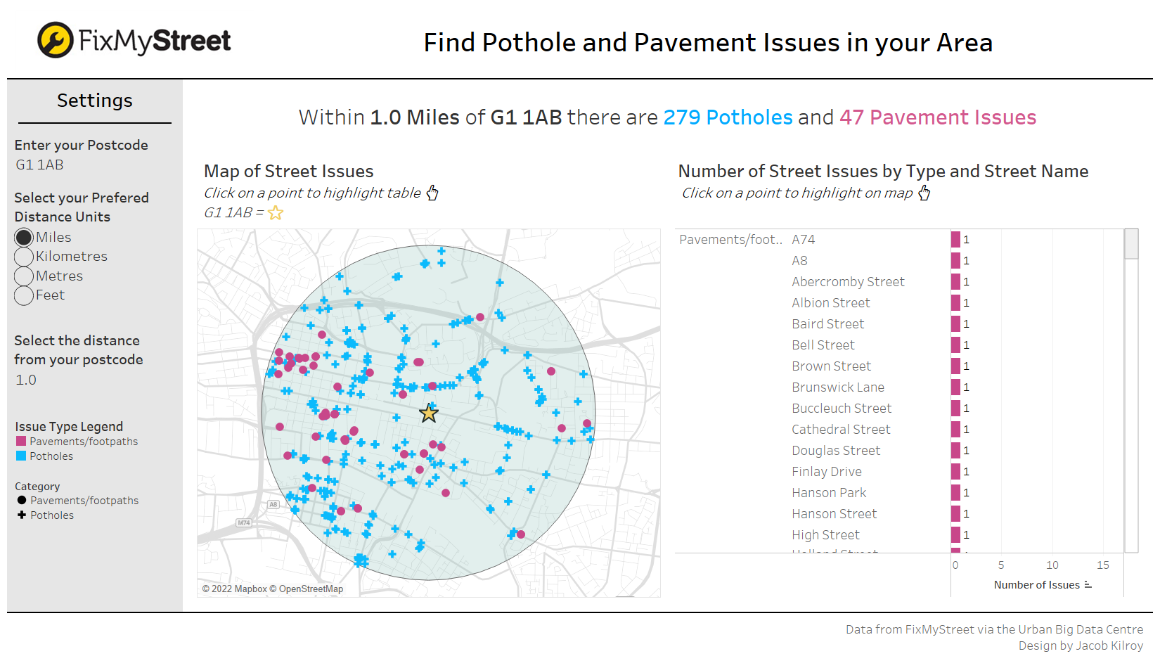
Here are some of the accessibility decisions I made:
- Large font and muted map colours for visibility
- Colour & Shapes to differentiate issue types
- Table view for a screen reader
- Title with BANs - again a screen reader can dictate the important info
- Instructions under chart titles to tell user how to interact
- Dashboard allows for user to 'tab' if they can't use a mouse
Overall, happy with how this dashboard turned out. I got to try some new spatial techniques in Tableau and made a tool that can be used by many different people. I also got to practice making my dashboards more accessible.