To start off our week of building dashboards, we were given a big data challenge and by big data I mean 9gb of data. The first task was downloading it, which took 30 minutes in itself.
While downloading the data, I took a look at the documentation. The data was from the US Environmental Protection Agency (EPA) and was made up of ten csv files. It was data collected by different regional national environmental initiatives around the US.
Once I had my hands on the data I put it into Alteryx to try to make sense of it. Unfortunately apart from geographical data, not much looked familiar. I decided to use this as a starting point, so if all else failed, I could plot a map. I soon found out even this wasn’t so simple as ‘State Abbreviations’ didn’t match ‘State Names’ and some ‘State Names’ weren’t even states.
To solve the issue with the geographical mismatches, I first thought about reverse geocoding since we had longitudes and latitudes which I felt was the only thing I could trust. Although it would have been nice to find a way to do this with an API, I only needed a state name so I went with a quicker option.
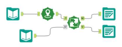
I found a shapefile of the US states which I brought in to Alteryx with the EPA data. I used the Create Points tool to create a spatial field from the longitude and latitudes and then using the Spatial Match tool I was able to assign state names to each row according to which state polygon a long/lat point fell in.

Now I could create a map but I still didn’t know the story I wanted to tell. Apart from an hour’s respite when I was doing a webinar, I spent the rest of the day exploring the data, trying to find some relatable element in the data.
I thought it would be interesting to look at the private companies which have sites being monitored by the EPA. Some of these companies are familiar names like 7-Eleven, Walmart and Chevrolet. With very little time left, I put together a simple dashboard showing organisations with more than a thousand monitored sites. I hoped to show differences between industries and the types of environmental issues affecting them, but in the end the best I could do was a hex map and some dashboard actions.
The unfinished dashboard: https://public.tableau.com/shared/7M82B9KQ4?:display_count=y&:origin=viz_share_link
