


After a really tough first day of dashboard board week, we were rewarded with something a little kinder, pinball data. This time we actually had measures in the data.
The trick was that we had to get the data from an API but luckily the documentation was clear and there was no need for an authorisation token.
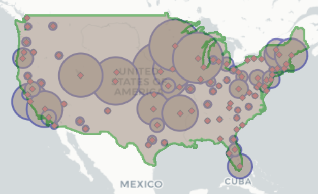
Once I had made a few GET requests, I could start looking at the data. There was the location of pinball machines around the world. The main two levels of details were the locations, for example a bar or an arcade and the pinball machines themselves. There was ‘region’ which were interesting because when I plotted them on a map, they weren’t evenly distributed across a country like regions usually are.
I realised that ‘regions’ were in fact administrators who had volunteered to monitor the pinball locations in their area. Each administrator had given the radius that they were willing to cover.
After plotting these radii on a map I saw that a lot overlapped which meant that lots of administrators were covering the same beat. I thought it would be interesting to split up the map so that no two administrator areas overlapped.
I did this by essentially creating a voronoi map in Alteryx using the Spatial Match, Spatial Process and Trade Area tools.

In Tableau I wanted to look at both the administrator submitted radii and the voronoi map so I joined the two on the location id.
In Tableau I tried to create an exploratory dashboard where the people who run the API can see where they might have too many administrators and where they might need to recruit more.