The second day of dashboard week had DS12 exploring the finishers data from every year of the London Marathon. Each of us were assigned a two letter code from either our first or last name to narrow down the searches for our web scraping, for me this was ‘ja’. My final viz can be found here.
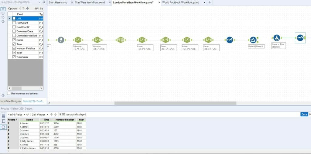
I started my prep in Alteryx by building out a basic workflow that would parse out the relevant data from one page of web scraping. This involved a series of regex tools which looked for data between different HTML tags and can be seen below. At this point I had the data for one page and one year. Next step was to get every page from every year.

To obtain every page from every year, I used the generate rows tool to replace both the page number and the year in the URL. To generate the new list of URLs I used the replace function in a formula tool.

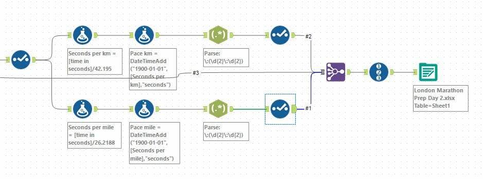
The final chunk of data prep that I did was to generate km and mile splits for all the runners as I wanted the option to be able to display this in Tableau. To do that, I used the DateTimeDiff function to generate the number of seconds someone ran for. I then calculated a number of seconds per km/mile field. Finally I added this to a date field by using the DateTimeAdd function, a bit of regex to parse out the values I needed and I was done.

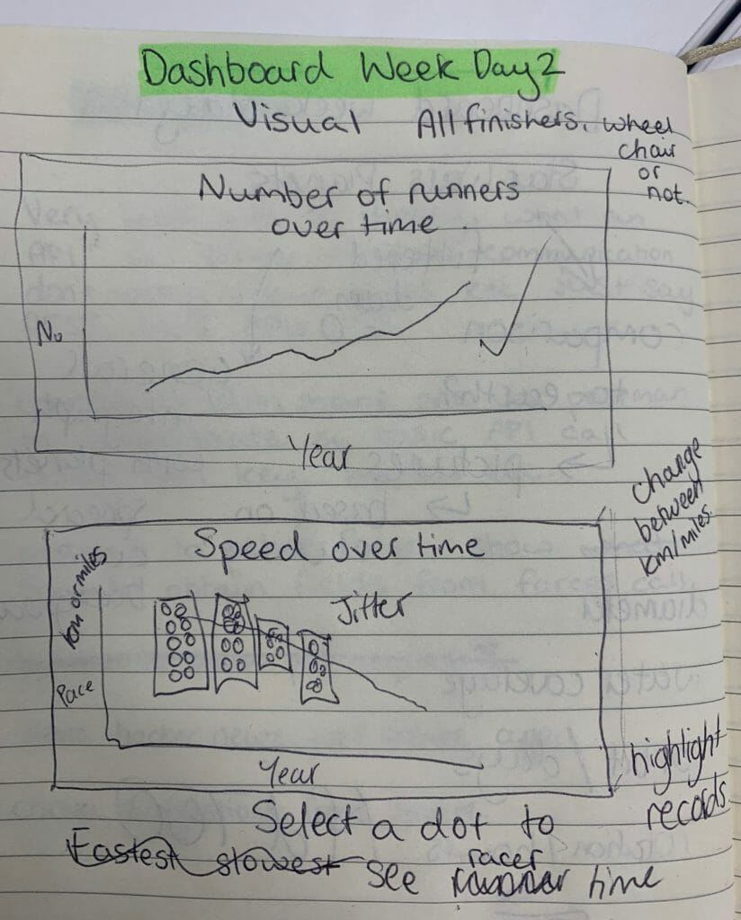
At first I wasn’t too sure how to visualise this data in Tableau, so I started some drawings (see below) to try and figure things out. Taking to pen and paper before Tableau is a great way to try and plan an overview or give you some ideas of what you want to visualise. Although I didn’t plan my full dashboard, I did use the ideas from my sketches in my final design.

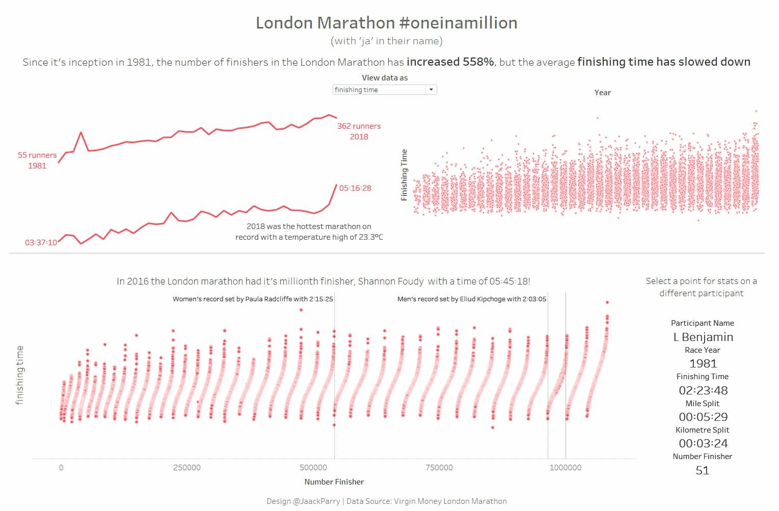
The dashboard itself was split into two sections, the first looked at how although participants have increased over time, the average time of finishers has decreased. I did this through two different sparklines to show the overall trends and then plot with every runner on it, to try and show the two sparklines together in a different way.
The second part of the dashboard looked at the finishing number of all runners, as the dataset was produced for the #oneinamillion campaign to celebrate one million finishers of the London marathon. This again showed every runner by overall finishing number and finishing time. This points are then used as a filter to show the stats for a particular runner in a given race.

Next up tomorrow… Power BI
