A sparkline is a very small chart used to show snippet trends of data such as, stock market price, seasonal changes or highlighting maximum and minimum values. Usually they are drawn with no axis and just present the general shape of a trend. I used sparklines for the first time as a viz in tooltip in the most recent Makeover Monday (2019 week 3), which I found to be very effective.
For this explanation, I’m going to use some share price data from a handful of technology companies. As I previously highlighted, sparklines are commonly used to give a snapshot of economic trends.
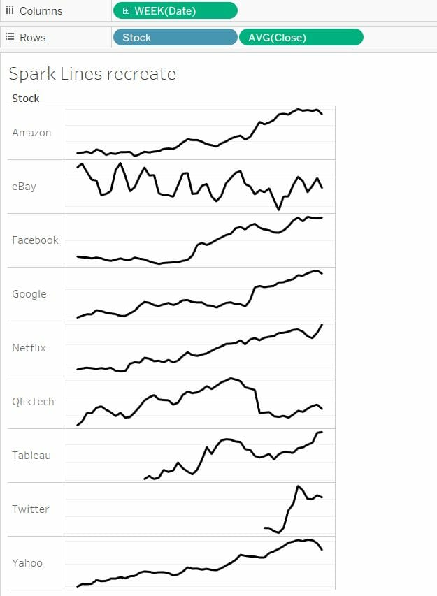
Creating the general view
The first step I took to create the general view was to put the week number on the columns shelf and ‘stock’ and the average close share price on the rows shelf.
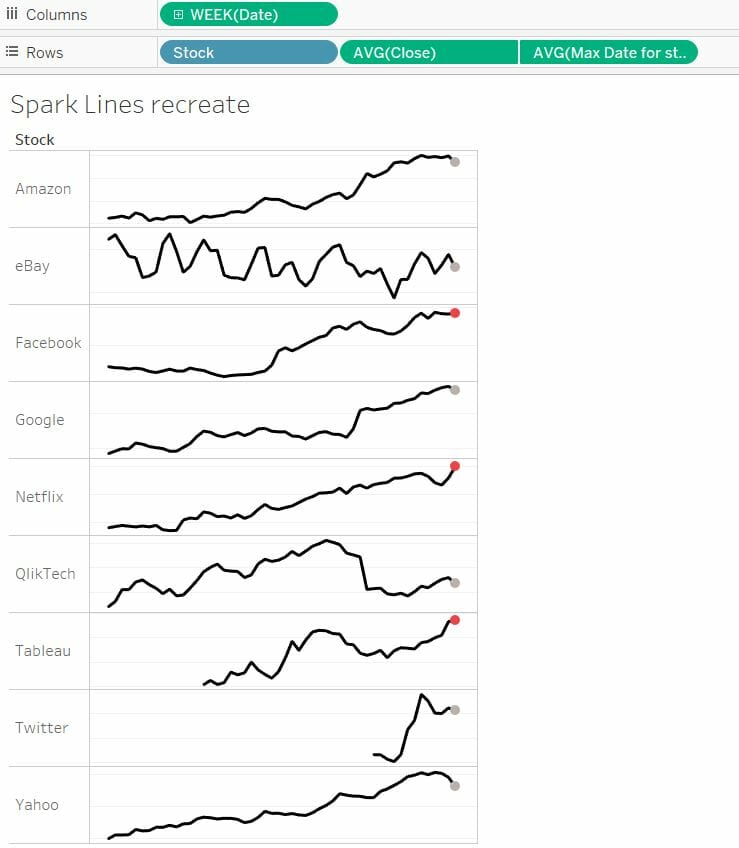
Next, I edited the axis for the close share price, I unchecked the ‘include zero’ checkbox and selected ‘independent axis ranges for each row or column’. Finally, I hid the headers for both close share price and the week number and pulled the right side of the axis in, so I had a view like on the right. You now have a some sparklines! However, these could be improved…
Highlighting weekly increase / decrease
I decided these views could be more effective if I used a circle at the end of each line to highlight whether there had been an increase or decrease in share price relative to the previous week. The first step I took to do this was to create a level of detail calculation which returns the close share price for each stock in the last week of the data set.
IF {FIXED [Stock]: MAX(DATETRUNC(‘week’,[DATE]))}
= DATETRUNC(‘week’,[Date]) THEN [CLOSE]
END
I then added this new field to the view and changed the mark type to a circle. I followed the same formatting as before such as excluding zeros and making axis independent for each row. The extra step taken this time was to create a synchronized dual axis. I then hid the headers for the two fields to produce sparklines which each had a circle highlighting the most recent point as seen below. You will notice there are loads of nulls which have not come into the view, this is because the level of detail calculation is only going to return one value, the most recent date, so the rest of the points in the view are null. This indicator can be hidden by right clicking on it.
The final step I took was to write table calculation which returned true/false depending on whether our most recent date value was an increase or decrease on the week before.
AVG([Max Date for stock])<LOOKUP(AVG([Close],-1)
This field is calculating whether our value for maximum stock date is greater than the value for the week before. I added this calculation to the colour shelf for my max date field which will colour the circles two different colours depending on whether there was a weekly increase or decrease which can be seen below!
I hope you have found this tutorial helpful and can apply it to your own work!
Final View