


Boxplots are a unique way to showcase the distribution and variability of data and a leading data visualization tool that empowers analysts to transform raw data into actionable insights.
A box plot, also known as a box-and-whisker plot, statistically represents the distribution of a dataset and provides a visual summary of key statistical measures, including the median, quartiles, and potential outliers.
They are particularly useful for comparing numerical data distributions across different categories. They are instrumental in identifying the central tendency of a dataset, detecting outliers, and understanding the variability within and between groups.
To create a boxplot in Tableau (such as the one above), use the following steps:
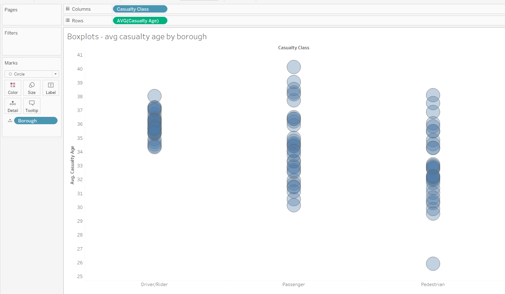
1) Drag the quantitative variable that you want to analyse into rows and the category onto columns. Change the marks card to circle. In the image below, the quantitative variable used is average casualty age and casualty class is used for category.
2) Then we need to break the datapoints up so put the borough on detail
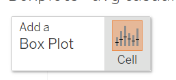
3) Then navigate to the analytics pane and drag distribution onto the 'Add a Boxplot' that appears in the top left of the visualisation pane.
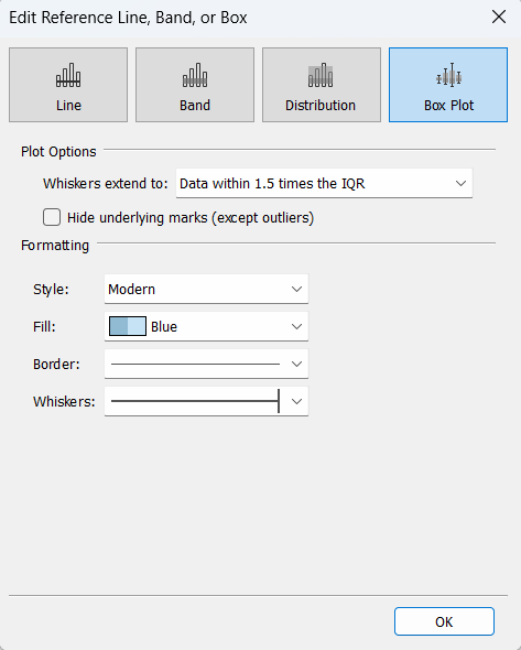
4) In this case, you can leave the settings as default, but you can change the 'whiskers extend to' options to your specified requirements if needed.
One note is that you do have the ability to hide the circle mark under the box so only the outliers are present but better practice is to still have these in the view as viewing the underlying marks allows for a more granular examination of the data points within the box, helping you understand their density.
It's that easy! We now have a box plot demonstrating the distribution of the average casualty age by borough for each of the casualty classes. Best practice now would be to identify and understand the reasons behind the outliers and whether they are valid data points or indicative of errors, so carefully examine them to determine their significance.
Hope you have fun making more box plots!