For those who aren’t familiar with Pareto principle which is also known as 80/20 rule, the idea is that by doing 20% of the work you can generate 80% of the benefit of doing the entire job – therefore businesses frequently use it to solve problems so they can concentrate on the major causes of their problems first, so they can eliminate the majority of their problems.
To build the chart, I will be using superstore dataset. You can get it here,
if you want to follow along.
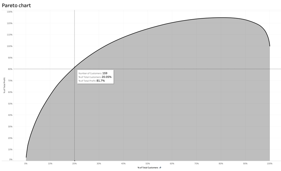
Let’s say, we want to know what percentage of customers account for 80% of our profit.
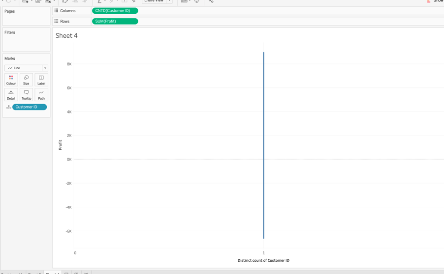
1] Drag Customer ID onto the columns shelf and change the measure type to CountD
2] Drag Customer ID onto the detail shelf (don’t change the measure type)
3] Drag profit onto the rows shelf
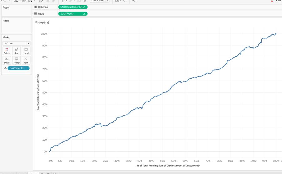
4] Add a table calculation for Sum [Profit] and select running total sum and select compute using Customer ID
5] Tick the box that says at the bottom: add secondary calculation. In the secondary calculation type choose percent of total and also compute using Customer ID

6] Repeat step 5 and 6 for CNTD[Customer ID], so now you should have something like this:
7] In the marks card, click on the drop down arrow and select sort by profit and select descending
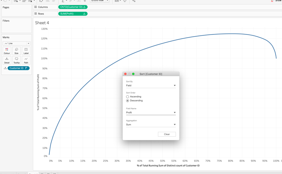
This step is imperative because it will allow us to visualise the most profitable customers first.
9] Right click on the y-axis and add a constant reference line and type in value of 0.8

10] Do the same for the x-axis but add a value of 0.2
And here it is:

You can also add an area chart below and dual axis both charts if you want to make it prettier or you can use bars instead of the line chart. You can also play around with the tooltips to figure out the number of customers, products or even regions.
So now you should be able to see that 20.05% of customers (159 customers), account for 81.7% of the total profit