Before joining the Data School I knew very little about Tableau. There were some things I knew how to do but often didn’t understand why or how these things worked. Since joining the Data School I’ve learnt many new techniques and theory which helps me understand and use Tableau better. In not particular order, here are the 5 things I’m most glad to have learnt
1) Tableau Order of Operations
Before joining the Data School I would often find myself confused about how thing worked in Tableau. I would do things and they would sometimes work and sometimes not. I would see people add filters to context on tutorial videos and dutifully do the same but without understanding why. Learning the Tableau order of operations changed this and I am now more confident in understanding how Tableau works behind the scenes. There is an order in which Tableau processes different things and this is what results in your view. Understanding this means things like context filters, LOD’s etc make much more sense and can be used strategically. I would definitely recommend learning the order of operations to any new to Tableau. For more detail read the following blogs:
Harry Cooney (me): Tableau’s Order of Operations
Ellie Mason: Order of Operations // Sorting with a Filter
Joe Macari: How to Talk ‘Tablish’
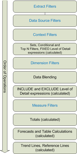
The Tableau order of operations.
2) Level of Detail Calculations
I hadn’t come across level of detail calculations before the Data School and even after first learning them I was unsure about how useful they would be to me. I quickly found this doubt to be unjustified and have used them in a huge amount of vizzes since. Level of detail calculations allow you to get a fixed value which doesn’t change by adding more fields to the view. You can then reference for example a fixed average for a category which can then be used as a comparison to each value. These calculations allow you to do many thing I previously thought not possible and are particularly useful when making KPI dashboards allowing calculations of year to date etc. For some examples of LOD calcs read the following blogs:
Manuella Marolla: LOD’s vs Table Calcs For Comparison to Selected Value
Thomas Luthi: Using LOD’s to Calculate Customer Retention
Harry Cooney (me): Using Fixed on Minimum Date LOD’s
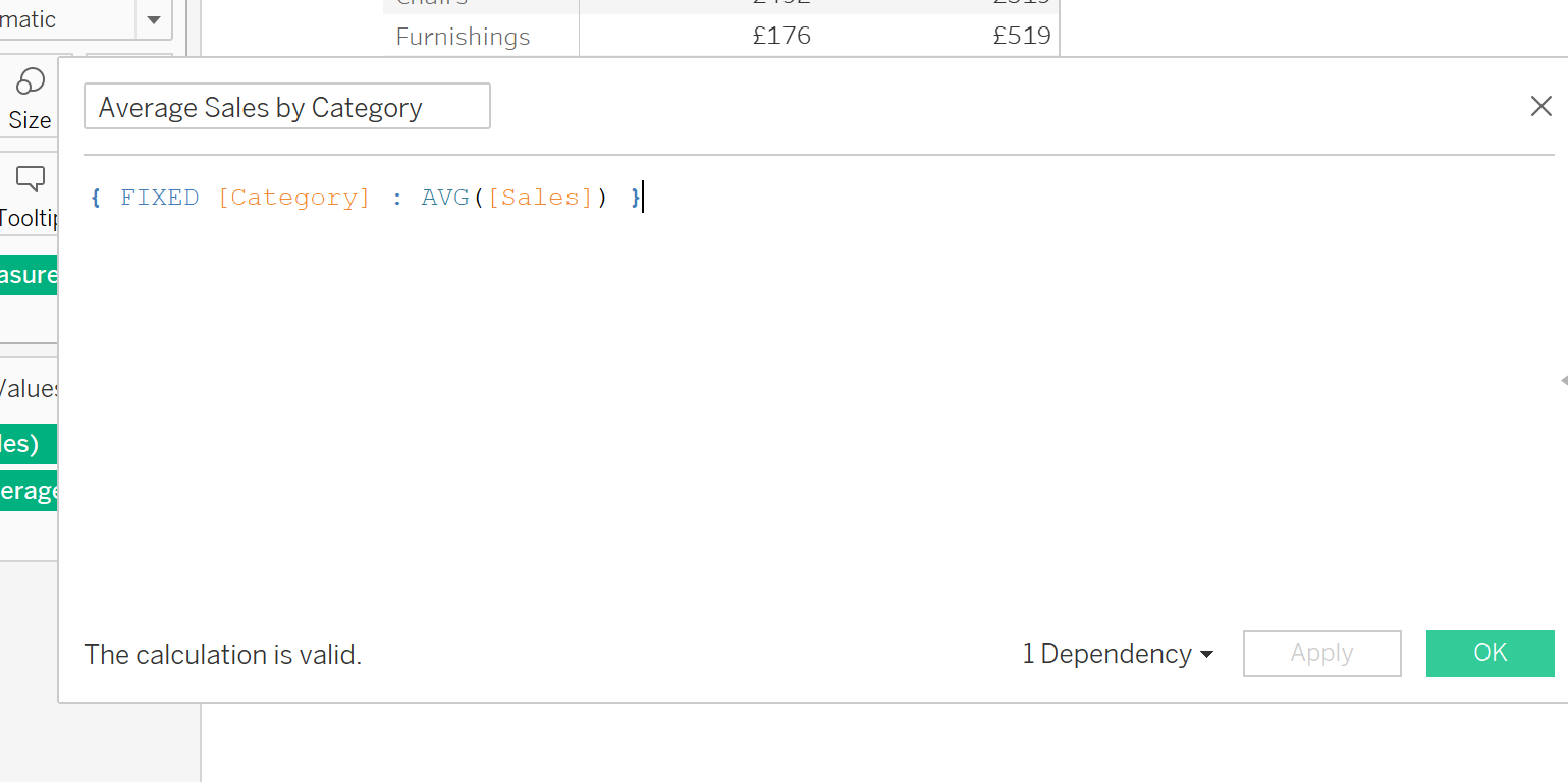
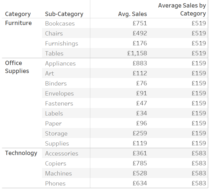
The fixed LOD calc (left) gives an average sales value for the category. This stays consistent despite putting Sub-Category on the view (right).
3) Containers
When it comes to designing dashboard layouts containers are far and away the most important thing to understand. Before understanding what containers are and how they work I would essentially wing it when it came to laying out dashboards. I would align things by eye trying to make them even (sometimes not possible) and would often float things to aid in this. Floating is a risky tactic as when uploading to Tableau Public the position sometimes changes throwing off the whole dashboard look. If however you need to float I recently found out that you can show a grid on your dashboard by clicking Dashboard>Show Grid (bonus useful thing!). Containers make this unnecessary however as they allow you to put your sheets, text, images etc. into boxes that are designed to aid structuring your dashboard. Things in containers can be set to distribute evenly, and the height of containers can be set in pixels and fixed. Containers place sheets either horizontally next to each other or vertically above/below and containers can be put inside containers so these methods can be combined. For more info read the following blogs:
Harry Cooney (me): Dashboard Formatting with Containers in Tableau
Andy Kriebel: How to Approach Analysis & Design Dashboards

Containers make your dashboard neat.
4) The Difference Between Dateparts and Datevalues
Before joining the data school I was also unsure about dateparts (blue dates) and datevalues (green dates). I had some intuition with them and through trial and error could usually get the view I wanted. However now I actually understand the difference making line charts actually makes sense. Dateparts essentially has the dates behave like dimensions in that they are non-numeric. This will cause line charts to sometimes lose continuity at the border of these date dimensions, an issue that used to drive me insane. They are useful for comparison between things like hours of the day or weeks of the year. It is better to make line charts using datevalues however as they give dates in a numeric style, meaning there is continuity. For more info read the following blogs:
Harry Cooney (me): Dateparts vs Datevalues
Timothy Manning: Blue and Green Pills – What Do They Mean Tableau?
Tableau Date Types.
5) Set Actions
Set actions weren’t a thing when I first started using Tableau, they were added with version 2018.3, but they have quickly become one of the most useful things I have learned. I used to not see the point in sets. All they do is create two groups, why not just use the group function? This was quickly proved wrong to me in the data school after a lesson focusing on sets and paramaters, but after the release of set actions they have become even more valuable. Set actions allow interactivity in dashboards and worksheets beyond just filtering and highlighting. They allow you to dynamically change set group membership which provides the opportunity to proportionally highlight, drilldown and many other things which were previously not possible. This makes making exploratory dashboards much easier and generally just gives many more options when it comes to design. For more information you can complete my workbook below and read the following blogs:
Harry Cooney (me): Set Actions Practice Tasks
Nick Jastrzebski: Using LODs and Set Actions for Benchmarking
Lindsey Poulter: Many set action related blogs

Set actions give more options when it comes to making interactive dashboards.