With some time free over Christmas I decided to look over my vizzes from Dashboard week with a fresher pair of eyes and fix some things that were annoying me.
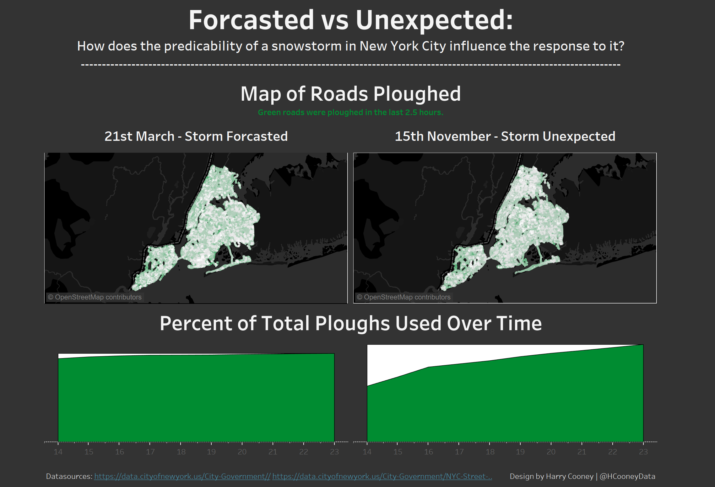
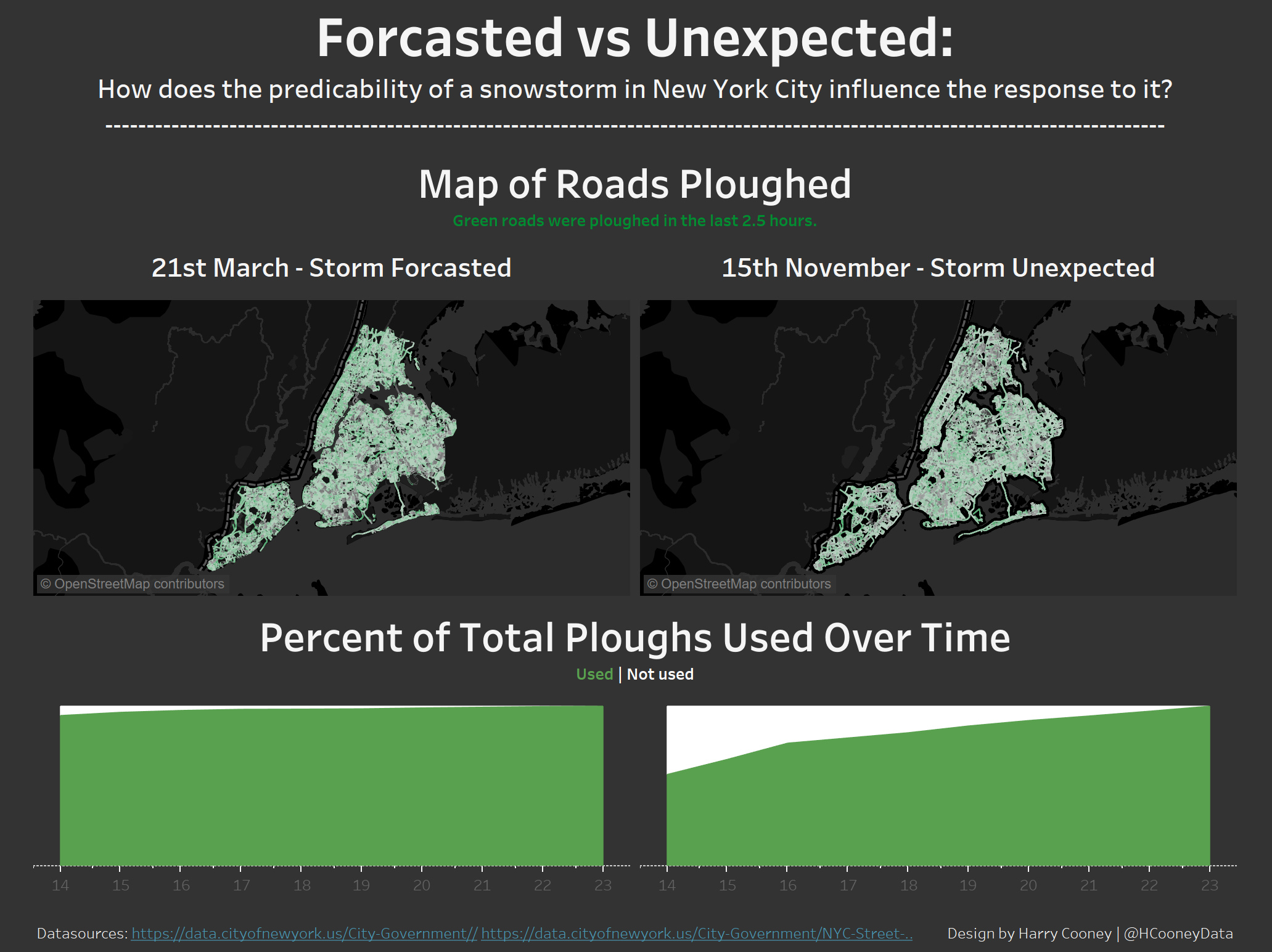
New York City Snowploughs
Day ones snow ploughing dashboard was my least favourite of the week and I didn’t think there was much I could do to improve it unless I started again from scratch. However I found that reducing the thickness of the road lines on the map and changing the colour range from white-green to black-green made the green pop out slightly better. The maps still look very similar and fail to highlight the difference in snow plough use as well as I’d like but they are an improvement on the original. I also used a duller green for the area charts below and created a legend for them so that the viz makes more sense. Find the viz here.
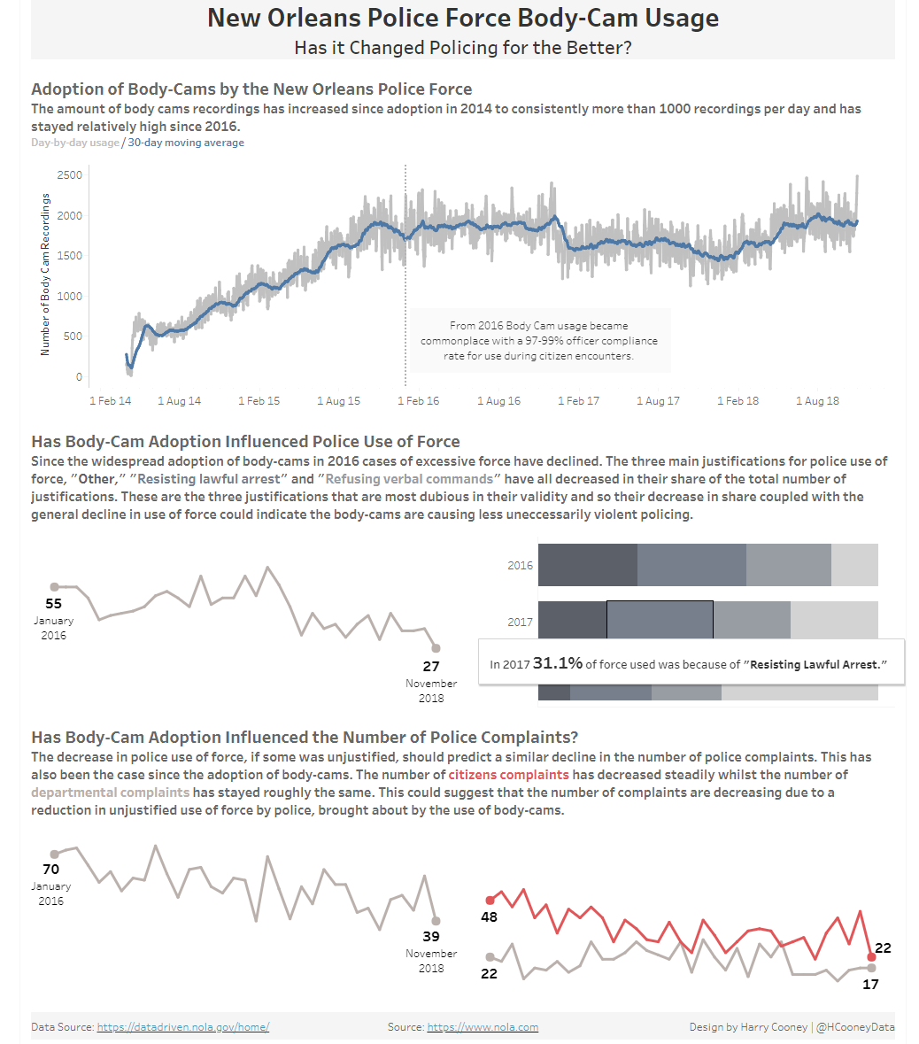
New Orleans Police Body Cams
My police body cam usage viz was my favourite of the week and so I was reluctant to change too much. I did however change the wording of tooltips and annotations and formatted percentages to be one decimal place. Find the viz here.

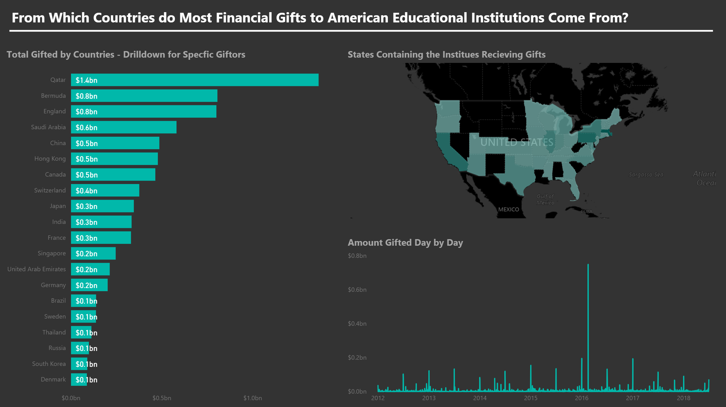
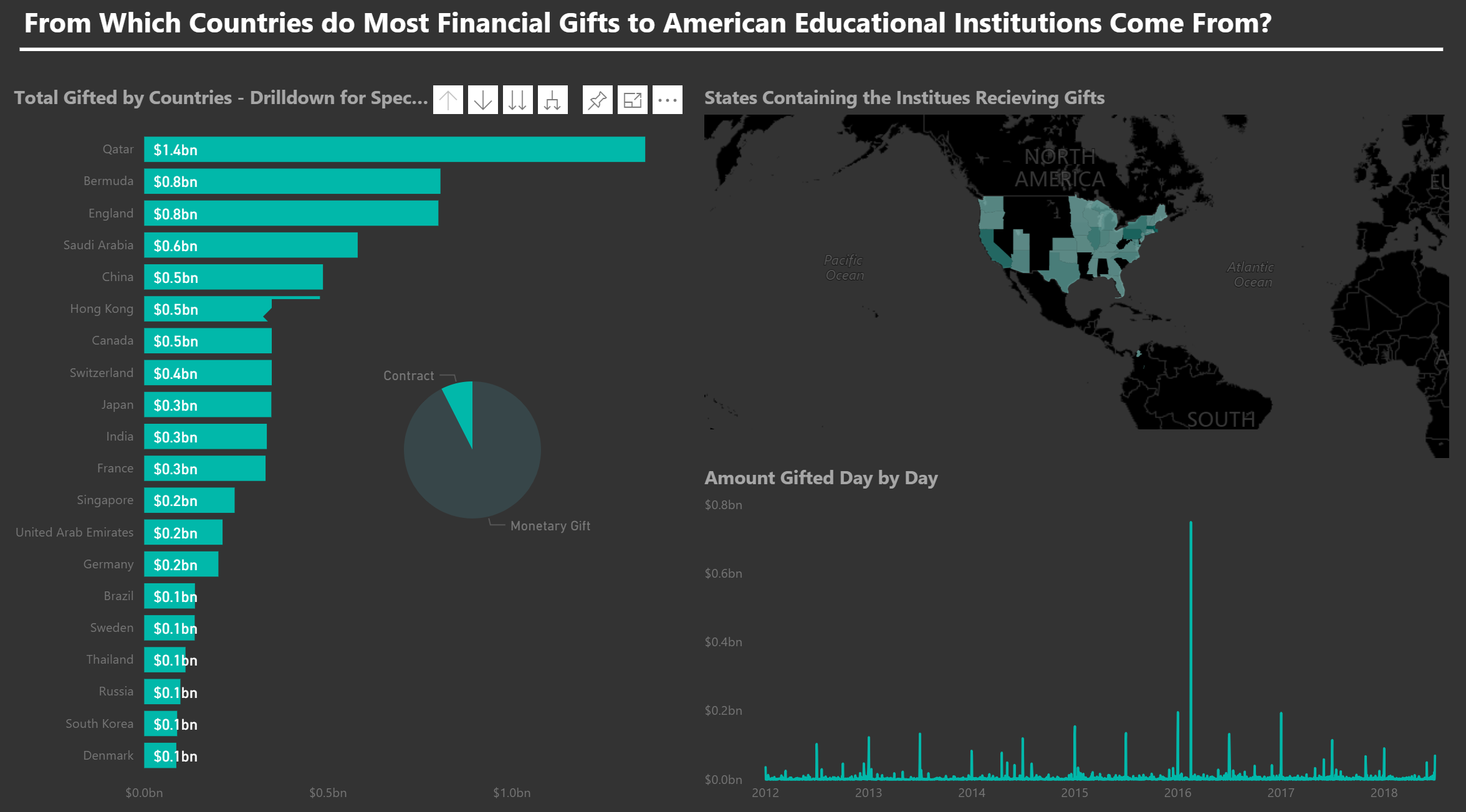
American University Gifts Received
I was impressed by the report page tooltips included in my classmates Day three Power BI dashboards so decided to add one to my own. I added a pie chart looking at the one aspect I hadn’t included in my original viz, the type of gift received. Therefore hovering over the bars for each country or institution would show the proportion of contracts, gifts and real estate that make up the total financial gifts given/received. I felt a pie chart was a good way to show this is there are usually only tow variables and at most three and so for a quick visual breakdown of the proportion each gift type makes up the pie chart works. Find the viz here.
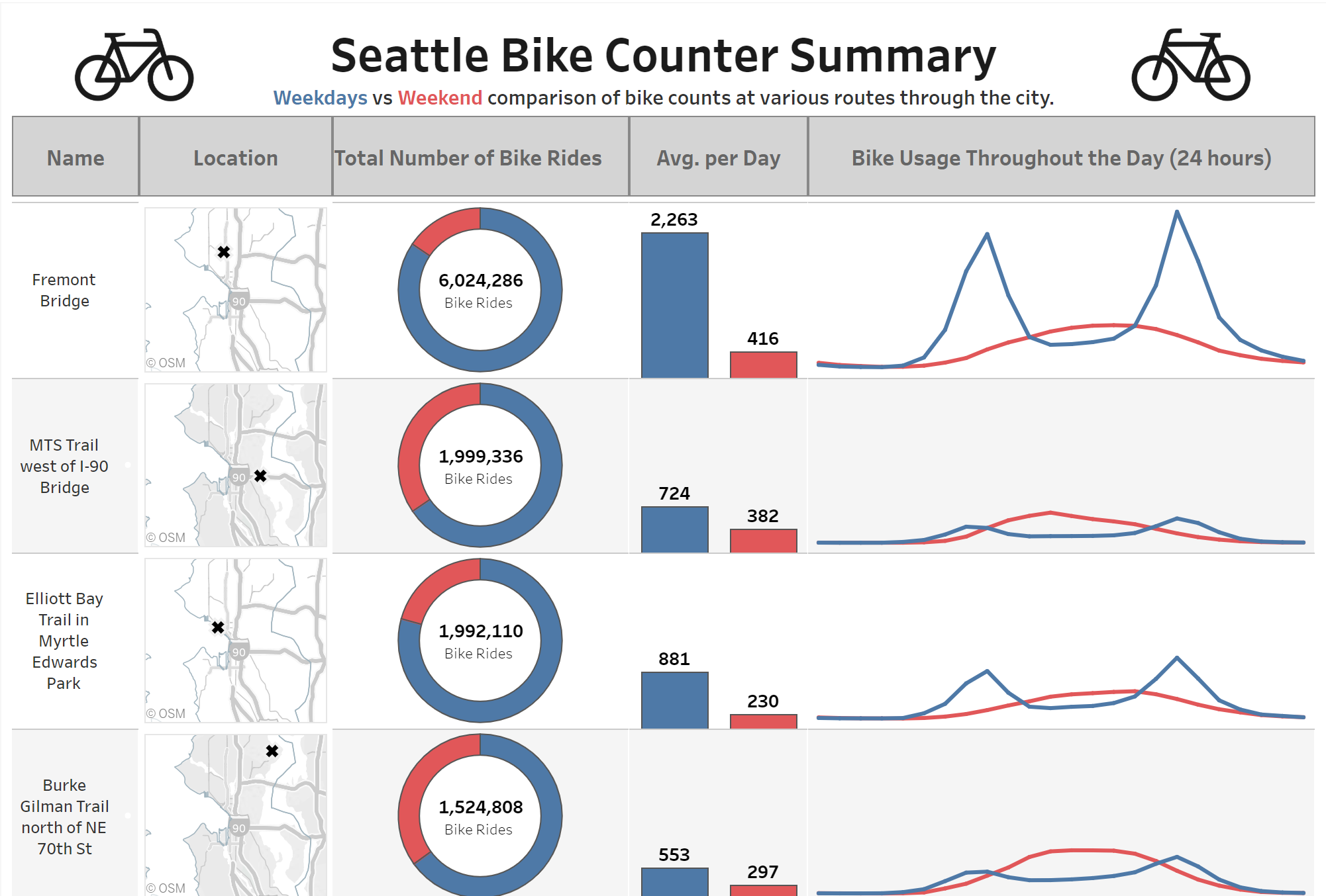
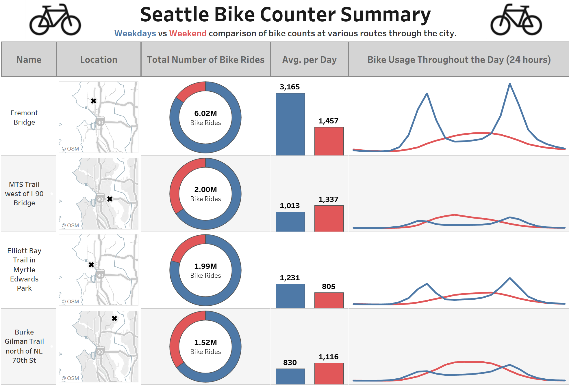
Cycling in Seattle
Feedback I received on day 4’s dashboard was the main reason for me wanting to go over my dashboards again. I’d calculated the averages incorrectly and so the viz I had published was incorrect. I had calculated the overall average for weekdays and weekends not taking into account the fact that there are 5 weekdays and only 2 weekend days and so the bars for the weekend average were always greater. Looking at the average bike usage hour by hour however revealed that this cannot be correct as for some locations the hour by hour use on weekends was consistently higher than for weekdays. To correct the mistake I counted the number of days and divided the count of number of bikes by it. This correctly calculated the average as the number of days was now taken into consideration. I also displayed the big numbers inside the donuts in millions as opposed to the whole number to make it easier to read. Find the viz here.
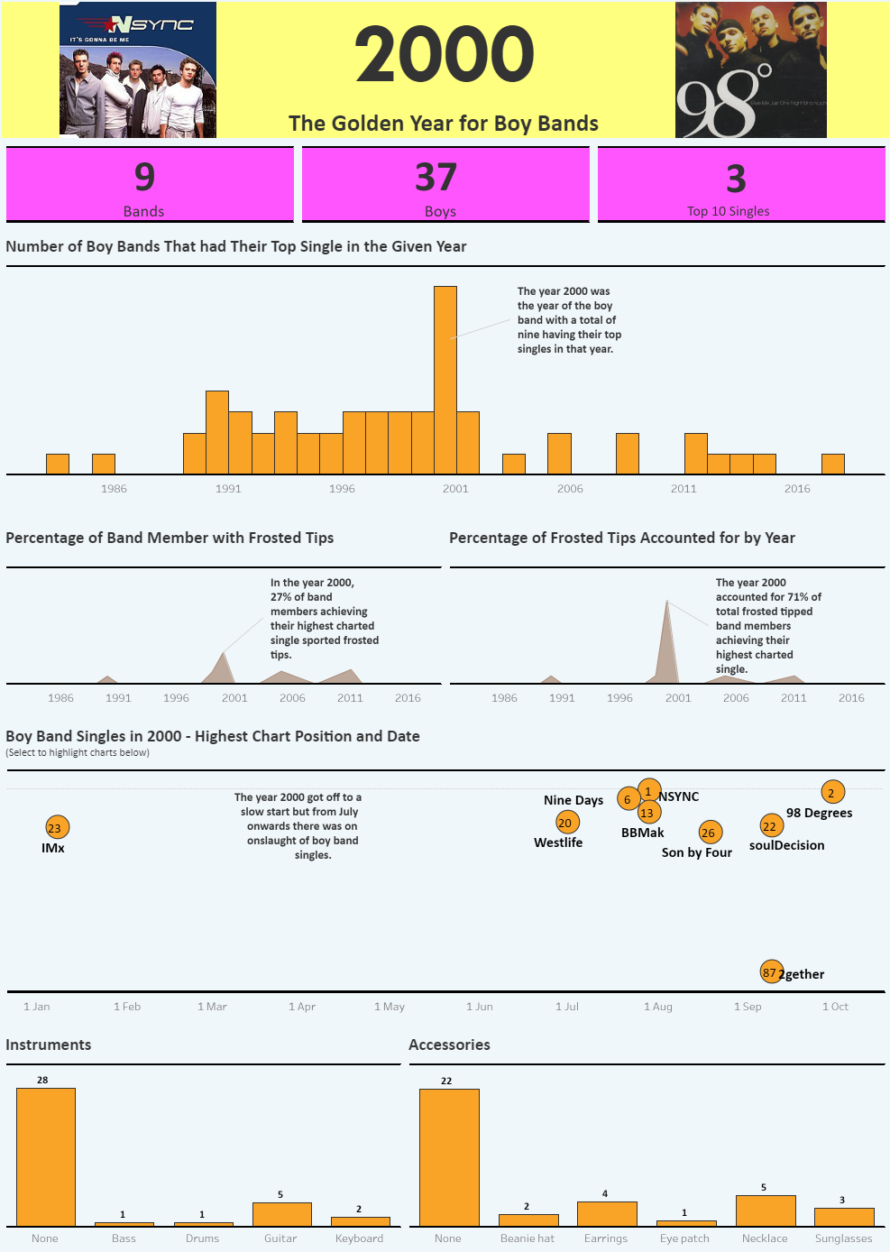
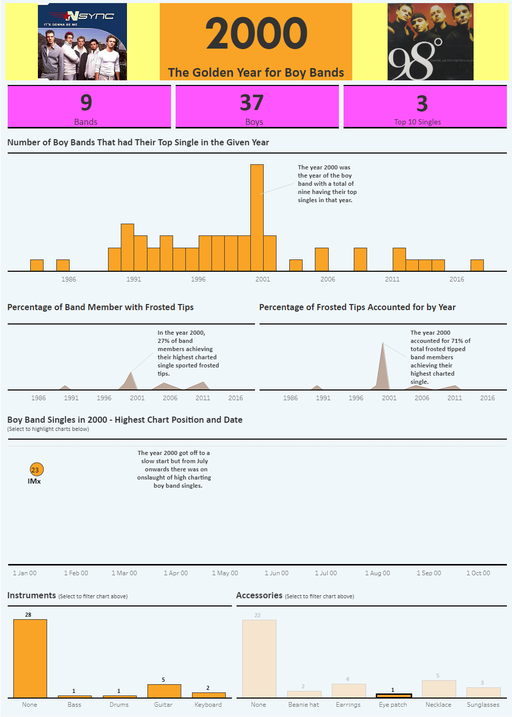
Boy Bands
When presenting my boy band viz I was asked from which band did the person wearing the eye patch come from. I hadn’t included any interactivity from the bar charts to any other charts and so had to select every band/song in the position/date chart in order to narrow it down by highlighting the bar. Therefore as an improvement I have added filtering from the bars to the position/date chart. This made the viz more interactive. Otherwise I was happy with the outcome so didn’t change much else, other than the colour of the title background. Find the viz here.