First day of Dashboard Week – ahhhh!
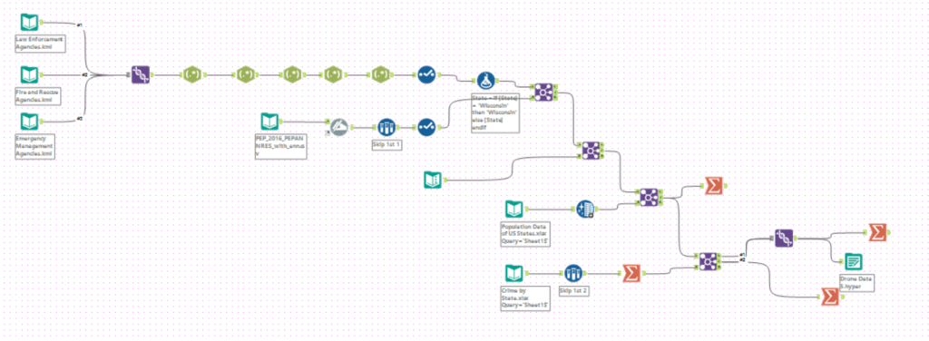
The data for today was about drone usage across the United States. The first challenge of the day was exporting data from a google map as a KML and then importing into Alteryx.
09:35: finally got some sort of data into Alteryx – not sure what to do with it though
09:47: Starting to panic as I don’t know how to REGEX
09:55 – Craig is the REGEX master
I was quite relieved that the data preparation only took me an hour this morning. I was worried that I would waste a lot of time panicking on this stage. (There’s still 4 more days for this to happen).
10:02 – My eyes are streaming (pretty sure it’s not tears – is the pollen different in the South than the North?)
10:14 – Looking at what questions I want to answer with the data: when, where, what, how, why, who?
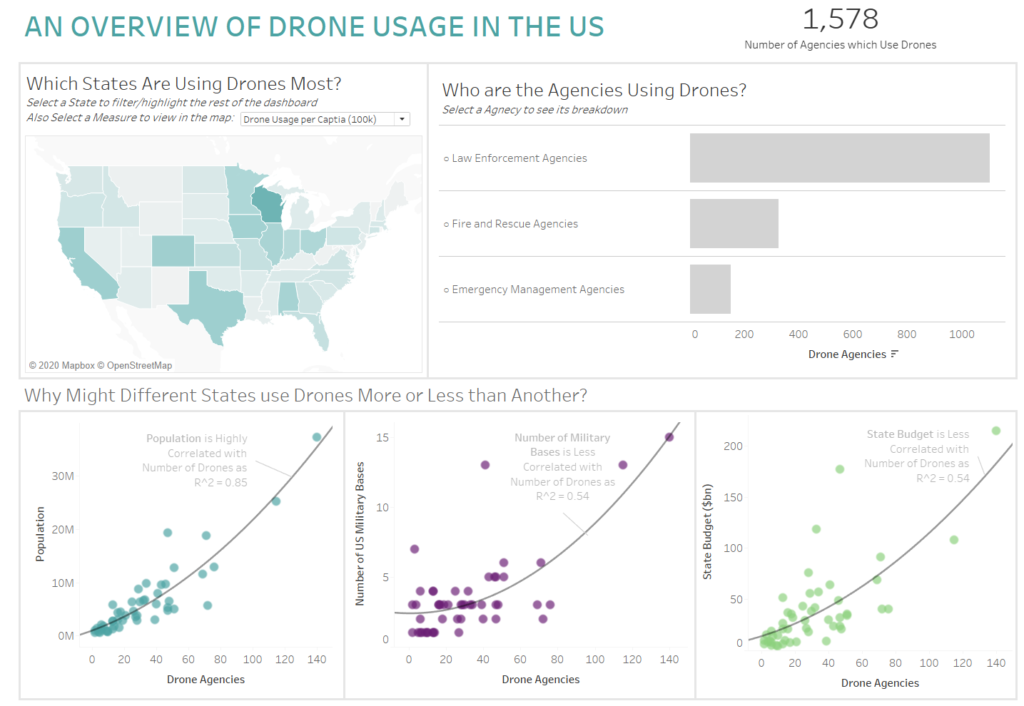
10:25 – Found population data for States and joined that to the data source to allow me to look at drones in each state per capita.
10:32 – I wrote a LOD all by myself and it worked!!!
11:01 – Looking for some data to use about where military bases are in the US
11:12 – Joined data on number of military bases per state onto my data
11:25 – I have a few basic graphs showing trends etc.
11:28 – Looking back over a set action drill down and applying it to a bar chart
11:43 – Completed my drill down chart! 😀
11:52 – Worrying time has finally started – not sure I’ve got enough and what I have got isn’t complex enough.
12:23 – joint population density and land mass to data
12:39 – Found no link between density and land mass to drone data so added state budget and crime rate to data.
12:45 – going to have a quick lunch
13:15 – Had a quick call with Andy to check if I was on the right lines
13:30 – FORMATTING – I am always surprised by how much of a difference some good formatting has!
15:00 – Blog Writing
My Alteryx flow ended up being quite big for this project as I joined quite a few different external data sources to the provided drone data. Some of which I didn’t end up using as the relationships weren’t strong enough.
My Dashboard is quite a broad overview of the data. It first addresses the ‘where’ question – looking at which states have more/less drones. I also included the ability to switch to view by drone per capita to add some context. The next chart looks at ‘who’ is using drones by looking at which agency types allowing a drill down for more detail. The final section looks at ‘why’. Here I included 3 scatter plots which showed various positive correlations between number of drone agencies in specific states and other variables.
I’m not overly proud of my dashboard today. I feel like it is quite basic and doesn’t really allow too much to be drawn from it. Going further into the week I want to try to choose a more specific direction in which to go with the data to prevent creating another ‘overview’ dashboard and to be able to draw more in-depth and detailed analysis from the finished product.