Task
Today we had to create a visualisation based on data about our Solar System within Power BI. This task required the use of an API to access the data.
Data Preparation
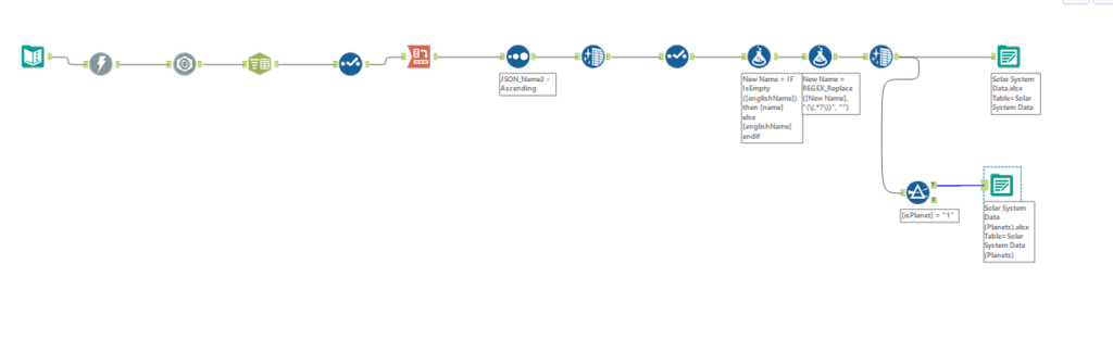
Retrieving the data was not as complicated as the previous two days and it was quite straightforward in regards to cleaning it. I downloaded the data and used some basic tools to clean it in Alteryx. I then outputted the file as an excel as Power BI is not compatible with Hyper files.
The Sketch
As I did not have any substantial knowledge on the capabilities of Power BI I did not spend too much time on a sketch, however I thought it would be beneficial to at least have some sort of idea of what type of fields I would like to visualise and how I would potentially like to visualise them.
Power BI
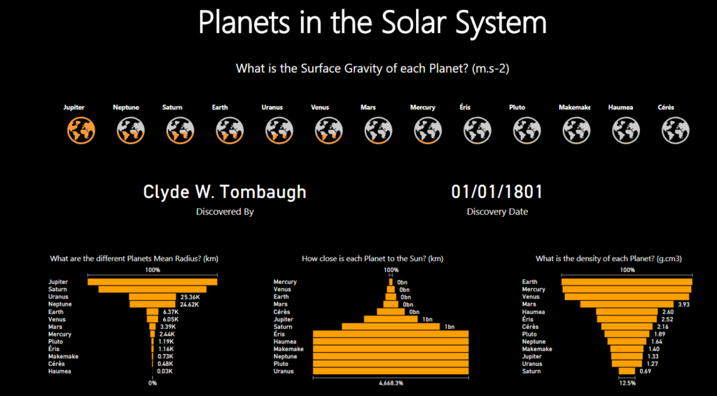
As you can see, the final product is much more developed than the sketch, however I managed to implement the planets and some form of bar chart! The planets were filled in colour based on their surface gravity, whilst I also had some key information below based on who discovered the planet and when. I used three charts at the bottom of the viz to show the mean radius, each planets’ closeness to the sun and the density of each planet. There is also some interactivity between the different charts and the planets, as clicking on a planet will return the relevant values for who the planet was discovered by and the date, whilst also highlighting the relevant fields in the 3 charts at the bottom of the viz.
You can view my viz here.
Thoughts
Overall, I did not have any high expectations for Power BI and although I believe Tableau is still miles ahead of the tool; it did leave a better impression on me than I had prior to using the tool.
Likes:
- Its quite simple to align charts, which is similar to the typical Microsoft assistance in their other tools.
- The charts automatically filter/highlight
- You can import creative chart types from the ‘marketplace’
Dislikes:
Caveat – I spent less than a day with the tool so some of my dislikes may be possible within Power BI, but were just not apparent to myself.
- if you want to change the action (filter/highlight) settings on the charts it is not so intuitive
- the formatting is quite inflexible as I did not manage to find a way to create aliases. You are also quite limited on what you can format depending on the chart types. I could not add labels on my scatter plot but could do so on a bar chart.
- There was also not many options in regards to how you could sort a chart.
- Inability to format the whole workbook. I had to manually format each chart rather than using a section (like you can in Tableau) which can allow the formatting preferences you have implemented to apply to everything.
- Could not view my viz in a presentation mode.
To conclude, I thought that Power BI was quite rigid and not as intuitive as Tableau, hence my (already huge!) appreciation for Tableau continues to grow substantially!