I wrote about this quickly in a previous blog, but felt it required a little more attention to detail.
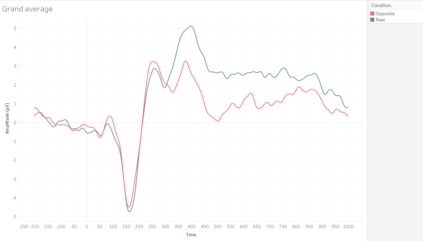
Sometimes, it’s useful to shade the area between two lines in a time-series plot. For example, here are some ERPs (event-related potentials, a measure of brain activity) from one of my favourite experiments in my PhD which I’ve reworked into an interactive viz. It’s a simple graph of the change in brain activity over time:
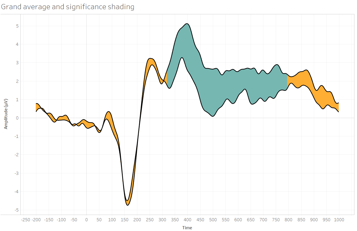
I also know from cluster-based permutation tests that the time period from 320ms to 796ms was significant (i.e. where the difference between the conditions was unlikely under the null hypothesis). One thing that’d look nice is to shade the area between the lines to show which time window was significant. That’d look like this:
To do this, the data has to be in long form (i.e. one column for amplitude, one column to say which condition the amplitude is in; not one column for real and one column for opposite).
This is a dual axis viz with the amplitude as lines and then Gantt bars (my new favourite mark type) with variable sizes. First, I dragged in measurement and added condition to the detail shelf to get two ERP lines for the two conditions. Then, I created some calculated fields; the average measurements for each condition separately, and then another calculated field to find the difference between those two (these are the same calculations as in the first point). As I calculated the difference using real minus opposite, I dragged the opposite average into the view, and made it into Gantt bars. This created a lot of lines which were the same thickness, but I wanted the thickness of the bars to match the space between the two lines. Calculating the difference and putting this onto the size shelf does this:
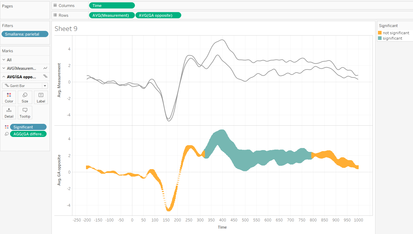
All you have to do then is make it dual axis, synchronise axes, and manually fix the width of the Gantt bars. Sorted.
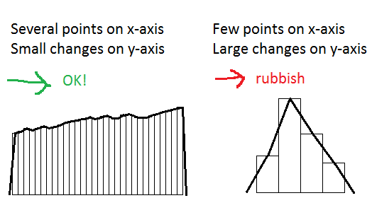
…but the thing is, this doesn’t work well for all graphs. It depends on the range of your x-axis. This is because Tableau plots the line through the middle of the top of the Gantt bar. This means that if you’re working with data where there’s loads of points along the x-axis (and if it doesn’t vary much on the y-axis), it works great, but if there are fewer points on the x-axis, the distance between points is greater, meaning that the Gantt bars aren’t confined by the line:
For my ERP data, there’s a point every two milliseconds between -200 and 1000ms, giving me 600 data points on the x-axis. Moreover, electrophysiological data isn’t independent at each time point, so adjacent readings are generally very close together. I can make my Gantt bars nice and wide, safe in the knowledge that the tiny overlap that is there isn’t noticeable.
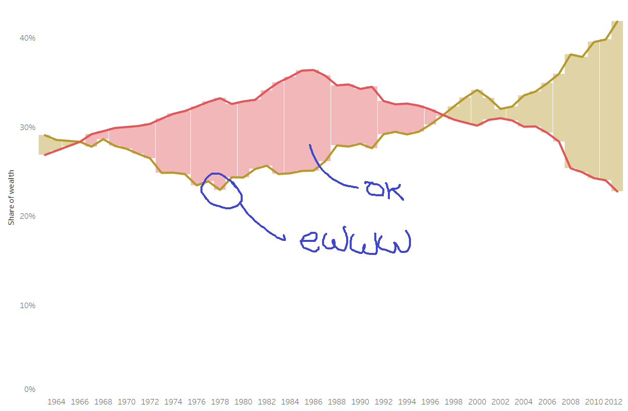
But, take this week’s Makeover Monday data on economic inequality in the United States. Say you want to look at how earning patterns have changed over the last fifty years on the x-axis. This doesn’t look great when plotting Gantt bars as filling between the lines, because there aren’t as many points on the x-axis and because the data varies more year on year. This means you can either set the Gantt bars at full width to fill the space between the lines nicely but also have the corners of the bars overlap the lines, or set the Gantt bars thin enough to not overlap the lines but also not fill most of the space. Neither look good:
You Gantt always get what you want.
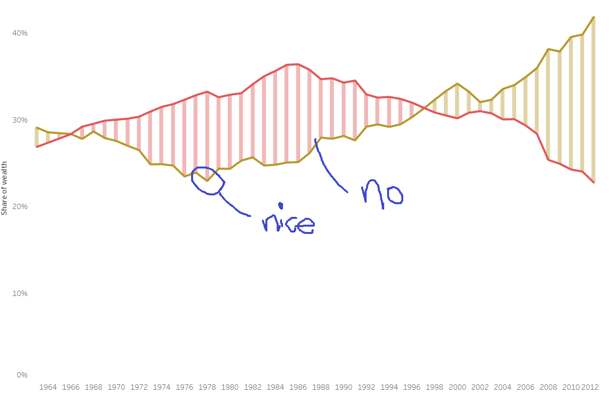
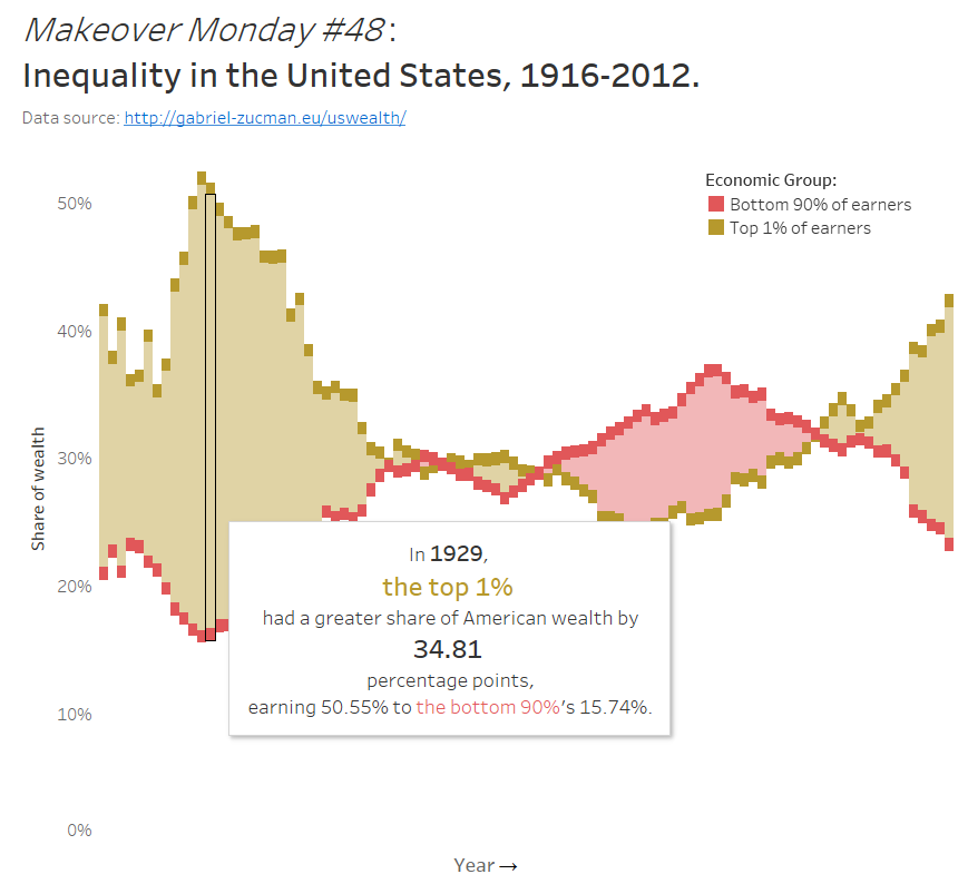
As far as I can see, there’s no way around this other than to plot the time-series lines as Gantt bars as well. This results in a chunky effect, but it’s far preferable to the messiness above. This is what I ended up with for my Makeover Monday:
Or, of course, you could just not fill in the space between the lines.