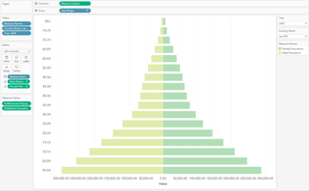
Diverging bar charts, also called butterfly charts, are a great way to visualise how a pair of categories varies by some measure. In this case we’re looking at how the ages of males and females vary across the population of a country. However for the data to be represented accurately, it is vital that the scales of the axes for each member of the category are equal.
One way of ensuring this is the case is to create a dual axis chart. First I create a pair of calculated fields for males and females. Since we’re going to have males on the left and females on the right, male population values are assigned a minus.
Female Population
if [Gender]= ‘Female’ then [Population] END
Male Population
if [Gender]= ‘Male’ then [Population] END
I drag these both on to columns, R-click on Female population and select dual axis. Then I right click on one of the population axes and select synchronise axis.
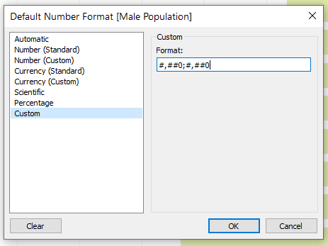
Hint: the male axis can be configured to display without a minus sign by assigning the Male population field the following custom number format:
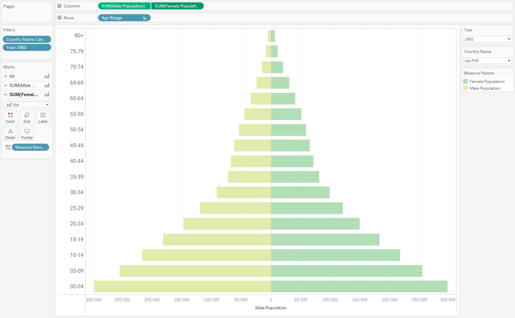
However what if we want to use our second axis for something else such as adding some custom labelling or making a lollipop chart?
We could instead build our chart with a shared axis, however here we run into the problem of Tableau automatically using a different scale for males and females:
To get round this we will make use of a pair of hidden reference lines which are designed to always take the highest population value in the view. With these in place we could go on to change different dimensions such as year or country while always having the axes retaining the same scale.
First of all we create a pair of calculations to dynamically capture the highest male and female populations in the field of view. Note the ABS() on the Max Male Population calc since we defined Male Population as negative.
Max Female Population
WINDOW_MAX(SUM([Female Population]))
Max Male Population
ABS(WINDOW_MIN(SUM([Male Population])))
We use these to create a pair of calculations that will be used in a reference band. The calculations are set up to both take the same value, and this value is the highest population group, either male or female. Again, note the value is assigned a minus to be used on the male axis.
Female Reference Line
if [Max Female Population]>[Max Male population]
THEN [Max Female Population]
ELSE [Max Male population]
END
Male Reference Line
-if [Max Female Population]>[Max Male population]
THEN [Max Female Population]
ELSE [Max Male population]
END
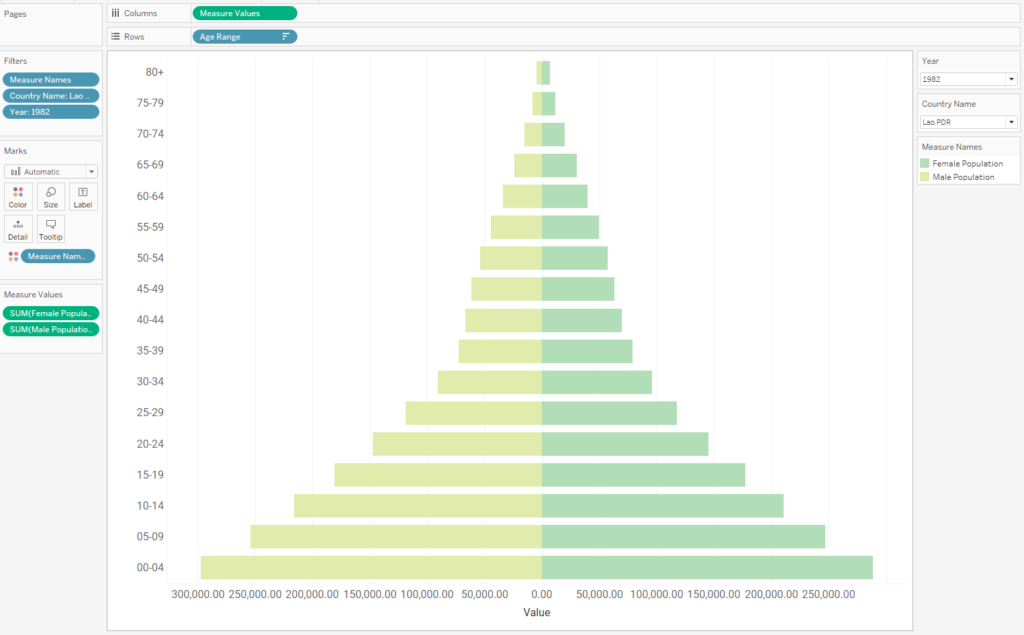
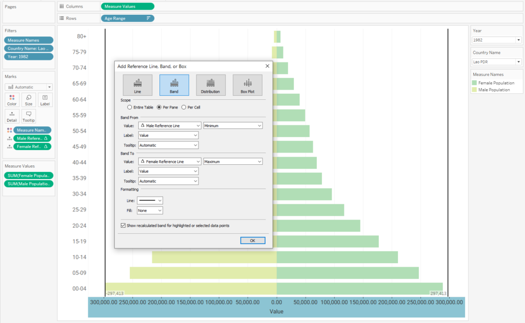
Drag these on to the detail shelf then create a reference band using the reference line calcs as the lower and upper bands. In the image below we can see that the bands have both taken the same (absolute) value of 297,413 which is the number of males in the age 0 – 4 group, the highest in the view. To hide the bands completely, clear all the band shading, lines, annotations and tooltip as well as un-checking ‘Show recalculated band for highlighted or selected data points’.
And there we have it. The presence of the invisible reference band will now ‘fix’ the scales of the two axes relative to one another, however the overall scale will change if for example the country or year is changed.