So after swanning around in the USA for 2 weeks I started my time at the Data School – a week after everyone else.
Thankfully on day 1 I didn’t feel too far behind as we learnt the basics of Alteryx, something that not many of us had used before. My data school compatriot Jeremy has talked about what Alteryx brings to the table and Giorgia has done a great blog about what we learned
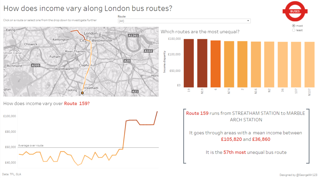
Bus routes and income
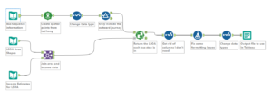
Our project this week was to use what we’ve learnt with Alteryx and Tableau to look at London bus routes.I chose to look at how income varied along the route. I took data from the Greater London Authority on mean 2012 household income data per LSOA (a census area). Then I used Alteryx to find out which LSOA each bus stop sits in. You can see my workflow below.
I took the output data and made a Dashboard on Tableau. You can see the final product below. Have a play around with it and let me know what you think.