


Start of second week at The Data School and we got right into communicating with data.
In a data-driven world, it is crucial to know how to effectively communicate insights and stories hidden within vast amounts of information. This is where data visualisation becomes relevant. It allows to convey complex data in a clear, concise, and visually appealing manner.
BUT, WHAT IN THE WORLD IS DATA VISUALISATION?
Data visualisation is the representation of information and data in graphs, charts, maps, (...).
It provides an accessible way to :
- Simplify complex information
- Identify patterns and trends
- Support effective decision making / sense making of data
- Enables clear communication (easier to communicate complex findings)
*Side note: Tableau is great for this*
Let's make a visual example?
Here you have a table with profits and dates.
How quick can we identify trends and patterns, outliers or comparisons? How can you keep an audience engaged when presenting this table?

NOW! Make the same questions, but look at the graph below.
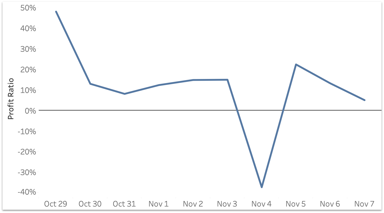
Better, no? Although it became easier to make sense and communicate this data, it is far from complete. There are numerous things that you can still do to refine this visual. Understanding best practices to communicate data is crucial for a data analyst/ consultant.
Best practices refer to a set of guidelines and principles that help ensure the creation of effective and impactful visual representations of data. What should you also consider then?
Ask the right questions for the right visuals – “one chart fits all” is not the case (check out Coach Andy's tableau dashboard on visual vocabulary https://public.tableau.com/app/profile/richard.bounds/viz/VisualVocabulary-CreditAndyKriebel_1/VisualVocabulary)
Gestalt principles of visual perception - we tend to group objects in particular ways. E.g. proximity, similarity, continuity, ... By grouping the right way, you are one step further to better engage people in your visuals (check out this blog https://www.topcoder.com/blog/gestalt-principles-for-data-visualization/)
Significance of colour- Colour helps draw the audience into the story (check out forbes article on the importance of colour https://www.forbes.com/sites/evamurray/2019/03/22/the-importance-of-color-in-data-visualizations/)
Formatting - helps you connect individual elements into a complete story. (be neat and consistent) E.G. Remove gridlines, borders, divider lines, shading of titles and labels. You can also replace legends by adjusting the color and size of text in titles, select simple colours that are easy to differentiate, ...
Using text effectively - show the audience what is happening
- add context to help with meaningful conclusions and understand the relevance of your analysis (y-axis label, line, color legend, subtitles,…)
- Communicate your insights
- Explain how to read a chart
- Provide specific values and details
- Summarise information in plain English.
To summarise: When data is visualised the right way, it can be powerful. Additionally, to become good at data visualisation, it is important to acquire the foundational knowledge, such as understanding and applying best practices.