


This week is our last week in training, which means Dashboard Week. Today we were made aware of the challenges that many individuals with visual and motor impairments face in the physical and digital landscape. We learned about many of the different accessibility issues that many people face and practices that could be useful to add onto Tableau visualizations to help with them. Our project today was to make a dashboard that allows users with motor and/or visual disabilities to access the “Fix my Street Glasgow” dataset. Our goal was to accommodate for the many different spectrums of disabilities as we could. However, due to the limited amount of time given to work on this dashboard, I focused mainly on accommodating for colorblindness first, while also trying to match the aesthetic of the website.
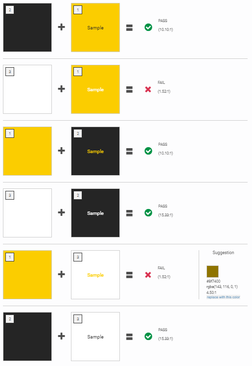
First thing I did was check whether the website colors (#fbcd00, #252525, and #ffffff) were contrasting enough for a colorblind individual to distinguish using the color palette contrast checker linked below. Some combinations passed and some did not as you can see below.
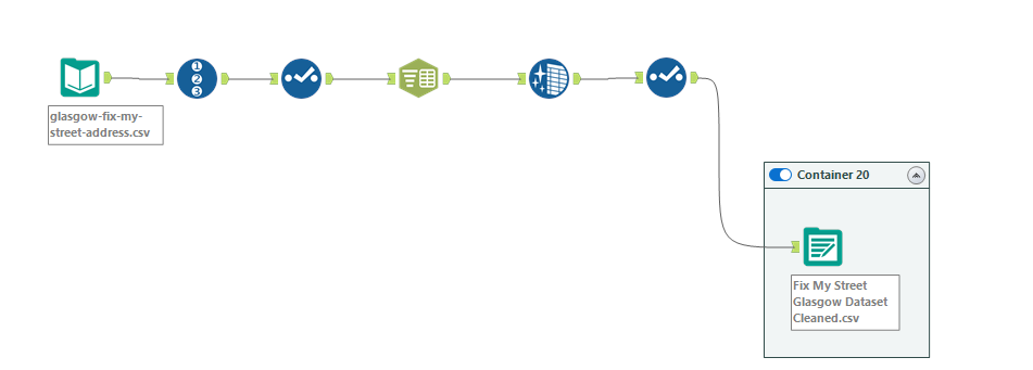
After, I applied some simple cleaning onto the data using Alteryx and at the same time I was trying to understand the data for analysis later on. The only cleaning I really did was add row numbers and separated the components in the name field (districts and group numbers).
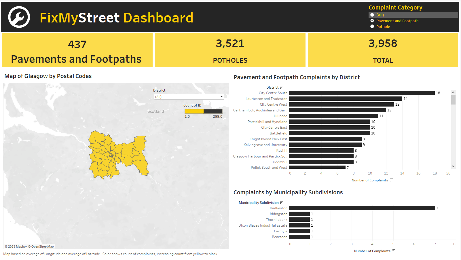
For the dashboard, Collin Smith taught us earlier in the day that screen reading programs can only read texts on title sheets. So, I knew that I wanted to incorporate big numbers on the top to highlight what I thought was the most important components of the data: the number of footpath/pavement and pothole complaints, and the total number of complaints in the Glasgow location. I was not really sure what else I could add, so I searched up what types of charts are commonly used in accessible dashboards. Most of the ones I saw used were bar charts, so I added two bar charts showing the count of complaints by districts and municipalities (municipalities were added on after in a different dataset provided by Collin). The last visualization I added was a map because we were provided with coordinates. I didn’t want to add too many colors and only used the two website colors (black and yellow). I had the black depict the areas that needed more focus, specifically if they had more than 150 complaints and thus should have a higher priority for repair.
Secretly, I added hidden closed caption by shrinking the size of the captions and coloring them white to blend with the background. This was for aesthetic purposes, but also functional for those who are hard of seeing and have to rely on screen reading programs (see below for toggle commands).
If I were to improve this dashboard in the future, I would increase the size of the details on my dashboard as they might have been too small for someone with certain visual impairments. I would also have a designated area for my radio button/drop down filters, rather than having them scattered around. By doing this, they would be easier to find for those who are hard of seeing.
References:
Fix my Street Website: https://www.fixmystreet.com/
Color Palette Contrast Checker: https://color-contrast-checker.deque.com/
Dashboard: https://public.tableau.com/app/profile/erlina6186/viz/FixMyStreetDashboard/Dashboard1
Screen Reading Toggle:
Mac: Command + F5
Windows: Windows button + Control + Enter