When you start creating dashboards in Tableau, you may find yourself experimenting with the different options in the ‘Layout’ tab.
Padding is a great way to create space between different elements in your dashboard. It can make your dashboard look less cluttered and can influence the order in which users look at your charts.
But what is the difference between outer and inner padding? This is a short blog to hopefully illustrate the answer (with some ghastly colours), but the truth is it won’t really matter unless you start putting borders on the different elements in your dashboard.
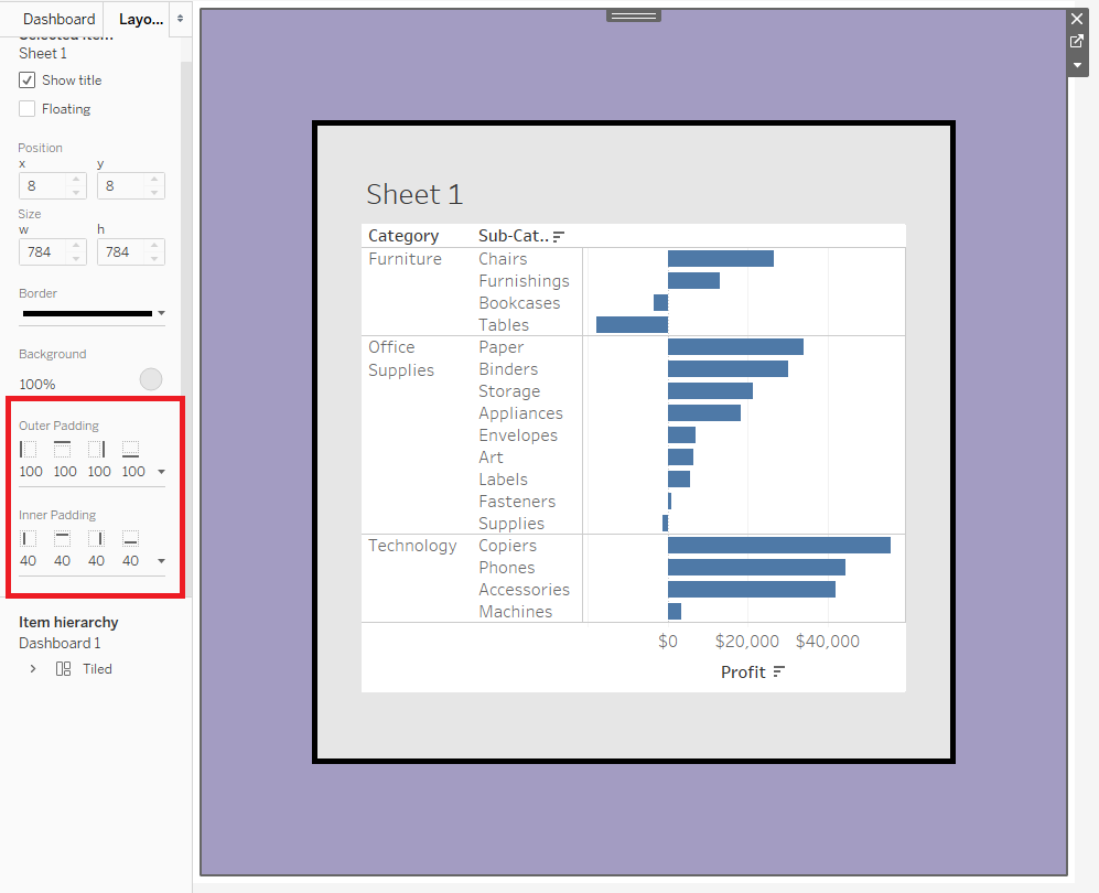
So first off, I’ve dragged a random worksheet onto my dashboard and changed the background colour of the whole thing to purple. Notice, to change the background colour of the whole dashboard you will have to select the container that is automatically created “outside” of the worksheet (as shown below):
I’ve added a thick border to my worksheet and changed its background colour to grey.
OUTER PADDING: Adds space outside of the worksheet border. Notice how the purple dashboard background is showing.
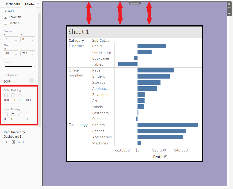
INNER PADDING: Adds space inside of the worksheet border. This time we see more of the grey ‘Sheet 1’ background.
OUTER & INNER PADDING: Adds space both inside and outside the worksheet border.