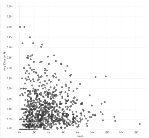
Sometimes when you create a scatterplot with a large number of data points, it becomes hard to differentiate between individual points as they begin to merge together.
A useful tip is to increase the transparency of the colour of the data points so that they can be distinguished more easily.
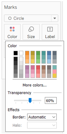
To do this, simply go to the Marks card and click on Colour. Here you can adjust the transparency either by moving the slider or typing in a specific value.
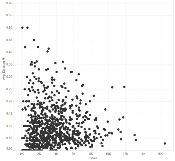
And instantly your individual data points become easier to differentiate.