Tableau Conference is on tour this week in London and Andy Kriebel & Andy Cotgreave hosted #MakeoverMonday live and streamed it via Periscope. So, back at the Dataschool office we joined in the challenge – to create a viz in under an hour. I managed to get my basic dashboard completed within the time (but then spent a bit more time afterwards cleaning it up and formatting…!)
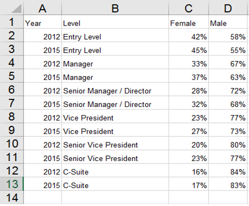
The dataset provided was very small and simple, comprising the percentage of US males and females in different level roles within corporate organisations.
First, I decided to look at the percentages of females in the different level roles over the two years. I created a simple chart with Year in the columns and Level (role type) in the rows. I decided to use a dual axis so that I could plot a circle for each years’ average percentage and then a line to join them together.
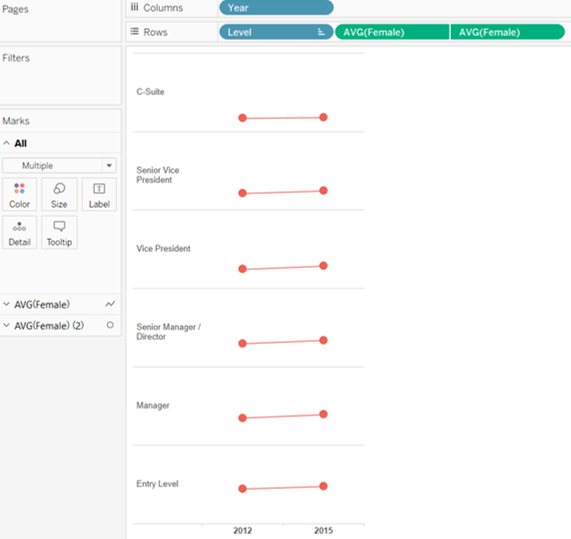
I then replicated this chart for the male percentages.
These charts showed the difference in percentages for the different role types, but it’s not easy to see a comparison between male and female, so I decided to:
- Add tooltips for more information
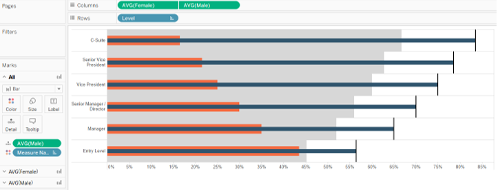
- Create another chart to see the differences in each role type more clearly.
For the second part of my dashboard I made a bullet chart to compare the overall percentage of males vs. females within each role type.
See my final dashboard here or search #MakeoverMonday on Twitter to see some great vizzes.