Waterfall Charts also known as Flying bricks charts, Mario Chart or Bridge Charts in the finance world, are a form of visualisation that helps us understand the cumulative effect of sequentially introduced positive or negative values. In other words, useful when we are interested in visualising a starting quantity, positive and negative changes to that quantity, and the subsequent final. Typically the initial and the final values are represented by whole columns, while the intermediate values are indicated by the floating columns – resembling to a bridge. However this type of chart may also resemble to Mario’s blocks.
It is ideal for displaying how we have arrived at a net value, by breaking down the cumulative effect of positive and negative contributions. This is very useful for numerous scenarios, such as, visualising financial statements or explore data about population, births and deaths.
How do we create a Waterfall Chart?
- Connect to your file; in this case I will be using the “Sample – Superstore”.
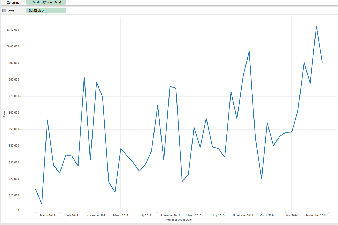
- Drag a dimension to the Columns Shelf and a measure to the Rows Shelf (SUM (Sales)). I’ve right-clicked and dragged continuous (green) month onto the Columns Shelf and Sales onto the Rows Shelf.
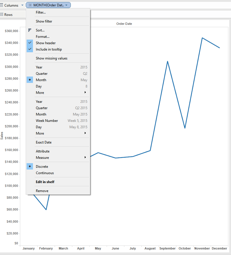
- Right-click on the Month field that is on the Columns Shelf and select “Discrete” from the drop down menu.
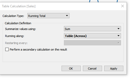
- On the Sales fields, located on the Rows Shelf, right-click and select “Add table Calculation” > Running Total > Sum > Table Across (We do this table calculation so that we can see how each ‘piece’ impacts the overall total)
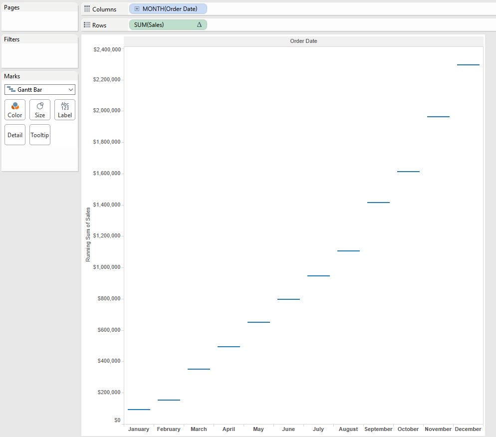
 5. Change the mark type from Automatic to Gantt Bar in the Marks Card.
 6. Now we need the size of Sales to fill downward, therefore we’re going to create a calculated field called “Sales – Negative” with this formula: -SUM( [Sales] )
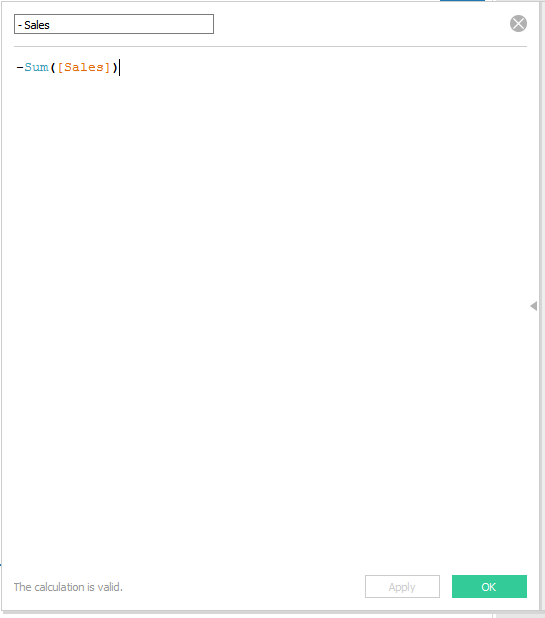 7. Drag the new measure “- Sales” to the size tab on the Marks Card. Previously, we only had a singular line indicating where the Running Sum of sales stood from one month to the next. We want to backfill all of the space from one bar to the next and therefore show the growth (or reduction) in sales from one month to the next. Positive values will consequently outspread our bar upwards and negative values will extend the bar downwards.
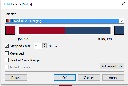
- Add the Sales measure to colour on the marks card and edit the colours changing the colour palette to be two stepped.
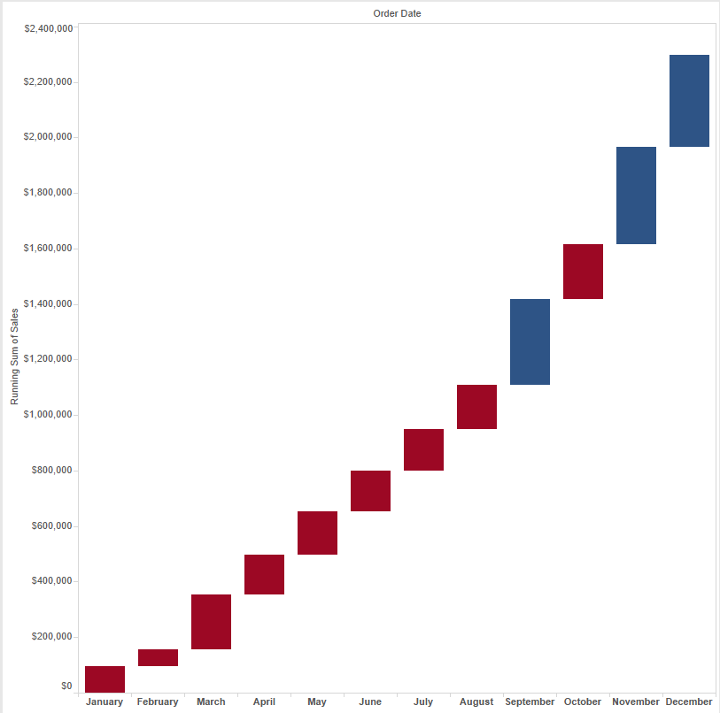
 8. Now we have a working waterfall chart showing growth and reduction in sales from one month to the next. A really cool and fun visualisation!
Note: If you want to see the total, go to Analysis>>Totals>>Show Row Grand Total (we know we should select Rows because our measure is on the Rows Shelf)