Pareto Principle (also known as the 80–20 rule, the law of the vital few, and the principle of factor sparsity) states that in many situations, 20% of causes determine 80% of outcomes. For example, 80% of sales come from 20% of the companies that sell the same product.
The principle was named after Vilfredo Pareto, an Italian economist that developed the principle after observing that 20% of the peapods in his garden contained 80% of the peas. He later published his first paper “Cours d’économie politique” where he showed that approximately 80% of the land in Italy was owned by 20% of the population.
This principle can be of extreme importance in the world of business and decision making, so it is important for us ‘Dataschoolers’ to know why we should use the Pareto Principle and how to execute it in Tableau.
For me, last week was the one when I had to use the Pareto Principle in Tableau and it was not only fun to create it but resulted in a very eye catching visual aid to my analysis. With that in mind, I decided to write this blog post to consolidate what I have learned and for all of you that may need to create a Pareto Chart in Tableau.
Why is the Pareto Principle important in business and decision making?
This principle can be a real eye opener when showed to decision makers, as it often identifies and helps them resolve hidden problems in their organisations, leading to gains not only in profitability but also in productivity. Nonetheless, we should bear in mind that while the principle can be used to identify the “root causes of problems”, this ratio is merely a convenient rule of thumb and is not nor should it be considered immutable law of nature.
How do I execute it in Tableau?
I will be using the Tableaus’ Sample Superstore data source, so you can seamlessly follow along all the steps.
The first thing we have to think is what percentage of customers (% of ‘causes’) represent 80% of total sales (outcome) and secondly, what percentage of total sales (outcome) is represented by 20% of customers (‘cause’).
The ‘Pareto chart’ will then assist us to easily identify the answers to the previous questions.
On our questions, we can already identify what the dimensions and measures we will use to create our chart:
Dimension – Customer Name
Measure – Sales
Step 1 – Open a new workbook and connect to the Superstore sample.
Step 2 – Drag the following fields to the view:
- From the Dimensions pane, under the Customer group, drag the Category (Customer Name) to the Columns shelf.
- From the Measures pane, drag Sales to the Rows shelf.
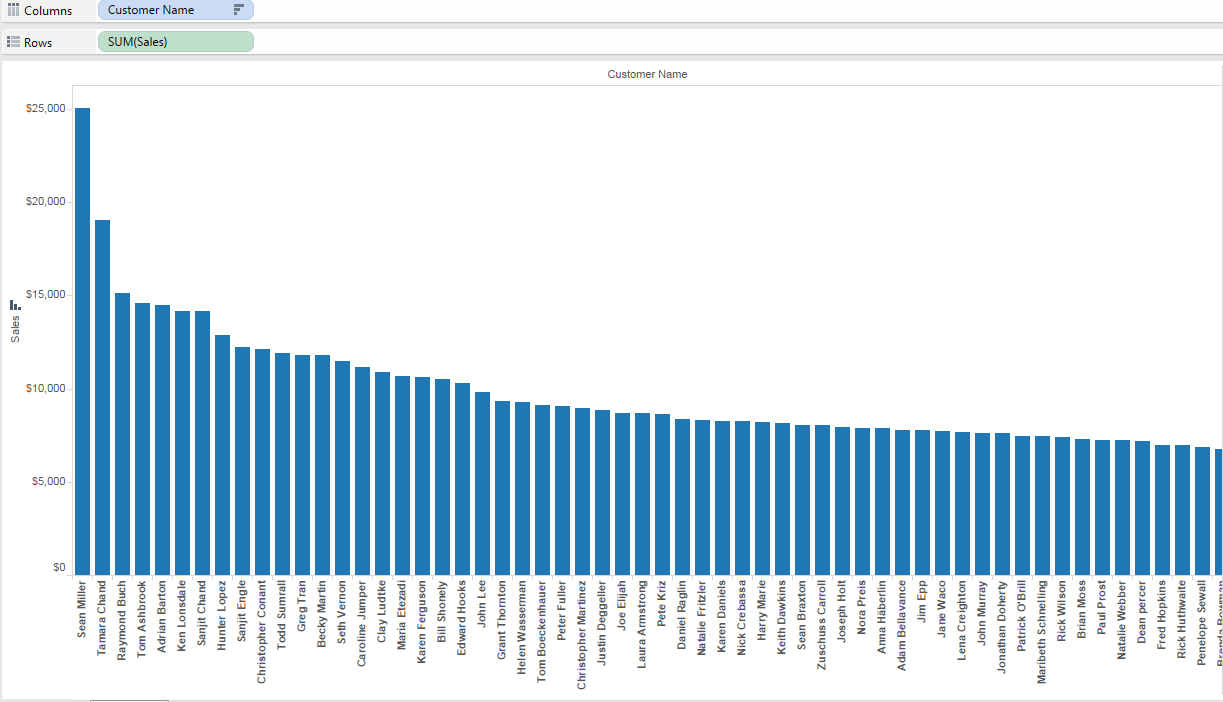
Step 3 – Sort your dimension by total sum of sales, in descending order
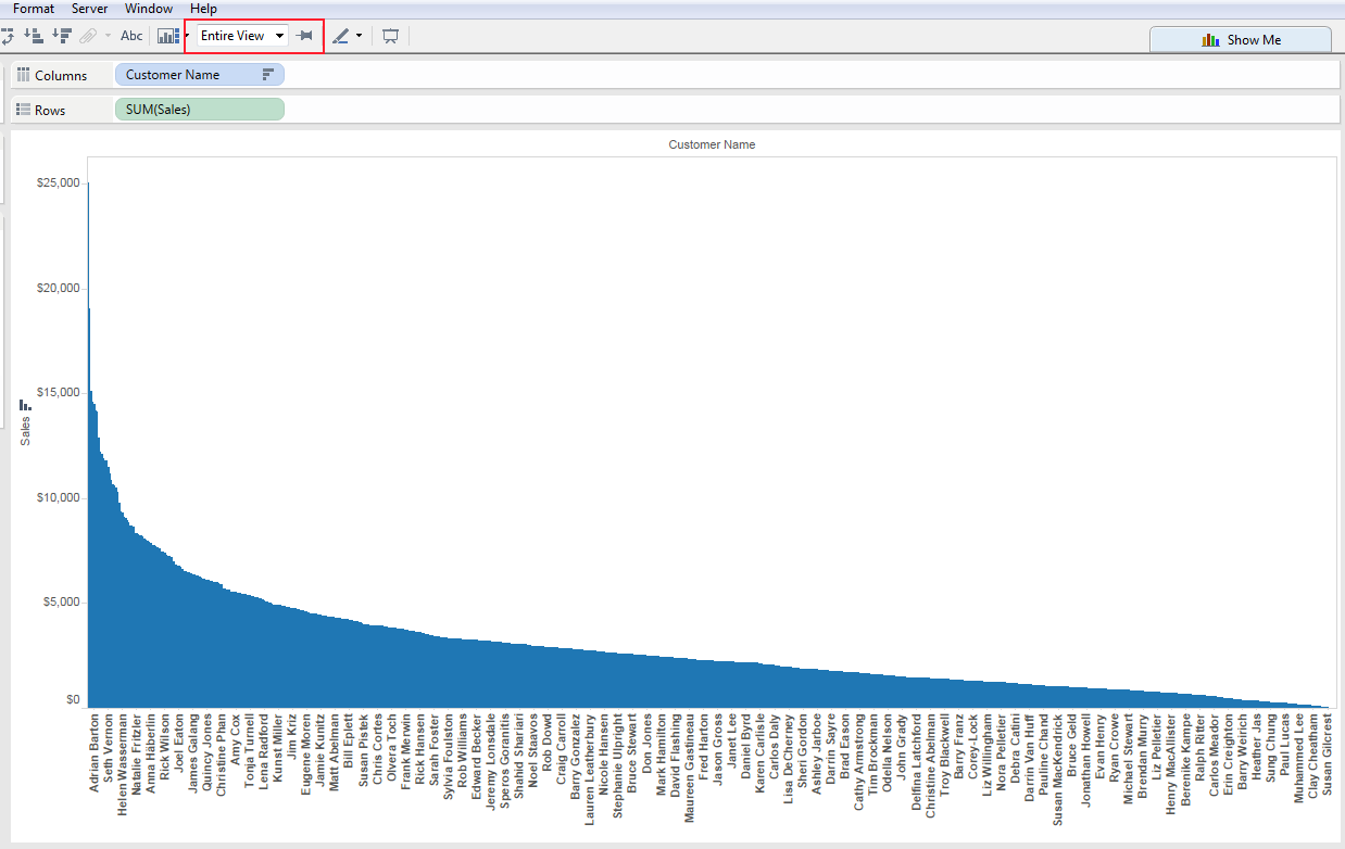
Step 4 – On the tool bar select ‘Entire view’ (squashing everything into your view)
Step 5 – Right click on the measure pill (green pill – SUM Sales) that is on the rows shelf and add a table calculation.
- Calculation type: ‘Running Total’
- Summarise values using: ‘Sum’
- Running along: ‘Customer Name’ ( your dimension)
- Select ‘Perform a secondary calculation on the result’
- Secondary Type: ‘Percent of Total’
- Summarise the values from: ‘Customer Name’ (or your dimension)

Step 6 – Duplicate your sorted dimension pill and place it on the ‘detail shelf’ on the marks card. You can do this by clicking on the dimension pill (blue pill – customer name), holding control key down and dragging the ‘duplicated pill’ to the Detail shelf.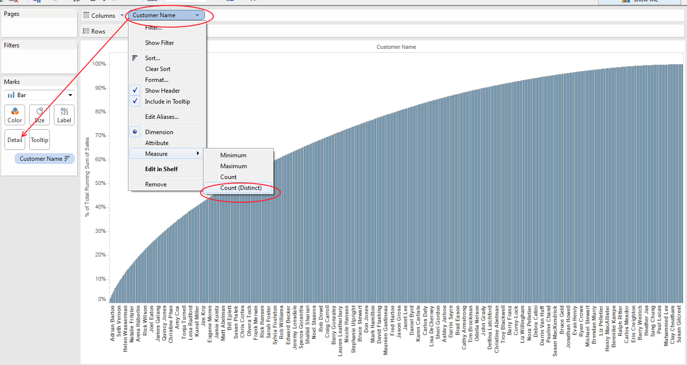
Step 7 – Change your pill on the ‘columns shelf’ to a count distinct of the dimension. Firstly you will have to right click on the Dimension pill (Customer Name) and from the drop down menu choose measure and then select count distinct.
Step 8 – Perform an identical table calculation to the previous one, but now on your dimension pill:
- Calculation type: ‘Running Total’
- Summarise values using: ‘Sum’
- Running along: ‘Customer Name’ (or your dimension)
- Select ‘Perform a secondary calculation on the result’
- Secondary Type: ‘Percent of Total’
- Summarise the values from: ‘Customer Name’ (or your dimension)
Step 9 – Change the mark type on the mark type shelf, to either bars or area, depending on your preference.
Step 10 – On the ‘Analytics Pane’ drag a constant line onto the x axis, right click on the line and click edit, choose a constant value 0.2 (20%) and the none option on the label. Repeat this for the y axis but set the constant value axis to 0.8 (80%).
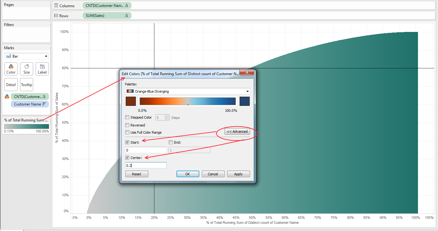
- The Pareto chart is now complete. By adding the reference lines you can assist the user in how to read the chart. In case you want to make it clearer, you can duplicate the Dimension pill (customer name) form the columns shelf and drag it to the colour ‘shelf’.
- On the colour legend, you can then choose a diverging colour palette, click on the advanced option and choose the centre at 0.2 (20%).
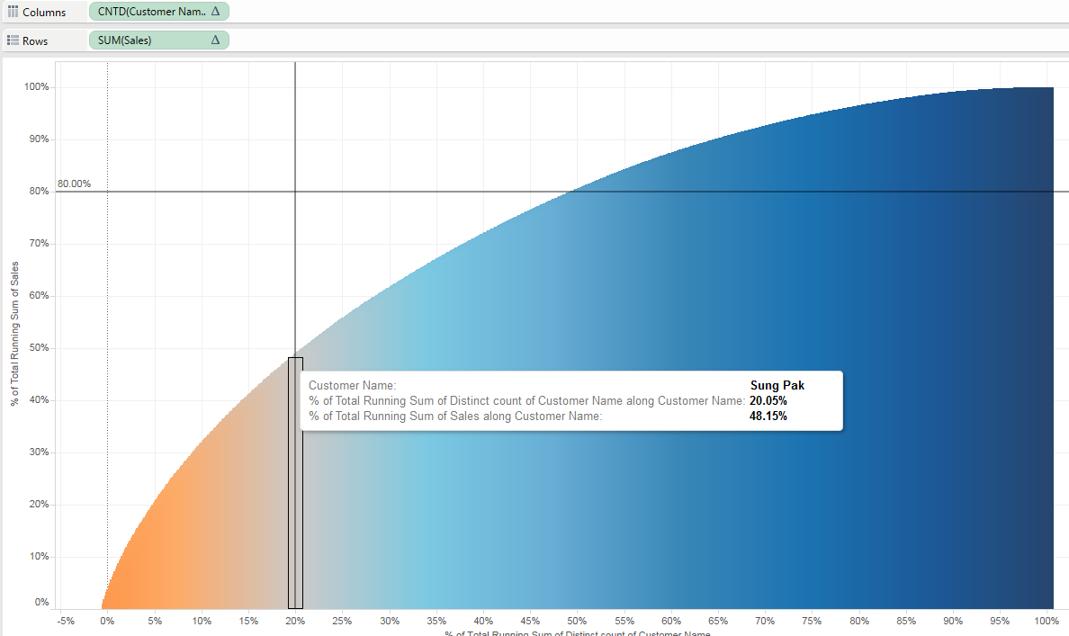
How to read the Pareto Chart?
When the two reference lines cross, that means that the ‘causes’ (in our case customers) placed to the left of the vertical reference line (20%) are ‘responsible’ for the 80% of the ‘outcomes’ (sales). In order words:
To the left of the 20% reference line – the ‘vital few’ causes (customers that are responsible for the 80% of the sales). To the right to the 20% reference line – the ‘trivial many’ (other customers)
In our example we can see that 20% of the customers are only responsible for 48% of sales. There isn’t an evident 80/20 rationale.
I hope this blog was of help to you and you have as much fun as I when building your ‘Pareto chart’.