This week is the week that everyone has been waiting for, the Tableau Conference in the UK week.
For this Tableau Conference Andy Kriebel and Andy Cotgreave, the renowned Makeover Monday duo, decided to do the challenge live in-site and via periscope. As part of our weekly DS3 calendar, we also had to participate in the Makeover Monday and restrict ourselves to the time limit of one hour.
The data set was a simple one, with only twelve points of data, however sometimes that can make the challenge even more thought-provoking.
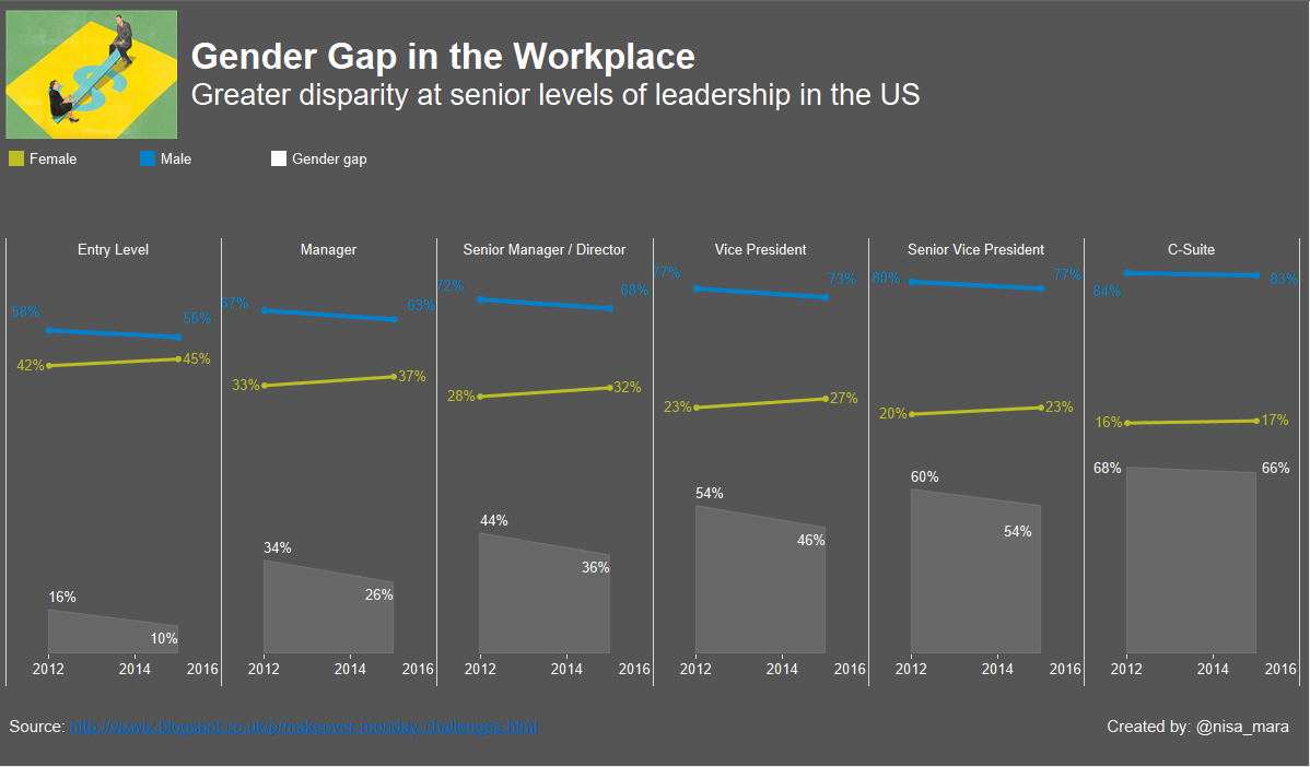
The theme for this week’s Makeover Monday was the underrepresentation of women in leadership positions within the US corporations. As it was comparing the gender gap by level and over a time period, I decided to use line charts to represent change over time and place them in one and only chart (using a dual axis) so I could compare the size of the gender gap. I could then see that as we moved up the leadership levels, the gender gap increases as the change between the first and last year of data becomes less significant.
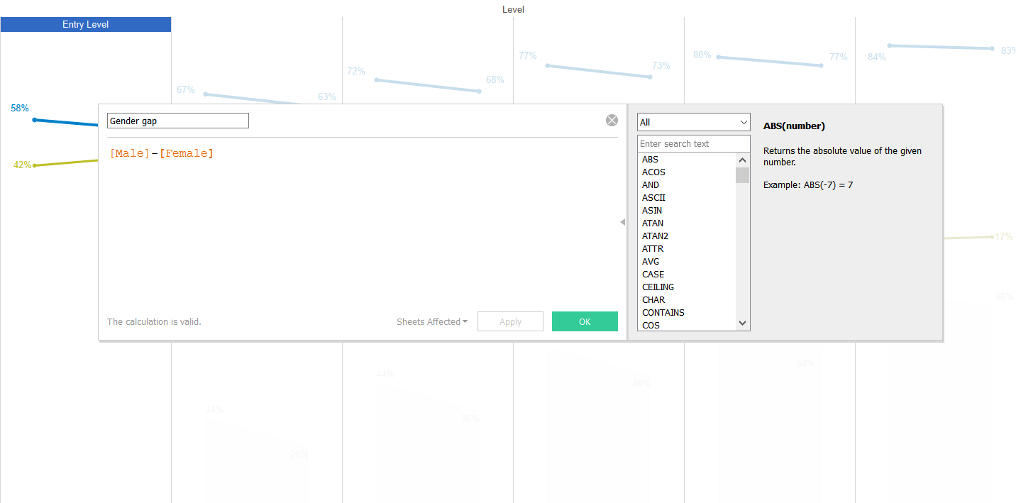
In order to quantify the gender gap, I used a simple calculated field and created an area chart to translate it visually, reaffirming the increment of the gender inequality with the level of seniority.
All in all, a great project and a fun way to learn.