Using Key Performance Indicators (KPIs) in a dashboard are a great way to give a quick indication of how an organisation is doing. This would be actual number of say sales, or number of people donating to a charity, as well as how these metrics change over time.
Having manually created KPI tracking reports in PowerPoint, or even having used E-Tabs to try to automate the process, learning that you could do it extremely dynamically in Tableau was fantastic. I know these KPIs are really useful across organisations, from department heads to analysts to store managers. To be able to create them relatively easily in Tableau made me a little frustrated that it had taken so long before!
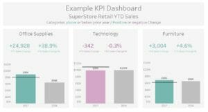
In this blog post, I will take you through creating a YTD style section of a KPI Dashboard in Tableau. This will be done using an extract of Tableau’s US Superstore data, where I have excluded half of 2017 for the sake of making the dashboard dynamic and more realistic. I’ve uploaded this as a workbook on Tableau Public, which will be developed further – see links at the end.
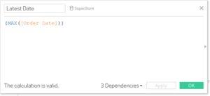
Use an LOD to fix the latest order Date
To ensure this is truely dynamic, create a calculated field using an LOD as a reference for the most recent date in the dataset. Without defining the LOD (Include, Exclude or Fixed) the LOD automatically defaults to Fixed.
{MAX([Order Date]}
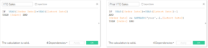
Create calculated fields for this year and prior year sales
Essentially the first calculation looks up the sales for all orders whose year matches the created LOD above. Whereas the second looks up the sales for all orders whose year matches the created LOD above AND those where the order date is less than the LOD day/month/(year-1).
YTD Sales
IF YEAR([Order Date])=YEAR([Latest Date]) THEN [Sales] END
Prior YTD Sales
IF YEAR([Order Date])=YEAR([Latest Date])-1 AND [Order Date] <= DATEADD(‘year’,-1,[Latest Date]) THEN [Sales] END
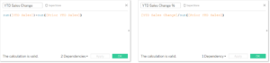
Create calculated fields for the change in number and percent
These reference the fields above and will be helpful in creating the BANs (Big Ass Numbers).
YTD Sales Change
SUM([YTD Sales]) – SUM([Prior YTD Sales])
YTD Sales Change %
[YTD Sales Change]/sum([Prior YTD Sales])
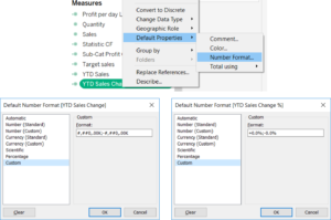
BAN Number Formatting
To add these as BANs in a KPI dashboard, it helps to customise the number formatting. This can be a simple + or – in front of the change digits, like in the example, but symbols or arrows can also be incorporated. Tableau tends to automatically assign a minus sign to the negative number, so usually only adding the positive sign is needed, but if special characters are used then both numbers need formatting.
To do this, right click on the Change fields and select Default Properties > Number Formatting. Then select the number or percentage to get the basic formatting, before clicking custom. This box contains the details for the positive and negative number formatting, separated by a semi-colon. This means we can insert characters to prefix or suffix them, e.g. percentages or thousand separators – ‘K’. This is great as we can add in extra characters that will dynamically be applied when the number itself changes. Here, + and – have been added.
If other characters/ unicode are wanted, these can be pasted in from word, or from unicode websites.
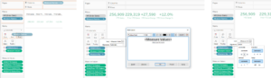
BAN Sheets
To create the BAN sheets, drag ‘Measure Values’ onto the text/labels shelf on the marks card. This will drag all the measures, but only keep the two change fields. Also drag ‘Measure Names’ onto the same shelf. Edit the text to have the measure value in a larger font (maybe 20 or 22) on the top line and the measure name in a small font (9 or 10) underneath. This can then be centred formatted to make it neater.
It’s also possible just to have one measure per sheet – which would lead to potentially better, but fiddly, formatting in the final KPI Dashboard. Although instead of putting the measure name in, the ‘YTD Change’ would have to be typed under the variable rather than dragged in.
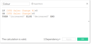
Applying Colour
A sprinkling of colour can make any KPI dashboard clearer, but try to stay away from Red and Green. Whilst these have negative and positive associations, they are not good for those with colour blindness, so using two shade or complementary colours is a better way to highlight change. Just make sure that the colour meanings are clearly indicated.
In the example I’ve used green and light purple, and have specified the identifying flags as ‘increase’ or ‘decrease’ to allow use in a sentence within the tooltips on the bar charts.
As an additional step I’ve also created a target variable for the current YTD (just the current value multiplied by a constant). The target was then put onto the current YTD bar as a reference line, and colour was also applied to the bar and tooltip with another colour field like the one above.
Putting it all together
In my final dashboard (view and download here) I have separated these out using multiple sheets and the Product Category filter: Office Supplies, Technology and Furniture. I have also begun formatting the dashboard, using many containers! It’s especially helpful to have sections in containers for a KPI dashboard because it allows for greater flexibility in design – either through shading or trying out various section positions more easily.
This is a work in progress, as YoY (MM/YY vs MM/YY-1), dynamic axis and further formatting will be added at a later stage.