Our challenge for Thursday and Friday was to redo one of our applications to The Data School, by blending it with another data source using Alteryx and creating a new viz on Tableau.
I decided to choose my initial application, which explored the global disease burden of tuberculosis.
When revisiting my application, I immediately noticed several things:
- It was very long, exploring many (if not all) of the metrics the data set provided.
- There was a lot of unnecessary/confusing/distracting colours in my graphs.
- Overall, just too much of everything.
- Despite 1-3, I was only moderately ashamed.
Accordingly, I endeavoured to make my second viz a lot more simplistic.
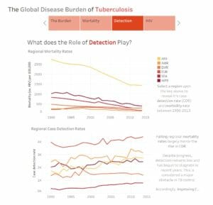
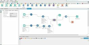
I felt my original application had some interesting analysis surrounding case detection rates and mortality, so I thought looking at some more socioeconomic factors surrounding would be interesting perspective to explore. Accordingly, I joined my initial data with used a data set concerning life expectancy and income groups worldwide. My unskilled attempt at using Alteryx independently can be seen here:
Then I set to work on my viz.
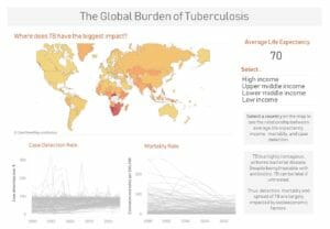
Overall, I’m pretty happy with the outcome. I achieved my overarching aim of simplifying my initial application, yet, I think it still shows some interesting insights when looking at the relationship between the incidence of TB and different income groups.
See my viz here: https://public.tableau.com/views/TheGlobalBurdenofTuberculosis-Improved/Dashboard12?:embed=y&:display_count=yes&publish=yes