In Part 1 I showed four ways to represent Likert data, each with varying levels of complexity. Here, I’m going step by step through the most complicated of those views; the slanted bar chart.
Within Part 1, I also explained a typical slanted bar chart will often look like this:
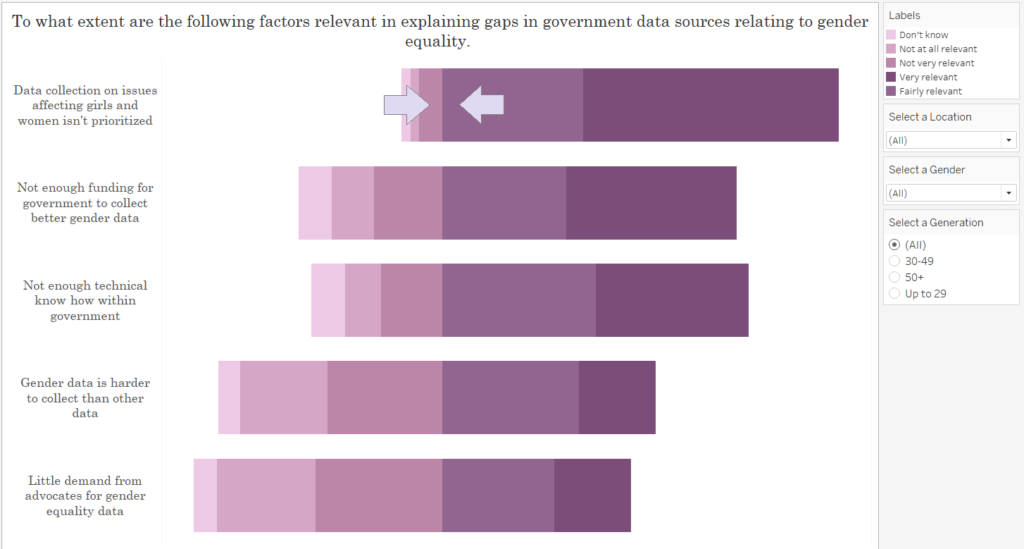
Whilst this view gives an idea of the weighting on either side of the scale, I don’t like how the the boundary between two categories of the Likert scale have aligned to become a central point upon the axis (as indicated by the arrows). Upon a traditional Likert scale, this may skew the view/weighting on either side of the bar if your central score is neutral, as a category’s appearance on either side of this boundary can give the impression of a positive or negative response value. Thus, it may be best to take the midpoint of the central/neutral category, and make this the centre point for our view.
Accordingly, this is the view we are creating:

- Firstly, we need to decide how to divide up our scores. Within this questionnaire, this is the scale can be seen below. I’m going to group “Don’t know”, “Not at all relevant” and “Not very relevant” as my “Negative Answers”, “Very Relevant” as my “Positive Answer” and use “Fairly Relevant” as my neutral category to split across the centre.
2. Next is the calculation for my negative responses:
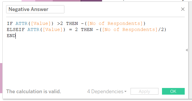
This calculation reads as follows:
If the value for my answer is greater than 2, then return the number of respondents who have selected these answers.
However, if the value of my answer is 2, divide the number of respondents by 2.
The ‘No of Respondents’ field is wrapped within minus marks to yield a negative value. As seen later, this will allow us to plot our negative and positive answer upon the same axis. This step isn’t necessary if a dual axis is used, however, the axes must then remain fixed to ensure the view isn’t skewed by the axes adopting a different scale when filtered.
3) The calculation for my positive answers:
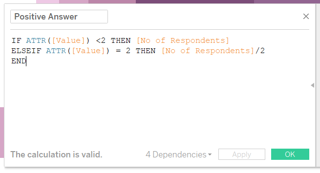
This reads as follows:
If the value for my answer is less than 2, then return the number of respondents who have selected these answers.
However, if the value of my answer is 2, divide the number of respondents by 2.
4) The next step is constructing the view.
- a) Drag the “Question Wording” into the rows shelf
- b) Drag your positive and negative response calculations into the columns shelf
- c) Drag “Answer Type” onto the colour shelf.
5) Sort the colours by dragging and reordering the answers within your colour legend.
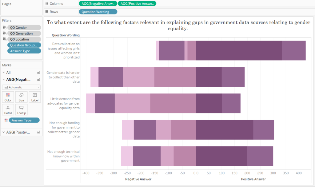
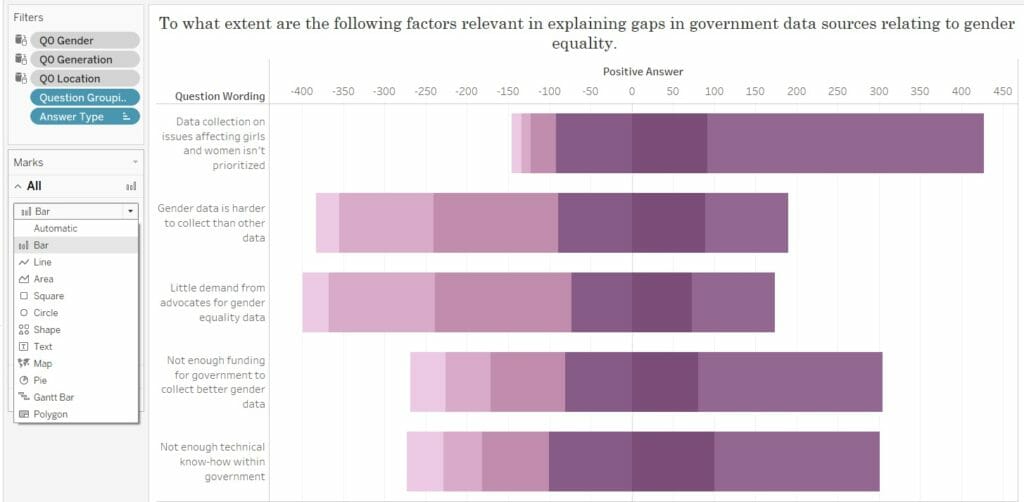
This will yield this view:
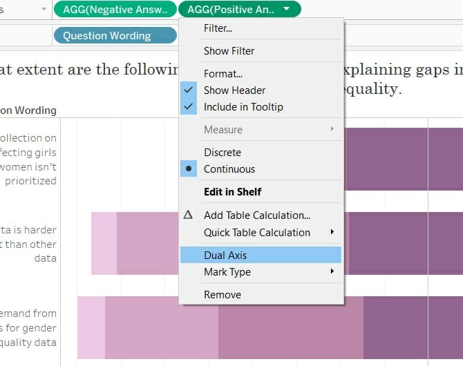
6) Next is creating a dual axis. Following the calculation for our “Negative Answer”, you can see that the values for negative responses are now negative, and the values for our “Positive Answer” are positive. Accordingly, we can now make a dual axis without our values overlapping.
This will give you this view:
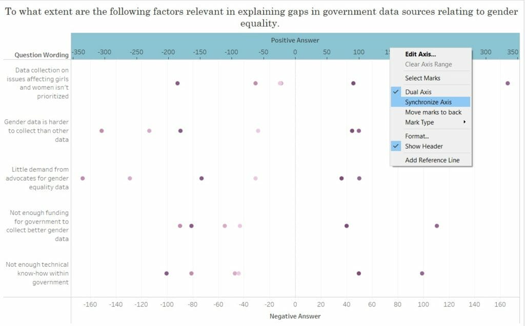
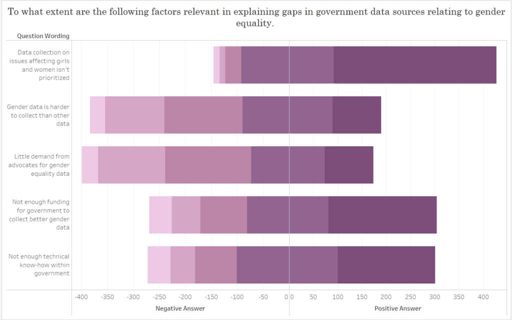
7) Simply synchronise you axes (see above), and change the marks back to bars (see below).
8) You’ll likely have to resort the colours using your colour legend, to ensure both parts of the category we divided into two will meet at 0.
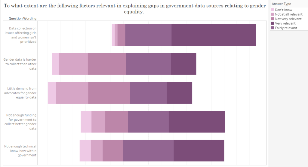
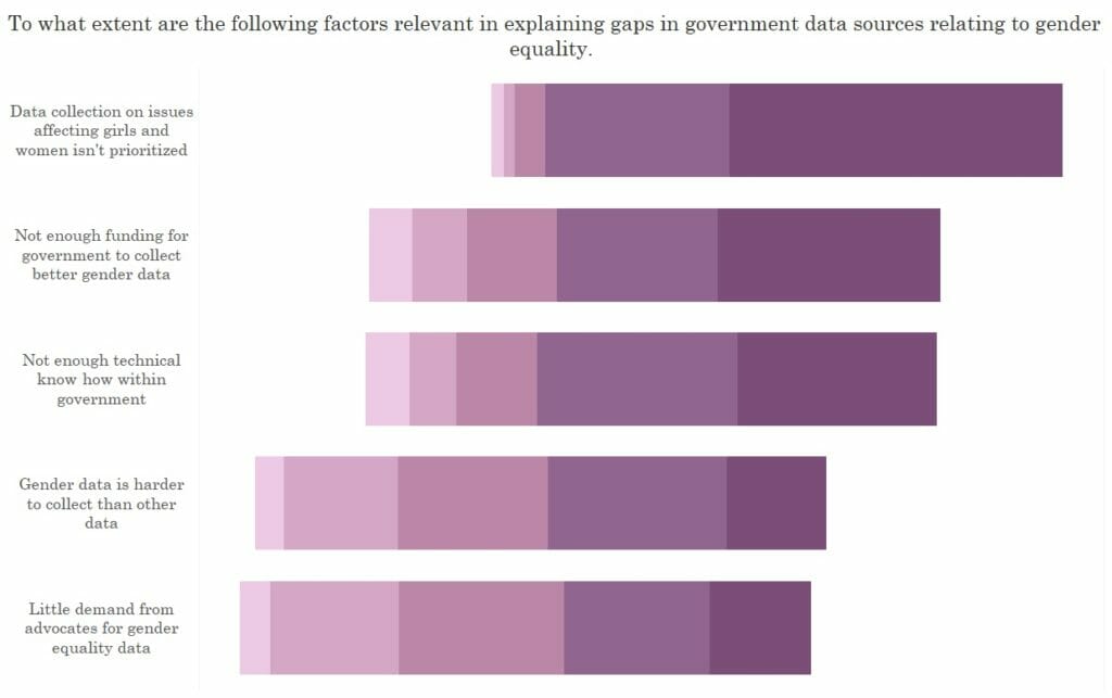
9) After some formatting and resorting the questions, this is the final view.
See my use of this final technique within my recent Makeover Monday viz.