Within surveys, a Likert scale allows for standardised and quantitative responses in which answers are scored along a range, often illustrating levels of agreement and disagreement.
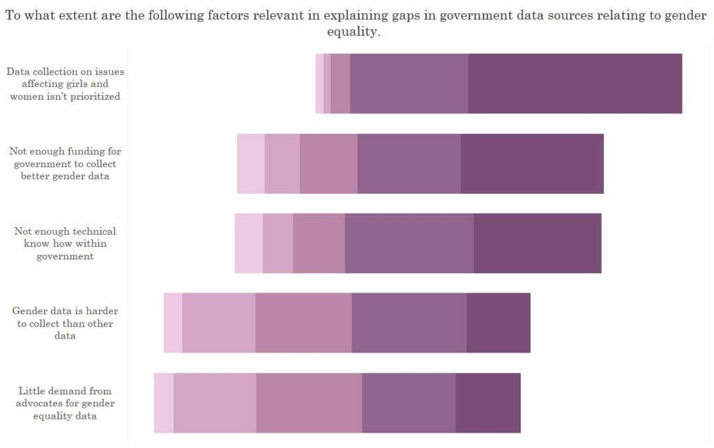
Survey data can be tricky to make sense of and illustrate. Below are 4 ways in which this type of data is often represented, and each technique is a little more complex than the next.
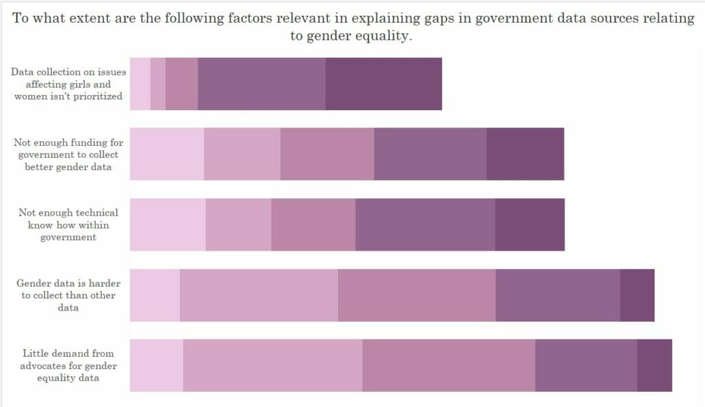
The first two are the most traditional:
- A stacked bar chart.
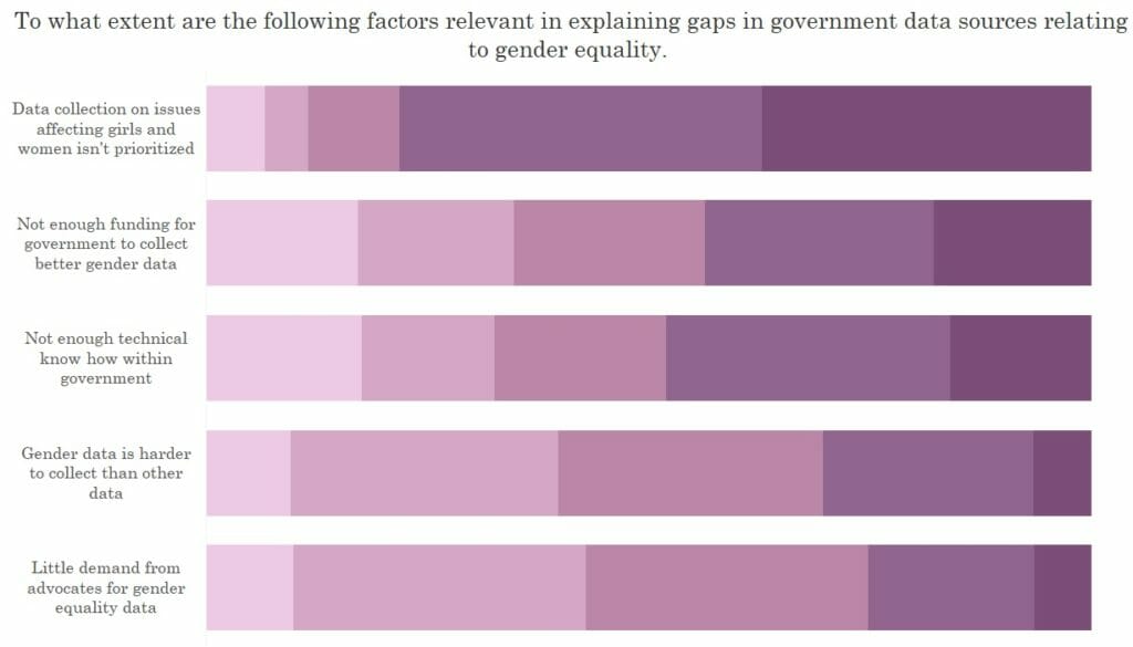
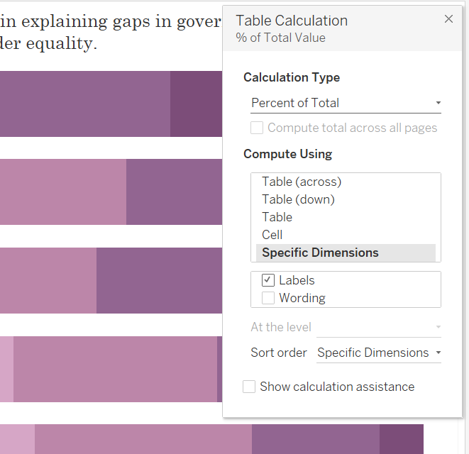
2. A stacked bar which represents the percent of total. This is formed with a table calculation (see below), which calculates the percent of total for each question (the unticked box called “wording”), along the Likert scale (the ticked box called “Labels”).
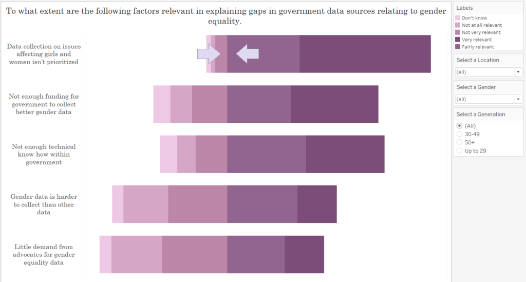
3. Still a stacked bar chart. However, this slanted format gives a better idea of the weighting on either side of the scale. Whilst I like this view more, I don’t like how the junction between “Not very relevant” and “Fairly relevant” align to create the central point upon the axis. Upon a traditional Likert scale, this may skew the view/weighting if your central score is neutral, as it’s appearance on either side of this boundary gives the impression of a positive or negative response. Accordingly, it may be best to take the midpoint of this central category.
4) The final format is the same as the stacked bar above, with the addition of a central division of the mid-point category. This view requires several calculated fields, and a step by step guide to creating this view will presented in Part 2.
See my use of this final technique within my recent Makeover Monday viz.