Radar (or spider) charts can be an effective way to show certain types of data. However, they can also make comparison a little difficult; this blog by Graham Odds details why radar charts aren’t always the best choice.
Nonetheless, I’ve seen a few on Twitter lately, and they reminded me of an old Makeover Monday in which ESPN rated 60 sports across 10 different categories, and I thought this would be a really good use case. I was anticipating this being pretty difficult, however, this took me very little time to create once I stumbled upon some good solutions.
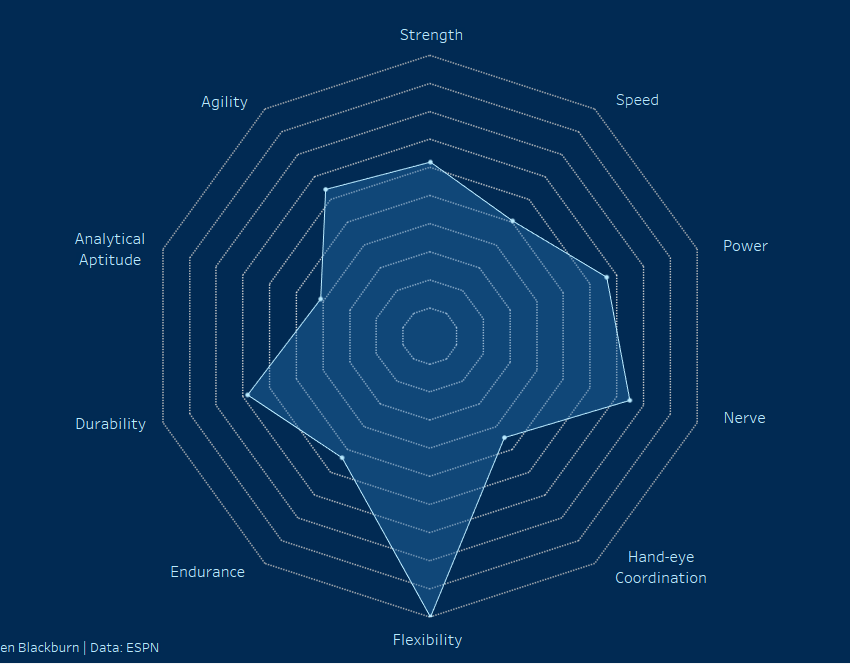
Here is the final result:
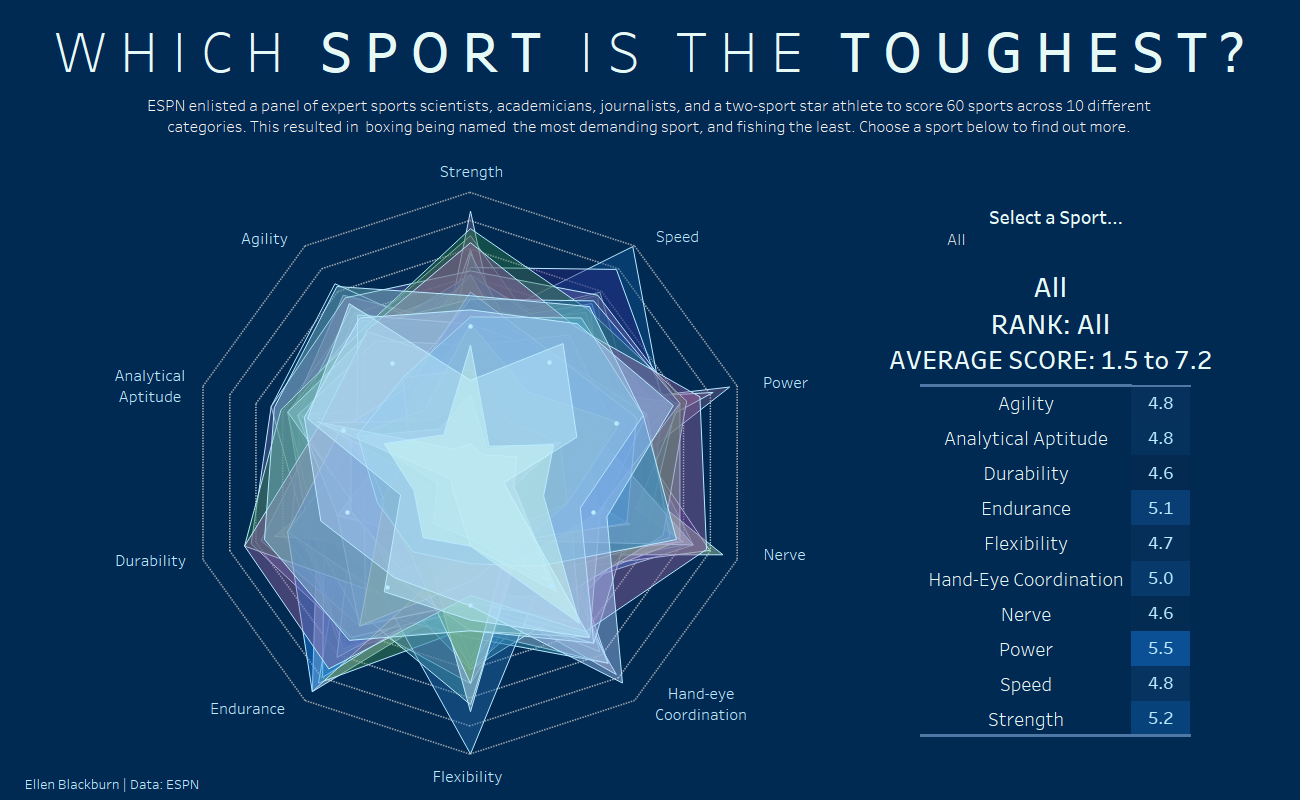
I really like this view, apart from the range of average scores given when all sports are in the view – which I’ll need to work out how to fix.
Avoiding Tricky Calculations
After scouring YouTube videos and some blogs, I could only find very long and confusing calculations, in which something like this would be required for the X axis alone:
case [Dimensions]
when “Dimension 1” then 0
when “Dimension 2” then [Value] *(1/2)
when “Dimension 3” then [Value] *(sqrt(3)/2)
when “Dimension 4” then [Value]
when “Dimension 4” then [Value] *(sqrt(3)/2)
when “Dimension 5” then [Value] *(1/2)
when “Dimension 6” then 0
when “Dimension 7” then [Value] *(-1/2)
when “Dimension 8” then [Value] *(-sqrt(3)/2)
when “Dimension 9” then [Value] *(-1)
when “Dimension 10” then [Value] *(-sqrt(3)/2)
when “Dimension 11” then [Value] *(-1/2)
end
In addition, within these calculations, the values need to be calculated within accordance worth how many “legs” you want your chart to have. Thus, the formula you use will differ between a 5, 8 or 10 axis chart.
The implication of this is that this method is pretty complex and less robust than the one I detail below, as it requires long formulas which hard code the number of dimensions. The alternative is simpler and more robust, and requires only 4 short calculations which don’t have to be tailored to the number of dimensions you intend to visualise, meaning you don’t require an understanding of trigonometry and you are able to filter dimensions from the view and your chart will automatically update.
The Method
A quick explanation of why a radar chart is a little tricky.
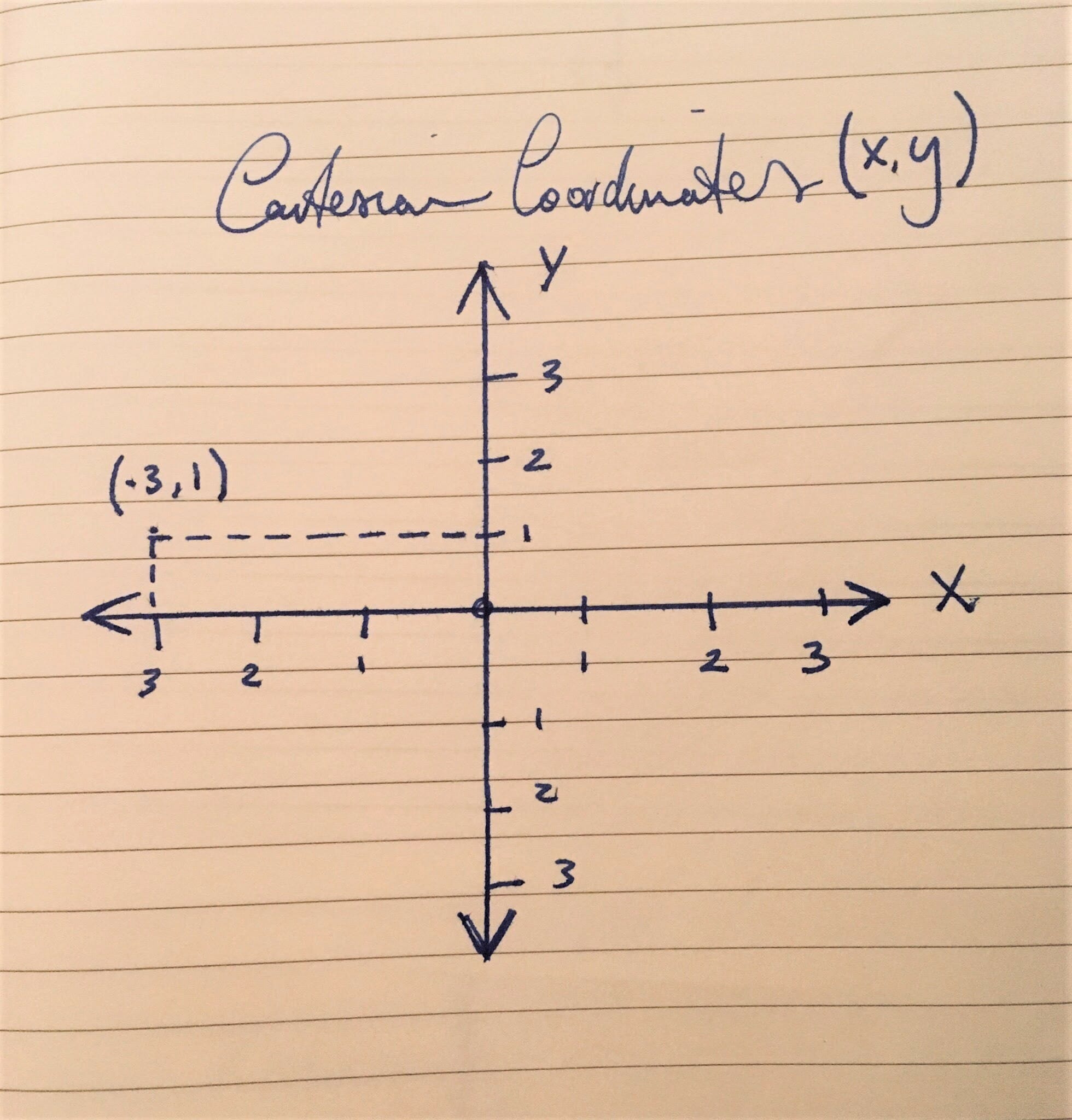
Radar charts are circular, however, Tableau doesn’t really think in circles, as the notion of “polar co-ordinates (b.)” isn’t something innate within Tableau. Accordingly we have to covert the typical “Cartesian co-ordinates” Tableau utilises (a.), into the polar coordinates required for a radar chart.
Cartesian coordinates look like this:
This is the “normal” format you most often come across, in which points are specified using numerical coordinates across perpendicular lines (x,y).
a.
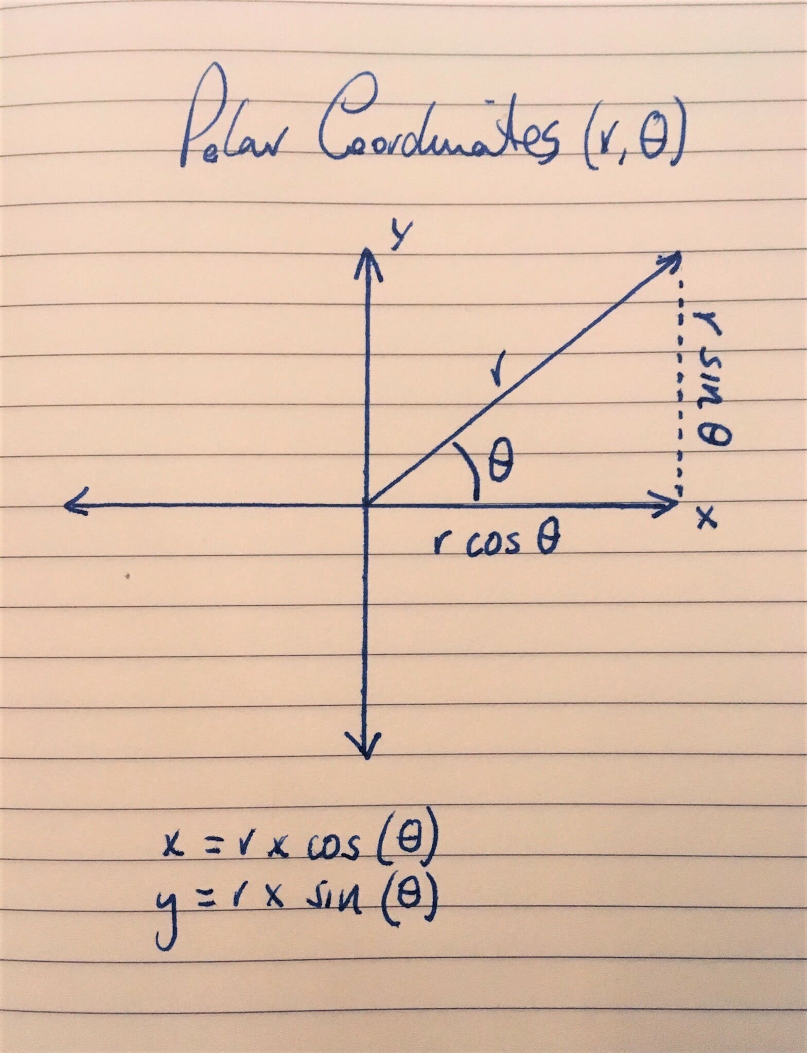
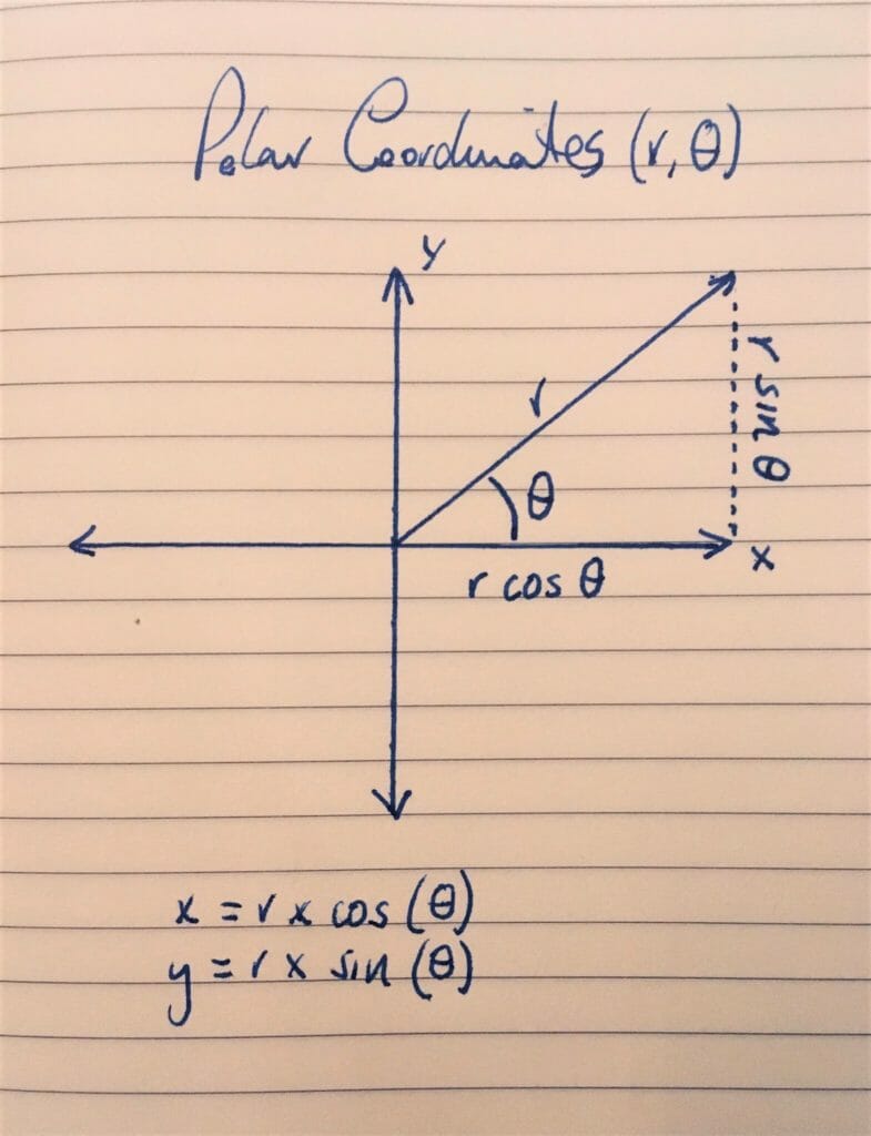
Polar coordinates specify points differently. These points are specified by their distance (r) from a reference point (the centre), and their angle from a reference direction (θ).
Calculation 1: This deciphers the angle (θ) of your radar chart, therefore, allowing us to create the number of axes we need for each of the dimensions we wish to plot. This calculation is the reason we don’t need one of those long, complex formulas shown earlier to create the correct number of axes.
This is the θ (theta) from the image above – Tableau defaults to the use of radians over degrees. Radians are one of two ways to measure angles (the other being degrees), and are employed as a standard unit of angular measure in mathematics. The radian measure of a central angle is denoted by θ.
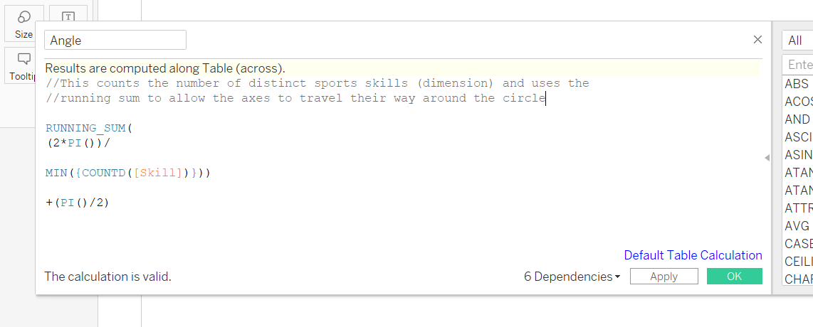
A closer look at the calculation: The solutions I read didn’t offer an explanation of the maths – these are the conclusions I came to after having a look at the formulas and playing around in Tableau, and I’m definitely not a trigonometry expert.
RUNNING_SUM – The running sum allows us to travel around the increments of the circle, and this path will come in handy when joining up our data points later.
2*PI()) – This is the complete revolution of a circle (360 degrees).
MIN({COUNTD([Skill])}) – This counts number of dimensions within “Skill”, using a Level of Detail Expression. Dividing the full revolution of a circle by the distinct count of our dimension returns us the size of each segment, resulting in the number of legs required for the chart. Owed to the running sum, for each count, the angle around the circle is incremented to yield the number of axes throughout the revolution.
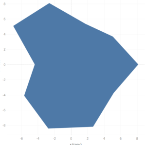
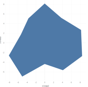
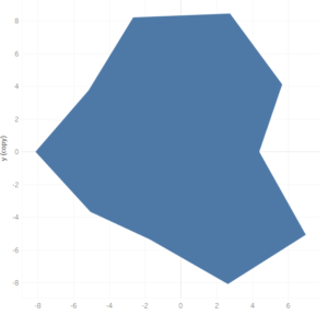
+(PI()/2) – I was confused about this aspect of the formula, given that the previous components had already created the number of axes required, and deciphered the angle between each axis. Accordingly, I tried the formula without this final line, and it still worked (a.). The only difference was the orientation of my polygon. PI/2 is equal to 90 degrees, and adding this to the calculation causes the polygon to rotate 90 degrees anticlockwise (b.), and adding Pi causes it to rotate 180 degrees (c.), and so on. Thus, this part of the calculation isn’t strictly necessary, but can be used to alter the orientation of your radar chart.
a. Not including the last line
b. +(PI()/2)
c. +PI()
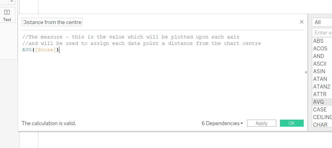
Calculation 2 – This is where the measure you wish to plot becomes incorporated into the calculations. In this case, I am plotting the average score of each category.
This is the r value. This is the distance between the origin and the data point.
The Axes
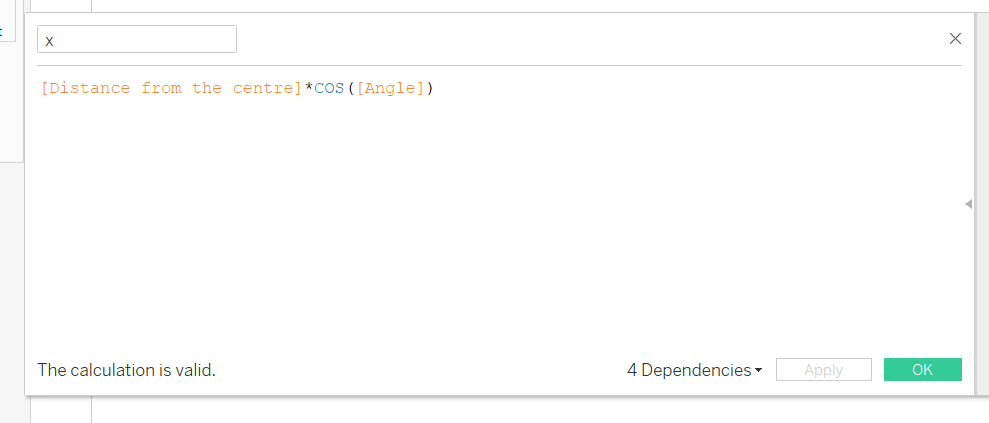
Calculation 3 – The X axis
This uses our r and θ calculations, and places them within the context of our x and y axes.
To get our X axis, we need to multiply r (our value), by the cosine of our angle (θ).
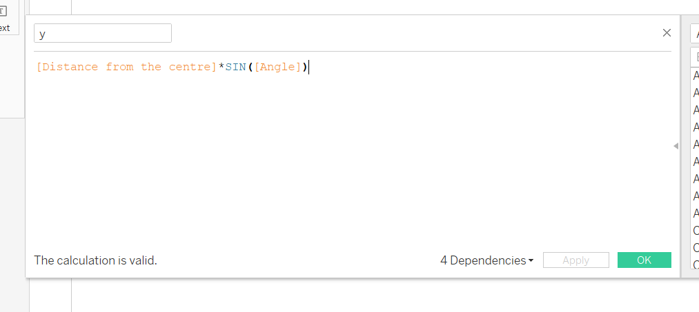
Calculation 4 – The Y axis (the dotted line)
Similarly to our X axis, we need to multiply r (our value) by the sine of our angle (θ).
Creating the view
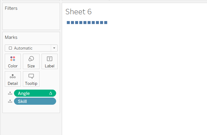
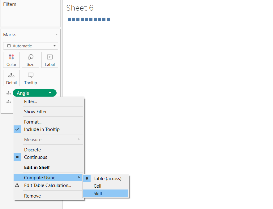
- Drag Angle and your dimension you used in your first calculation onto detail.
2. Set up your running sum.
Our angle calculation utilised a running sum, and we need this to be computed using the dimensions we which to visualise. Accordingly, click, select ‘Compute Using’ and then select your dimension.
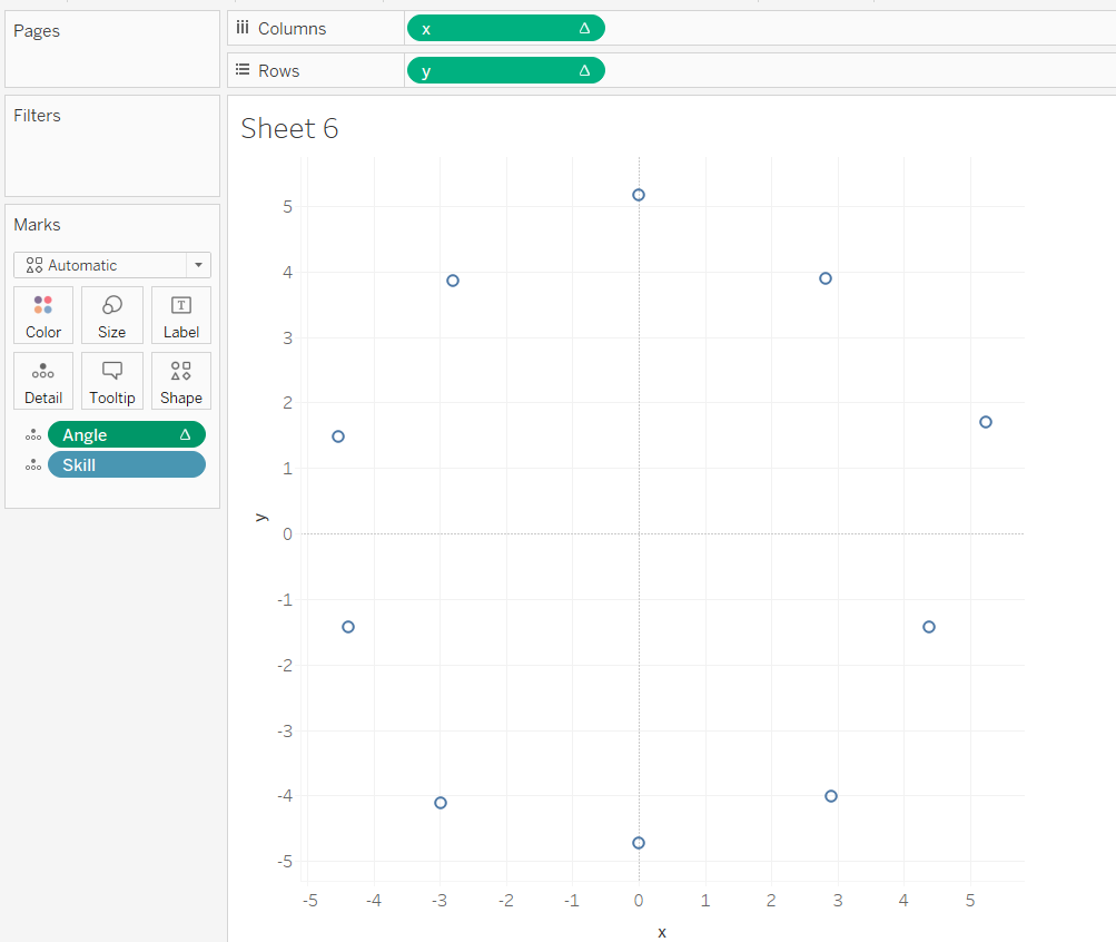
3. Drag x onto columns and y onto rows – you’ll see your already pretty close to have your radial chart.
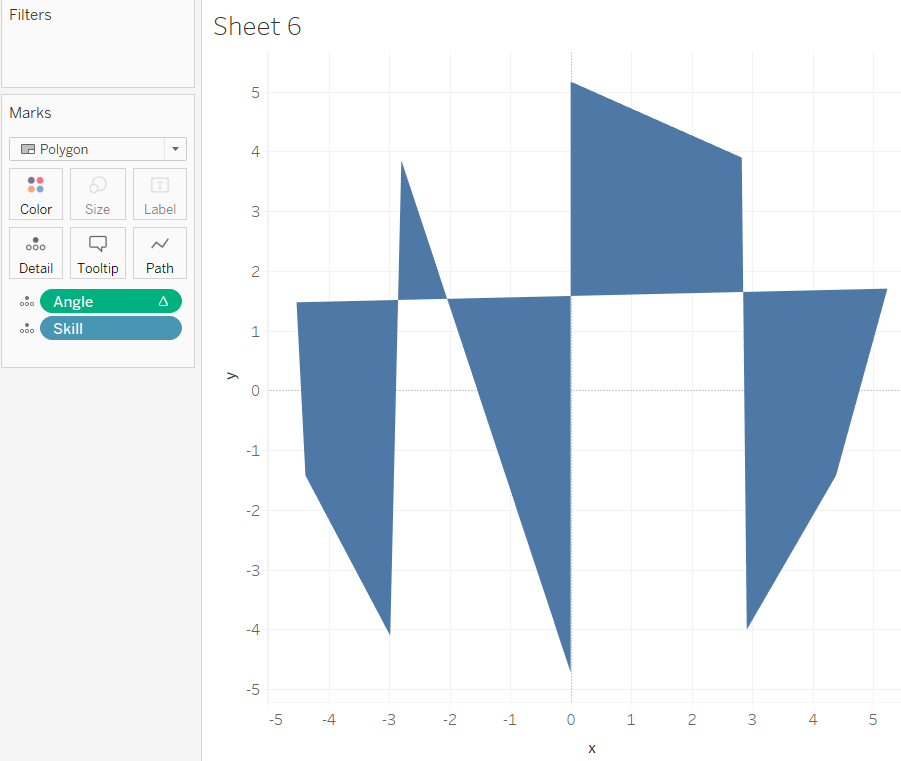
4. Change mark type polygon – this returns this view, as Tableau doesn’t know how to link up our data points in the circular sequence we require.
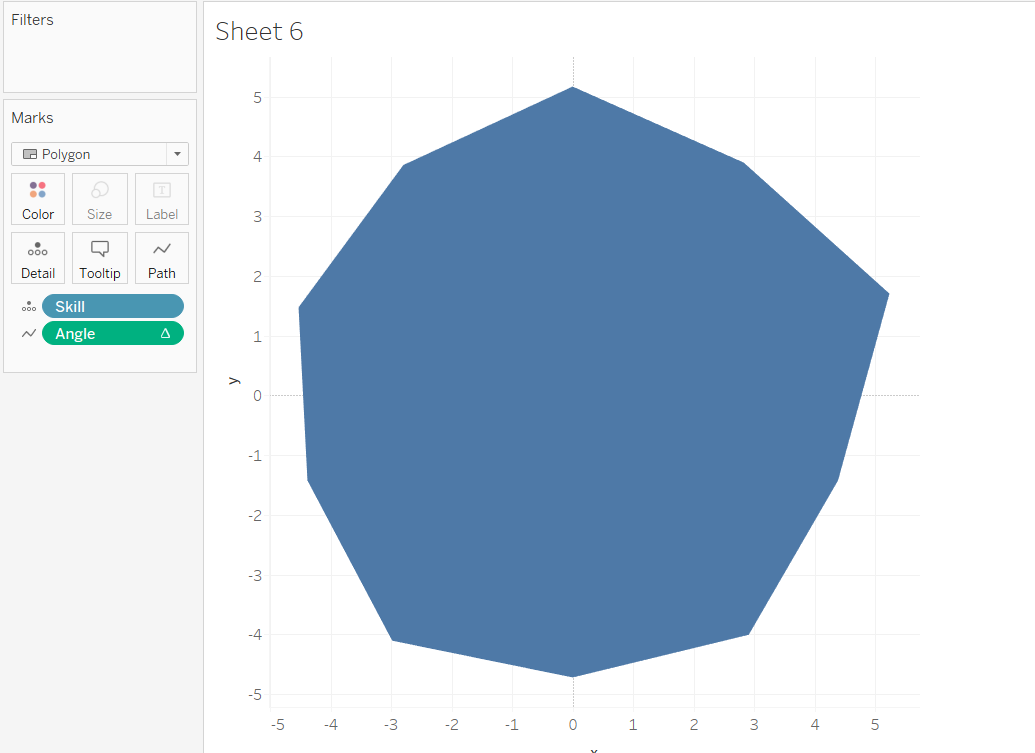
5. To tell Tableau how to link up the dots, we need to use the angle calculation from earlier, which uses the running sum to travel it’s way around the circle. Thus, drag angle into path. This will yield this view:
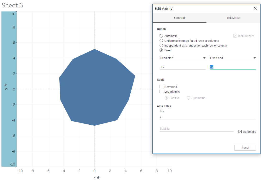
6. Fix the axes.
My scale goes to 0 to 10, accordingly, I need to fix both my x and y axis, starting at -10 and ending at 10.
7. For my viz, I wanted to stack each of the sport types on top of one and other. To do this, drag this dimension onto colour.
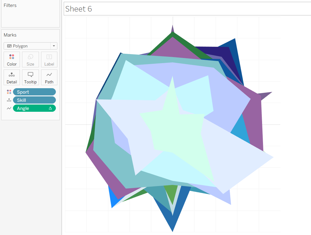
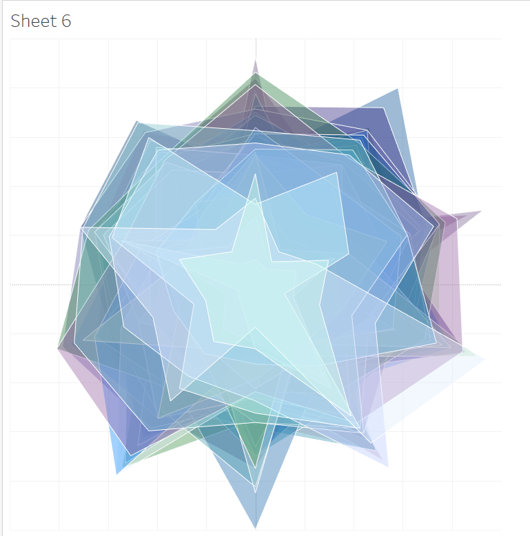
After some formatting:
8. A trick to label your points is to create a dual axis. Drag x onto the columns shelf again, select the circle mark type, and select show mark labels.
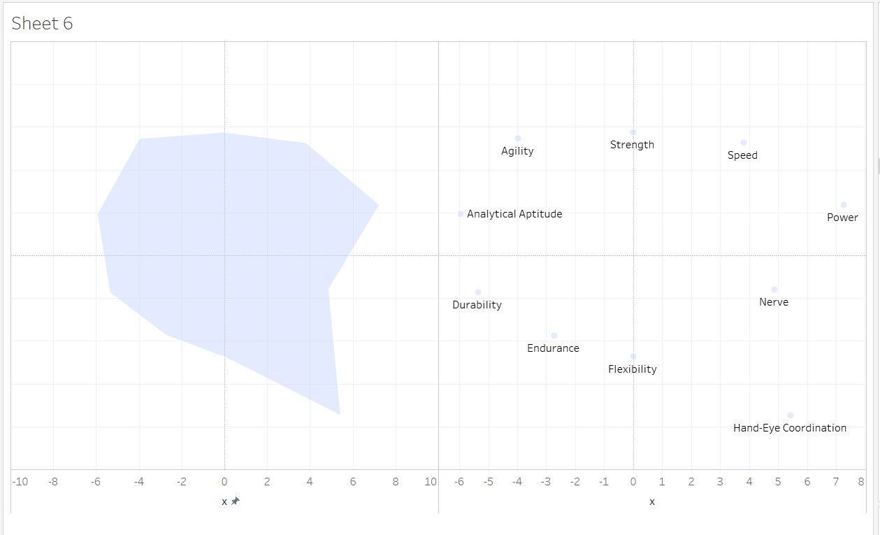
9. Then right click on the second X pill, choose dual axis, and then synchronise axis.
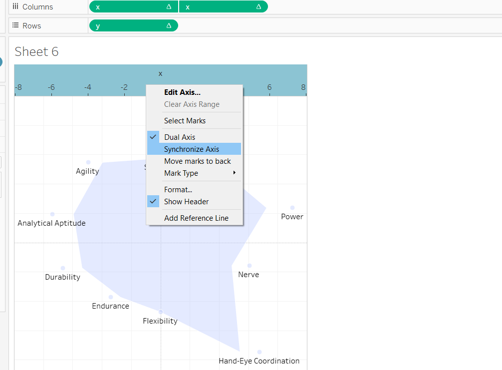
This will give you this view:
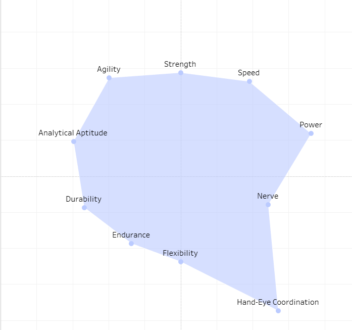
I decided not to use these, as i felt there were a little busy given I was visualising 60 different sports which appeared quite different upon the chart. Instead I obtained a blank radar chart from excel, placed that in the background, and labelled the edges.
Like so:
See my viz here.