One of the best things about Tableau is how the user can interact with dashboards and create a view totally personalised for their needs. However, if the user is not aware of how to do it, it all goes to waste.
In this blog post I will cover some of the ways you can use to help with that.
Quote it in the title
That may be the easiest way – just add to your title whatever the interaction the user can have with it!
One of the downsides of this method is that it can take up valuable space from the dashboard, especially if you want to explain something in much detail.
Using icons
If you feel like adding text is too much space from your dashboard, you can use icons instead and a legend for it. Here’s an example:

Designed by Kolsuma
In this case, we were using the same symbol with different colours – blue for click action and green for hover action. Although that may be too much if you already have a colourful dashboard or if you are using those colours to other elements. Instead, you can use a filled symbol for one and a hollow one for the other!
One negative aspect of this idea, for me, is that you can not be very specific with this.
Use an info icon with all the details on how to use the Dashboard
You can create a sheet with an info icon and then explain everything you want to in the tooltip!
One of the downsides of this one, in my opinion, is that the user will have to keep going to that same place to read directions on elements that may be far away. The good part is that you can be very descriptive as you are not using up dashboard space!
You can read how to it in this blog post from Paul.
Create a Control Bar and put everything there
This is one of the methods that I believe to be more efficient. You can explain everything in detail and it is always displayed in the view so users can always see it.
Designed by Hanna
I would recommend you to try and keep all filters/parameters/indications align with the charts they will apply to!
One of the negative aspects of this method is that a lot of dashboard space is taken with the control bar…
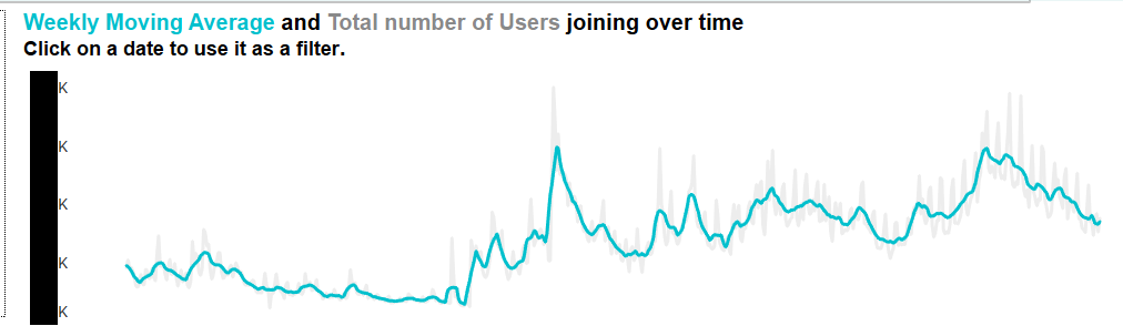
Claim it in your most important title and put it in the tooltips
This is something that I’ve used in one of the lasts Client Projects. I was not very sure about stating something so important in the tooltips – for me, it is very intuitive but I believe it should be tested with different users to be sure.
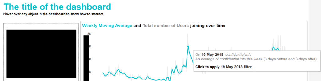
To be fair, this is my favourite method. It allows me to explain exactly what will happen and what the user should do without taking up any space in the dashboard.
Let me know if you have any different ideas or if you use any of these and how they worked!