The task:
Read it in here:
/andy-kriebel/avengers/
We were also told that the final result should be in the format of an infographic and that we had to show our drawings to Andy before moving on to Tableau.
The “why did I struggle?”
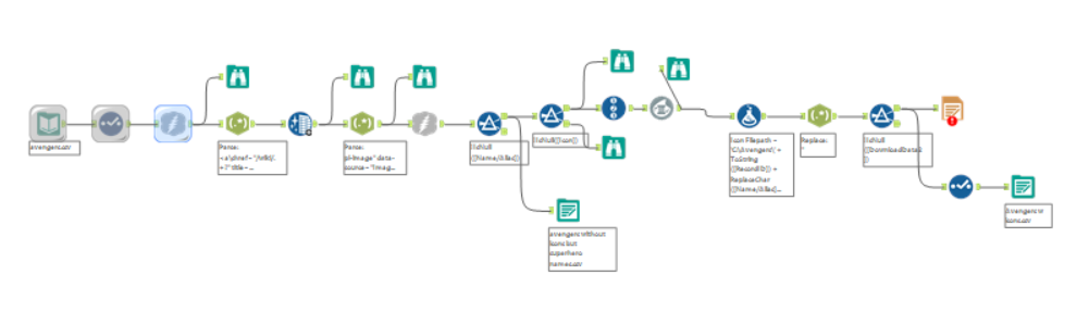
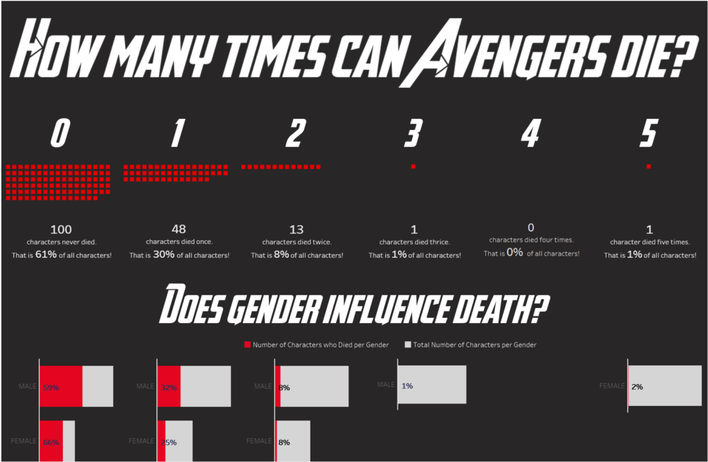
My idea was pretty simple: I wanted to have the number of times that avengers died and the images of those characters in each of its correspondent number. Unfortunately, in the datasource, we had 173 characters, 10 of them with no name, and I could only get images for 87 of them… That was not helpful at all as that would take to long to assign them all! I then decided to discard that idea and this awfully disorganised workflow below.
I spent too much time working on this and in the end, I did not even use it… I mean, I have used the superhero names. But only on tooltips. So, it doesn’t really count.
The solution
I decided to go for a unit chart with just squares instead of using the images. My idea was to in the end have a top of the most important characters and use the images for those, along with more information, but I ended up having no time to progress with that.
The final result
Click the link below to see the final result.
It is not an interactive viz as one of the rules was that it should be in a printable format!
https://public.tableau.com/profile/d.bora.contente#!/vizhome/Howmanytimescantheydie/Howmanytimescantheydie
My conclusions
I definitely need to manage my time better. I am not very proud of my final work, once again, and that is the other thing I need to change.