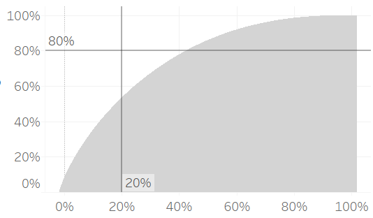
If an event follows Pareto’s law then 80% of the effects come from 20% of the causes. To test whether superstore sales follow Pareto’s law we need to check if 80% of the sales come from 20% of the customers. In Tableau, we can do this visually by creating a Pareto chart. Let’s see how this looks using global superstore data.
Step 1: Add customer ID and Sales to the columns and rows shelves
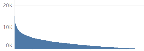
Sort customer ID by sales (descending) and fit the chart to ‘Entire View’. Tableau defaults to showing bars, but it looks like an area curve as we have squashed 4873 bars onto the screen.
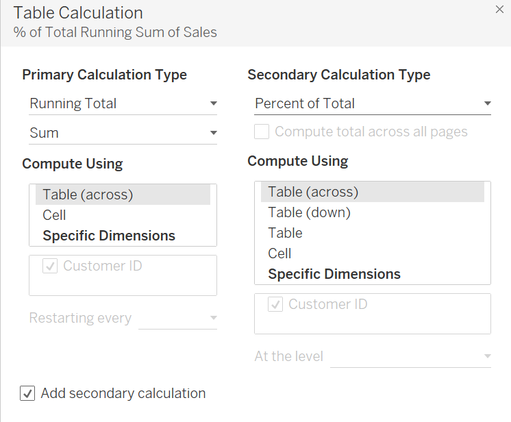
Step 2: Add table calculations to sales.
Right click sum(sales) on the rows shelf and a table calculation. Change calculation type to running total then tick add secondary calculation and change the calculation type to percent of total.
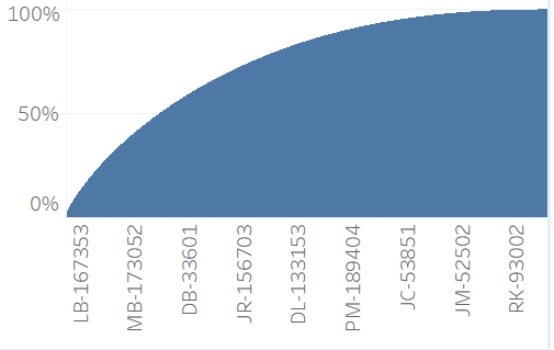
We now have the customers on the x axis and the running total of the percentage of sales on the y axis. If you hover over the chart the tooltips will show which customer is at which percentage.
Step 3: Replace the x axis with the percentage of customers.
We need to keep the bars showing individual customers but change the columns to show percentage of customers. So to start, drag customer ID (while holding ctrl so it is copied) from the columns shelf to the marks card (as detail). Customer ID should still be sorted by sum(sales) descending on the marks card.
Next right click customer ID on the column shelf and change to count distinct. This will show a single, bar but don’t be alarmed, we just need to add a nested table calculation to get the curve back. Click CNTD(Customer ID) and add table calculation, first running total then tick add secondary dimension and select percent of total. Both should be computed using customer ID.

We now have a Pareto chart with percentages for the customers (x axis) and sales (y axis). To check how closely our data follows Pareto’s law, just drag some constant reference bands onto the chart at 20% and 80%.