Todays task made be feel right at home going back to reading countless papers about obscure topics at university. With the topic of insects and birds as close to marine biology as it will get. Because of this I felt quietly confident. Today for me was really about messing with different chart types to find the best way to represent the data in as clean a way as possible.
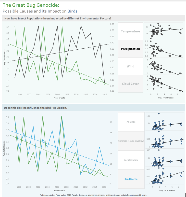
Once the data prep and article reading was done I knew that one focus of the dashboard would be looking at the insect population trend and I wanted to try and visualise what factors impact this number. In the articles different people had stated that there are several different factors that all play a part in this decline, but I wanted to give a weighting to these factors.
Looking back I wasted a lot of time messing about with finding the right chart types. The data showed a very peculiar oscillation over the years, but I am very glad I didn’t smooth this out using a moving average as when these oscillations were compared to the different environmental factors it clearly showed some strong negative correlations within the data.
With the overall dashboard I am starting to like having uniform sections within the data showing different dimensions but in a similar way as once the view understands one side they can quickly see what is happening in the next part of the visualisation.
Using these uniform sections I created the second half of my viz. I definitely feel like as this dashboard week has progressed I have got a lot quicker with formatting.