The Brief
Having missed day one of dashboard week whilst on holiday I was keen to get stuck in. Andy briefed us from Ireland on the task. We were to obtain weather data from the National Centres for Environmental Information website, which is a fantastic source for weather data. Then find insights within the data. See the final visualisation here
Data Prep
We quickly ran into an issue. You could only download 1000 years worth of weather data at once. This sounds like a lot, however there are hundreds of years of data for a single weather station. I chose to look at the weather in Toronto which had over fifty weather stations. To download all of its data required 11 different requests to the website. I used alteryx to combine this data with the union tool, as shown in Figure 1. Despite requiring additional clean up I outputted this union as a yxdb to compartmentalise the overall workflow and reduce run times. 
Figure 1. Unioning the Data together
The remaining part of the workflow was to add a decade field to the data set to allow grouping of the data. Very little cleanup was required of this data.
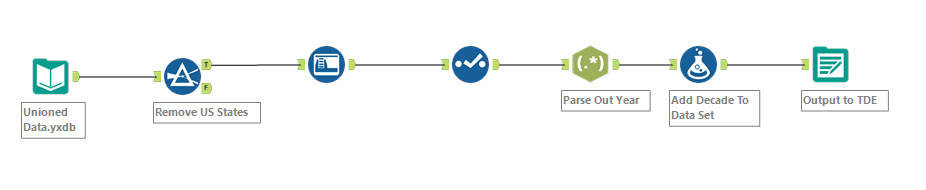
Figure 2. Adding Decade to the Data.
Visualisation
The hard part of visualising this data was creating a story. Even though I just downloaded data for Toronto I had over 500,000 rows of data which seemed overwhelming and was the largest challenge of this project. Even after Andy made us work in Tableau 9… I drew out sample dashboards, created multiple sheets but struggled to come up with a story. I then came up with the final visualisation which showed the major rainfall events in Toronto throughout history and data about temperature, precipitation and snowfall. This is shown in the final visualisation below.
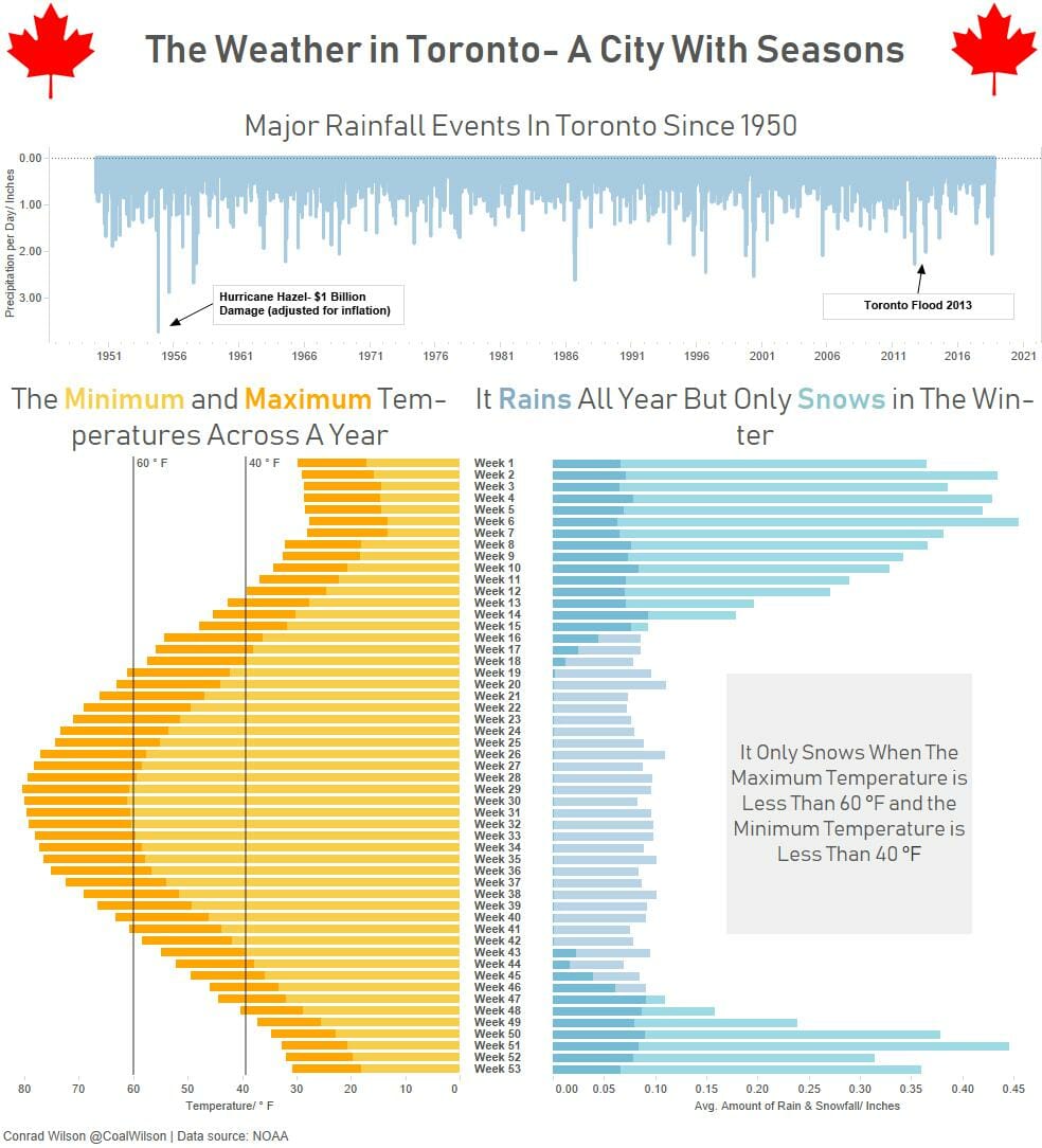
Figure 3. Final Visualisation
.