


To inaugurate DSNY 3’s dashboard week, our cohort learned about the principles of accessible dashboard design. Accessible design is to ensure that as many people as possible are able to participate in the usage of a dashboard as possible. Examples include making sure that the color blind can distinguish between colors, that those who are unable to use a mouse or trackpad can still use the dashboard or that the visually impaired can use a screen reader to communicate the meaning of the visualization.
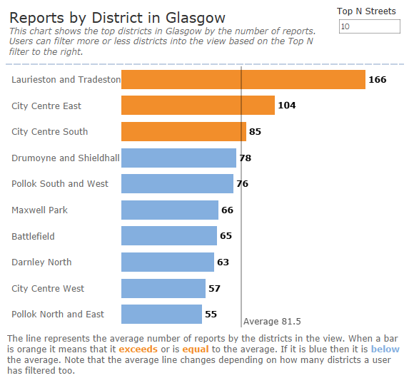
One of the simplest and easiest things a user can do to make a dashboard accessible is documentation, or rather labeling the meaning of a visualization right next to it! For this I used subtitles and captions to explain the meaning of a chart and how to use it.
Besides just writing instructions and documentation on how to read and use a chart, dashboard designers should also try to make the colors of their dashboards contrast well for easy legibility but also accessibility for those who have color blindness. For example, while red and green can contrast well under the right usage, those suffering from red-green color blindness may be unable to distinguish the meaning of the colors from your charts.
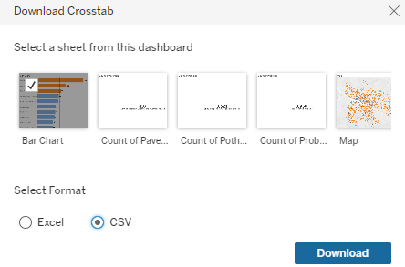
For those who are more comfortable using other tools like Excel, including the option to download a visualization into other formats is another excellent way to make the insights from your dashboard more accessible. This was another feature I included in my dashboard which gave users the ability to download their data into an Excel or CSV format.

Finally, another key feature of accessibility design is to make your dashboard as screen reader friendly as possible. Despite using a lot of text in a dashboard, screen readers like Microsoft Narrator can have a hard time reading the actual text if it is embedded into the chart area (ie. BANs, KPIs, Labels etc.). Users can use Tableau tricks like putting calculations in dummy sheet titles to get around this and make their dashboards as accessible as possible.
Ultimately designers should tailor their dashboards for their audiences. It is sometimes impossible to make a dashboard accessible for all audiences and some features of accessible dashboard design may favor certain audiences over others. The most important thing of all to understand before making a dashboard accessible is understanding who the dashboard is going to be accessible for.