What are Sparklines?
Sparklines are a tiny chart, usually drawn without axes, that enables you to quickly compare trends over given values. I’ve found they’re a great way to compare trends in values over time. You might use a sparkline to compare seasonal increases or decreases, stock market values or to highlight the maximum (or minimum) values.
How do I build a sparkline?
It’s simple really, in fact building a basic sparkline in Tableau can be done in just 5 easy steps!
- Drag your fields onto the view! To recreate the sparklines above, using the tableau superstore 2020 data: Add Order date (Continuous Quarters) to your columns shelf; and add Region and Sum(Sales) to your rows.
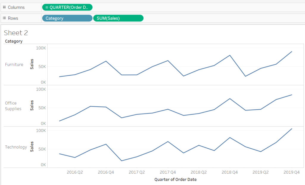
2. Right click on your Sales axis and select edit axis. This new window allows you to edit how the axis is configured. Select ‘ independant axis ranges for each row and column. This means that ‘Office Supplies’ will only be compared to ‘Office Supplies’, and values for ‘Technology’ will not affect how the sparkline looks.

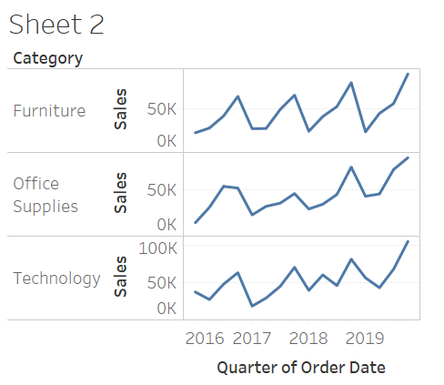
3. Resize your chart area! Remember that sparklines are usually small charts. When hovering your cursor at the edge of the view a double headed arrow will appear, use this to resize the charts.
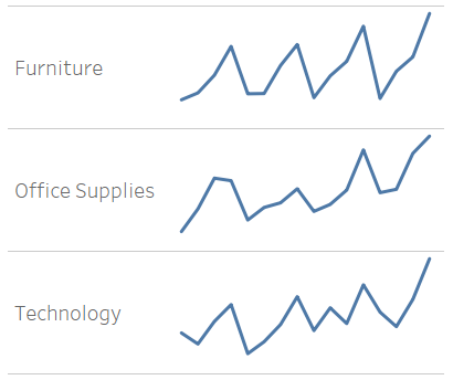
4. Remove the headers for fields and quarter of order date
5. Format to remove grid lines, zero lines and the column divider.
And that’s it! Your simple sparklines have been complete.