In my last blog post I walked through the steps to building sparklines in Tableau. Find that blog post here.
While basic sparklines can give insight into trends within data, how can we add an additional level of detail to them?
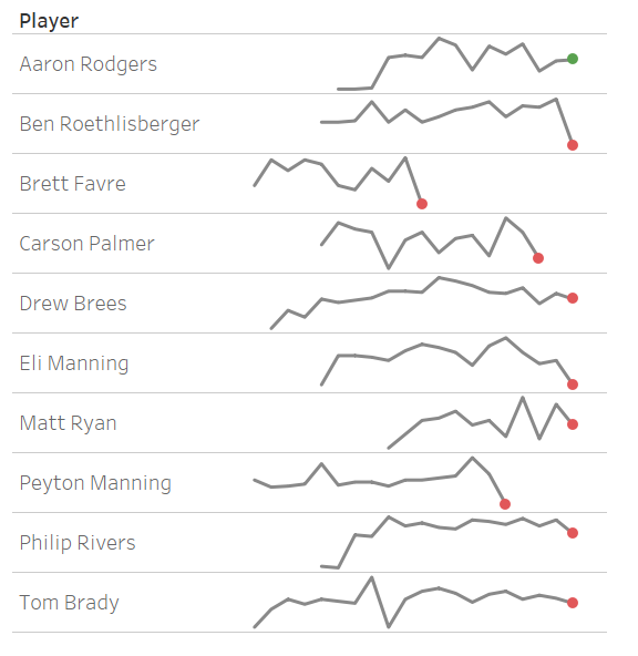
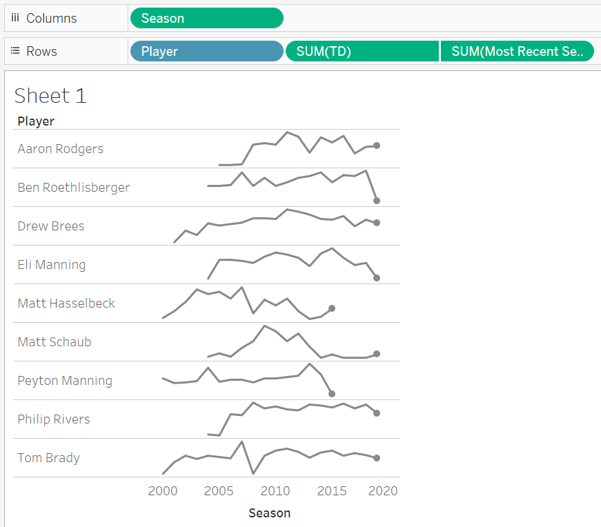
For this example, I’ve looked at the number of touchdowns each quarterback had thrown in each season. The coloured dot at the end of the line indicates whether a QB threw more (Green), or less (Red) touchdowns in their final season, compared to their penultimate.
Recreating these sparklines can be done in 10 steps!
Step 1 |
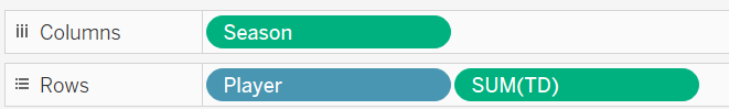
Draw a basic sparkline for each player. I’ve shown what fields I added to the Rows and Columns to help you out.
Step 2 |
Not all Quarterbacks ended their careers in the same season. Therefore, we need a fixed Level of Detail calculation to work out the final season of data for each quarterback. I achieved this using a calculated field and the below calculation.
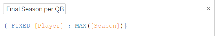
This calculation returns the largest value for season (The Final Season) for each individual player. I’ve named this new calculated field, [Final Season per QB]
Step 3 |
We also need to know the penultimate season for each player. This calculated field was called [Penultimate season per QB] and the calculation is a little easier:
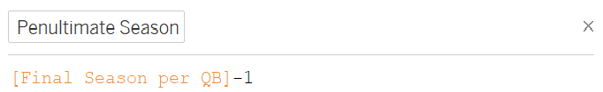
As the Penultimate season will always be 1 less than the final season, we don’t need to use another Level of Detail calculation in this situation.
Step 4 |
As we want a dot on only the last season for each Quarterback, we need a calculated field to show only the most recent season.
Step 5 |
Drag this new calculated field onto your rows, and create a dual axis chart. Remember to synchronize your axes!
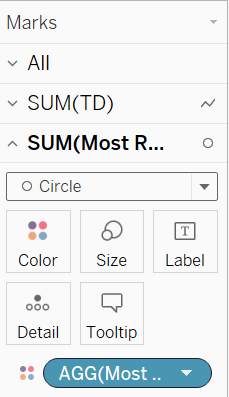
I changed the mark type of the new field to circle, and increased the size so it was slightly larger than the width of the line.
How do we change the colour of the dot?
Step 6 |
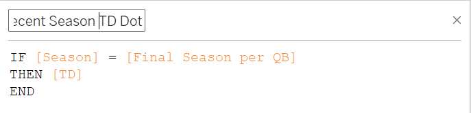
Create a fixed LoD calculation to work out the number of touchdowns in each Quarterbacks final season. As before this has to be a fixed Level of Detail as the final season will be different for each player.
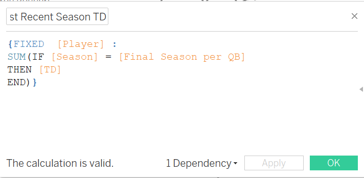
This calculation says that: for each player, if the season matches the final season for that QB, return the value for Touchdowns (TD).
Step 7 |
We also need the calculation for Touchdowns in a players penultimate season. This will look very similar, except the [Final Season per QB] field will be replaced by the [Penultimate Season per QB] field we made earlier.
Step 8 |
Place the two calculated fields you just made onto your details shelf.
Step 9 |
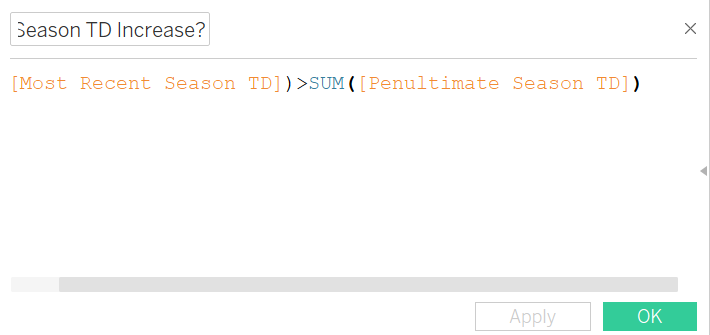
One final calculation to work out if a player got more touchdowns in their final or penultimate season! This will be a boolean calculation:
Step 10 |
Add this new field onto the colour shelf for your dots. I’ve chosen green for players who had an increase in number of touchdowns between seasons.
I hope this method of adding a little more detail to a sparkline was helpful.