For this week’s Book Review I decided to read Edward R. Tufte’s ” The Visual Display of Quantitative Information”. The main reason why I decided to go for this book is because I thought I would help me make my visualizations about the actual data and not about the tricks, tool and aesthetics that can be applied to the visualization.
Edward Tufte states a very clear idea in this book: The main purpose of Data Graphics is to be able to represent complex information in a very simple way.
Often the most effective way to represent, study, and summarize data is by looking at pictures of the data. Well-designed data graphics are the simplest and most powerful way to explain data.
In order to do that he believes the field of Data Graphics needs a certain level professionalization. As he puts it, he wanted Statistical Graphics to be “intellectually respectable and not just about pie charts and ruling pens”.
In order to achieve this, Tufte offers the reader a set of concepts and principles to follow in order to design data graphics that represent complex information in the most effective way.
Tufte starts by presenting the concepts of Graphical Excellence and Graphical Integrity.
Graphical Excellence consists of complex ideas communicated with clarity, precision, and efficiency.
Graphic Integrity refers to a series of principles that need to be followed in order to not show the data out of context. For example, the representation of numbers, as physically measured on the surface of the graphic itself, should be directly proportional to the numerical quantities represented.
He then continues presenting a set of principles that constitute the core of the Theory of Graphic Design:
- Above all show the data:
- Maximize the data-ink ratio.
- Erase non-data-ink.
- Erase redundant data.
- Revise and edit.
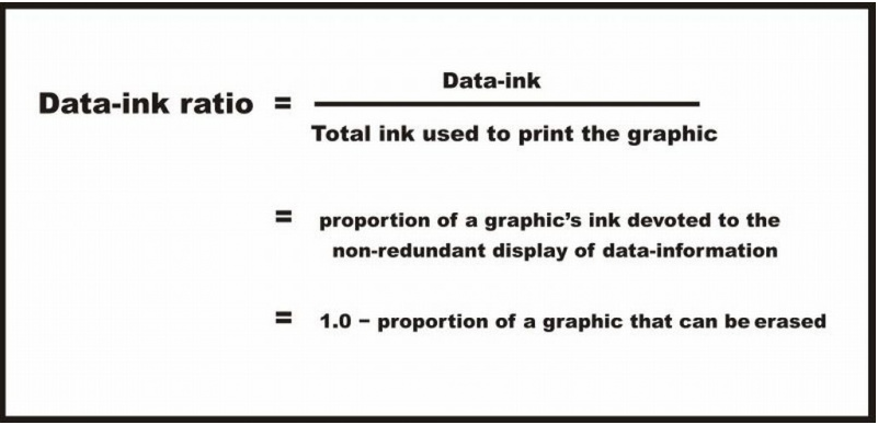
Perhaps the most interesting of these principles is the Data-Ink-Ratio which can be expressed in the following formula.
Tufte hopes that following these sets of principles data graphics will serve their purpose of representing complex information with clarity but also hopes that this process will bring innovative ways to present information.
Despite of being a book about theoretic concepts and principles Tufte manages to keep it interesting and dynamic by presenting the reader with lots of really interesting graphs, some really poorly created and some brilliantly drawn, as examples.
As a final note however, Tufte states how these principles should not be applied rigidly and they should be used as a guideline and that it is better to violate any principle than to place graceless or inelegant marks on a paper.
Overall an enjoyable read in which you’ll find some interesting concepts in an attempt to establish a structured process for the creation of efficient Data Graphics.
The variety of graphs makes the book very easy to read by dynamic switching form theory to applied examples very easily.