Today was a day with many challenges. I was very excited about the data as it was about celestial bodies in the Solar System, however there was one big caveat. We were only allowed to use PowerBI.
There are a lot of things that PowerBI cannot do. Along with the fact that we have not seen it before, it became a headache to visualise in it very quickly.
I decided to focus on an aspect of PowerBI that was an advantage over Tableau, and that was the ability to animate visualisations much smoother and easier.
So I used Alteryx to do all the complicated calculations that will calculate the position of the 9 planets over a time field that I generated.
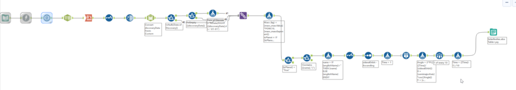
Then I built a simple dashboard, where I would then put the time field I created onto the “play axis” selector in PowerBI and let it flick through time like Tableau would do on the pages shelf. This would let me create a simple version of the planets orbiting the sun.
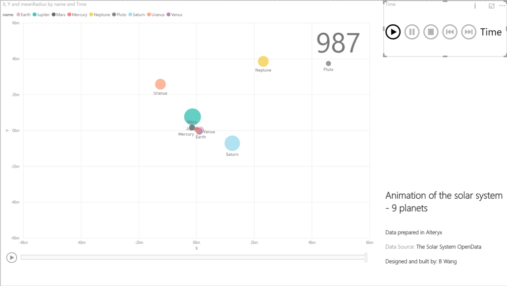
So it turns out, PowerBI does indeed animate much smoother and nicer than Tableau – however it does this quite inefficiently. There were numerous problems I faced.
- It could only handle a couple hundred of seconds, and would animate the first couple thousand in a split second before the others. This baffled me as it proved it could animate the entire thing very quickly but just did not want to do it properly
- There is no way to control the speed of the animation. I wanted to create a smooth animation, so I created a lot of time points but it would only flick through one “page” per second. To get around this I had to download a third party addon that let me speed it up considerably
- Inefficiency, every time I even clicked onto the dashboard it would take 5 minutes to “re-render”. I had no idea what it was even trying to do in the background but it made it impossible to try and add anything else to the dashboard/do much formatting.
For example, if I wanted to add colour to my marks, I would have to click onto the scatter plot, wait 5 minutes, click onto the formatting and turn on colours, wait 5 minutes, and select the field I want to colour by and wait another 5 minutes. It was infuriating.
Also everything I did is hugely CPU dependent, and if you’re computer isn’t really modern and expensive, there’s no way the animation would even run. (when I unplugged the charger, the animation would slow to about 5 frames per second)
The thing that shocked me most about PowerBI was how hard it was to quickly make some insights and investigate the data before planning out the dashboard. Today really let me appreciate Tableau for what it lets me do every day, and also without a tool like Alteryx behind it, getting anything useful in PowerBI would be a huge challenge.
That’s the end of my rant for today, I look forward to tomorrow when I can return home to Tableau 🙂