


It’s the last week of training for DSNY2 which means DASHBOARD WEEK. Day 1’s theme is Accessibility, using the Fix my Street Glasgow dataset. Dashboards should be created with the broadest set of users in mind and be usable by people with motor and/or visual disabilities.
What the data looks like:
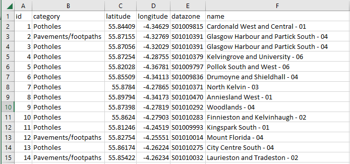
I cleaned the street names to have only letters, which also aggregated the data a bit.
What we took into account today:
SCREEN READERS
Windows Narrator shortcut is Windows Key + CTRL + Enter
FOCUS ORDER & KEYBOARD-ONLY EXPERIENCE
The order in which you can TAB through a Tableau dashboard, which relates to how much of the dashboard can be interacted with using only a keyboard
COLORS
Contrast between colors; red-green color blindness
REDUCING COGNITIVE LOAD
Aspire to be more consistent; having explicit instructions
UNIVERSAL DESIGN
The idea you design for everyone that could possibly use it
And more…
How I tried to build for all audiences:
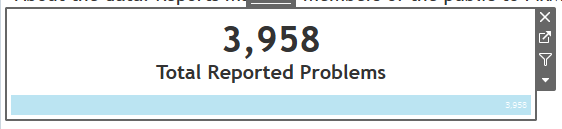
Typically we create our BANs within the chart area, but those are ignored by screen readers, so today my BANs are within the sheet title.
Highlighted is the actual chart area (text is in white so it will be invisible normally).

Normally, we might use 3,521 (89%) but I didn’t like how Windows Narrator was reading it. So in addition using the chart title for BANs, I also added text so that it would read as a sentence.

The first paragraph is all within the title, and the numbers change based on a filter. The text states the top item and the value.
As I built my dashboard, I tested it with Windows Narrator, so I wanted to also specifically call out the filter being two tabs away - after this chart and the next chart, a map, so those instructions are in white font, size 1. There are also instructions to view underlying data (shortcut is CTRL + Shift + Enter).
I included captions at the bottom, which also gets read aloud by a screen reader.

This map also has white color instructions on viewing underlying data, and also tells you that Pavements/footpaths are in orange and potholes are in blue, as the legend is two tabs away.
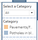
I also aliased the legends to include the color, as the screen reader only read out “Pavements/footpaths”.
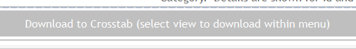
Finally I included a download button - which would be the only way to read aloud any data that feeds the visualization.