When working with big geo-coded datasets, points often become cluttered and overlaid when mapped, making it difficult to decipher meaningful spatial patterns that could lead to key insights.
In these scenarios, spatially aggregating data points into surfaces or bins will help tease the signal out of the noise. Meanwhile, in the process, aggregating will take the strain off your processor or server, by obviating the need to plot each individual observation.
In the previous post I explained how to achieve this with Grid Maps, using the 2015 Department for Transport collision data as an example.
If we want a more generalised overview, we can go one step further than a Grid Map. We can ‘de-pixelate’ and smooth our grid squares into continuous surfaces representing different density ranges. This generates what is known as a Heat Map (sometimes referred to as a hot-spot map, or kernel density map).
By rendering lots of of point-level detail as more intuitively understandable hot-spots, broad spatial patterns can be interpreted more effectively.
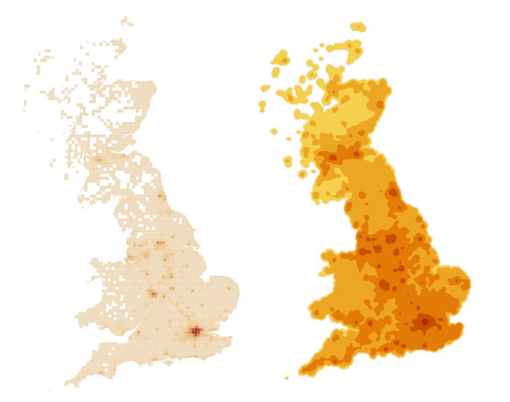
Grid Map (left) and Heat Map (right)
Heat maps have their limitations however. They are not ideal for discerning precise patterns (such as collision densities along road networks), as density surfaces ‘bulge’ into spatial areas which might not actually contain data. Instead, they are better suited for providing a general overview of patterns.
How do they work?
How do Heat Map’s generalise spatial data?
Imagine each cell in the grid map above is a glowing heat lamp, where cells with greater collision densities radiate more heat.
‘Heat’ from adjacent cells merge with one another; each cell gets full credit for the density of heat sources within it (i.e. density of collisions), and also a small amount of heat from nearby cells. The extent cells merge is determined by ‘Maximum distance’ and ‘Decay function’ parameters in Alteryx, which set the distance the ‘heat’ travels away from the cell of origin and with what intensity. By default, the decay function is set as a linear gradient, where heat fades out proportionally to distance away from the cell of origin.
This decay principle that underpins heat mapping acts as a sort of spatial smoother, merging values of cells together by controlled extents.
With their adjusted values, cells are then ‘tiled’ into surfaces, by aggregating adjacent cells with similar values into homogenous polygons.
How can we create Heat Maps?
In Alteryx:
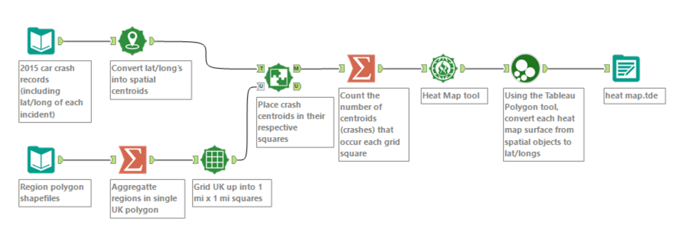
Alteryx workflow used to create my Heat Map
STEP 1: The process of preparing data for the heat map is largely the same as for the Grid Map. We split the UK up into grid squares, and bin crash data into the squares. Making the grid squares as small as practically possible, and hence the binning highly defined, will give us more flexibility later on.
STEP 2: Now we feed the data into the Heat Map tool. This as has following configuration options:
The data input will be your Spatial Objects (in this case the pre-made grid squares), and the Choose Heat option will be the count of crashes within each grid square.
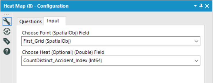
The Heat Map tool has 3 configuration options
- Grid size
- Maximum distance (also known as bandwidth in other software)
- Decay function (also known as the kernel density function)
The Grid Size option modifies the detail of spatial data to be fed into the decay algorithm. I generally prefer to keep this low, so I have more control over the smoothing process using the Maximum distance + Decay function which determine extent to which cells are merged.
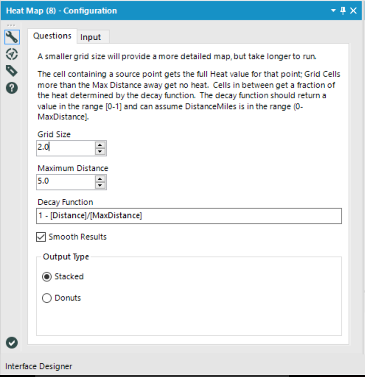
The ‘Smooth Results’ tick-box offers the option of smoothing edges of density surfaces into curves, or leaving them jagged-y and pixelated.
In Tableau
Mapping the data follows the same basic protocol as for the Grid Map.
STEP 1: In Tableau, double click the Longitude and Latitude fields in the data pane to bring the base map into the view. Then, from the drop-down menu switch the mark type to Polygon.
STEP 2: Now, the Tableau Polygon tool has taken our grid square polygons and returned 3 fields, which exist in a hierarchy:
- Polygon ID – a unique ID for each heat map band
- Sub-polygon ID– The ID number of each segment (or island) within a heat map band
- Point ID– The tells Tableau the sequence of points that need to be connected to re-construct each heat map sub-polygon.
To plot our heat map bands on the map, we simply need to drag Polygon ID and Sub-polygon ID to the Detail Shelf, and Point ID to the Path Shelf. Then we drop the ‘Tile Number’ field on the Colour shelf.
STEP 3: The tiles representing heat map bands are overlaid on top of one another. By default the largest band is generally on top, obscuring all other bands. Therefore we need to Sort Tile numbers in descending order, before applying an appropriate colour scale. In this case a discrete Orange-Gold colour scale.
Below are 3 maps that illustrate the effect of altering the Maximum distance configuration:
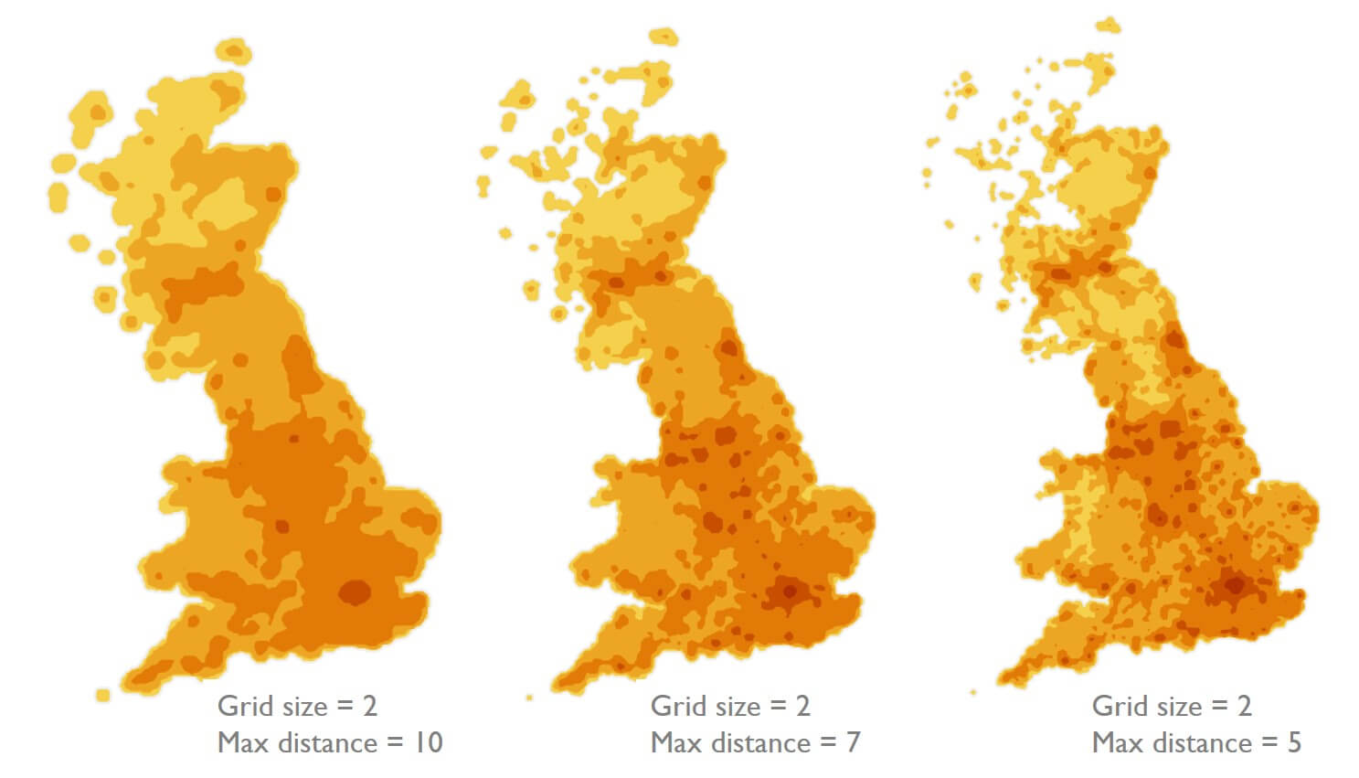
More advanced users could also experiment with modifying the decay function, to alter the extent to which adjacent cells ‘share’ values during the smoothing process. For example, a power function would result in a more sudden drop off in ‘heat’ radiating from cells, thus more discrete cells, and less merging.
Closing thoughts
Heat Maps provide an effective way of summarising high densities of points into intuitive graphics that are easy to interpret.
However, Heat Maps should be used and interpreted with caution. Spatial smoothing can lead to potentially misleading patterns, whereby density surfaces cover areas with no underlying values. Therefore, heat maps are not ideal when precise interpretations are needed – but are more appropriate for a big picture overview.