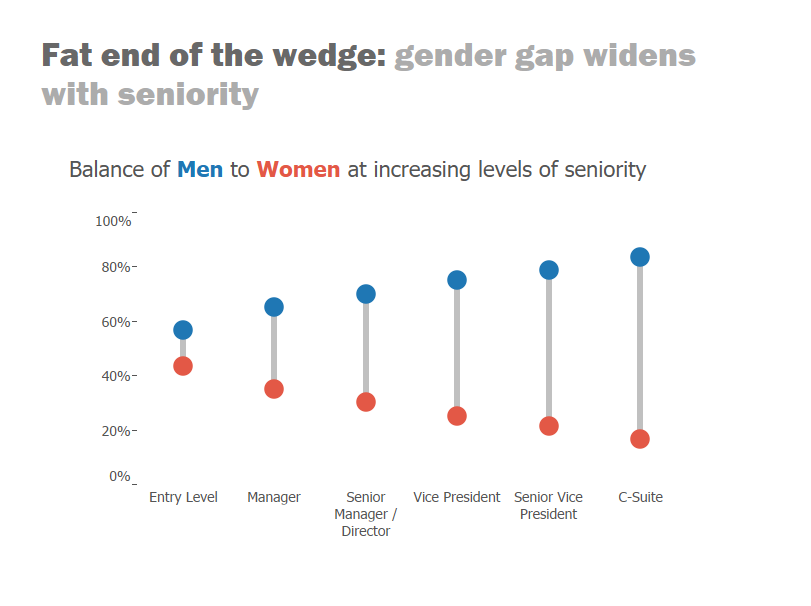
Often, dot plots can be an useful way of comparing values of different measures on the same chart area.
To further enhance their effectiveness, we can draw a line between the two dots. This guides the eye to size of the gap between them, and can aid perception of differences. Doing so transforms a dot plot into what is known as a ‘barbell’ chart (e.g. see below).
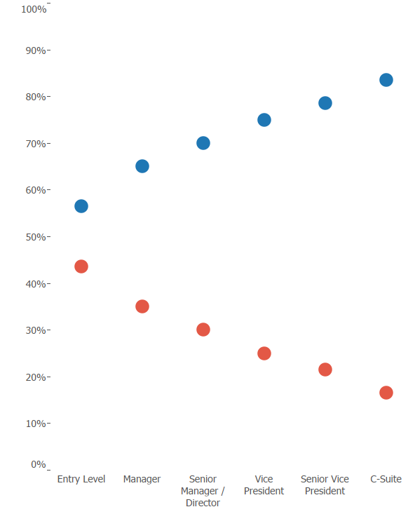
To create one of these we need to initially plot the different measures (in the case men & women) on the same axis.
This is done by dragging one measure pill from the data pane over the existing axis (with the other measure) until you see the double ruler symbol as below:
We then have a free axis on the right hand side, which we can subsequently use to plot bars, representing gaps between the dots.
Now drag one of the measures (in this case either men or women) to the second axis, until to see the dotted line, as below:
Convert the mark type to ‘Gantt’ and make sure the aggregation of the measure is consistent with the other axis (e.g. SUM, AVG, or CNT etc.). Then synchronise the new axis with the original.
You should now have something looking like this:
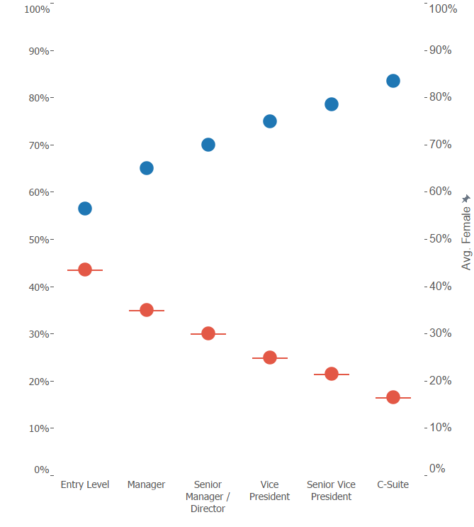
If you can’t see the horizontal lines going through the dots, try increasing the size in the Marks shelf.
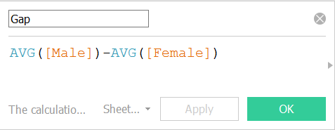
Now, to get these Gantts to bridge the gap between the two dots, we need to write a Calculated Field to calculate the difference between the red and blue values – then drag this to the Size card.
Note: once again, the calculated field should aggregate the measures consistently with the rest of the chart (in the case AVG).
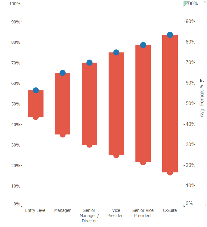
Dragging this calculated field to the size card should produce something like below. If the bars are going in the wrong direction – simply reverse the order of your calculated field (i.e. swap the two measures around).
Now, reduce the width of your bars in the Size card, and enable manual re-coloring by removing ‘Measure Names’ from the Colour shelf. Also, remove your second axis labels by right clicking on it and un-ticking ‘remove headers’.
Now you should have a nice barbell chart, emphasising the gap between different measures or categories.