In this post I discuss how to apply the proportional brushing technique to highlight the proportion of a dimension’s members that correspond to a selected set as a share of the total.
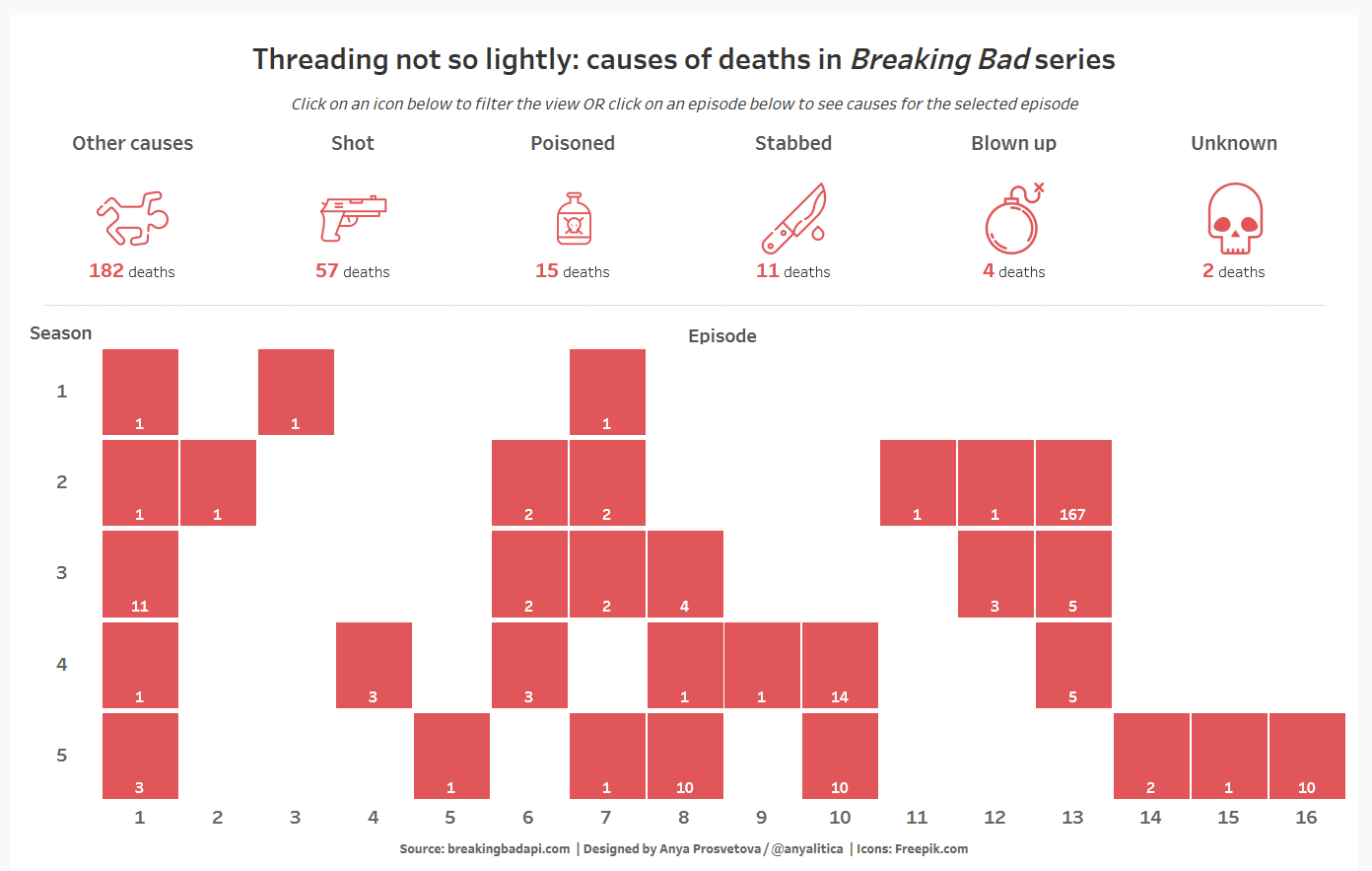
Last Friday we joined DS16 for their Dashboard Week challenge and worked with the Breaking Bad API compiled by Tim Biles. We had only 3 hours to create a dashboard, and since I haven’t watched the show before I decided to look at an angle which doesn’t require a lot of background knowledge – causes of characters’ deaths in the series.
The first version of my viz was a combination of icons and a marginal histogram showing the number of deaths per episode in each season. Marginal histograms are histograms added to the margin of each axis of a chart for analyzing the distribution of each measure. In my case, I wanted to use this type of chart to show the distribution of deaths in seasons and episodes of the series.
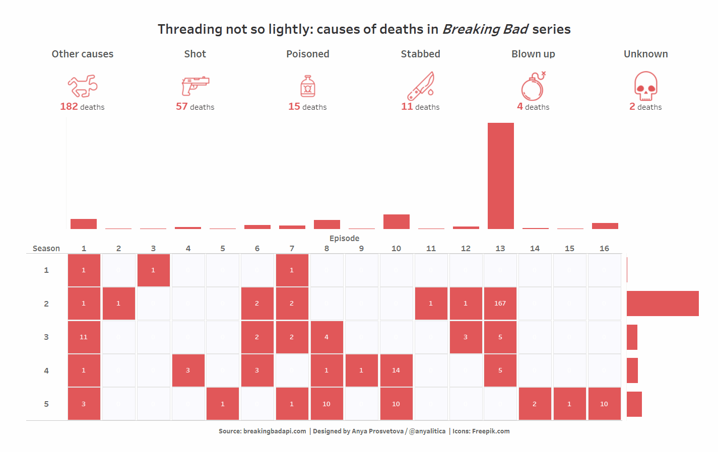
However, as you can see in the gif above, the proportional brushing technique doesn’t work here as well as in other cases. It’s difficult to see the proportion of a selected cause of death among the total number of deaths due to the large difference between the number of deaths across episodes. After my presentation, Coach Andy suggested that it may be better to apply the same technique to the main chart and remove the bar charts on the margins.
This is the final version of my dashboard:
Here is how I changed it:
Creating a bar chart
My original chart was built using the Square mark type and was coloured by the number of deaths in each episode. To show the proportion of different causes in each episode, I changed the mark type to Bar. When the icon corresponding to a cause of death is selected, this bar chart becomes a stacked bar chart, driven by the set action.
1 – Let’s start by putting the [Episodes] field on the Columns shelf and the [Season] field on the Rows shelf. As mentioned earlier, make sure to change the mark type to Bar.
2 – Next, drag the [Number of Deaths] field to the Rows shelf and add a Percent of Total table calculation by clicking on this field and selecting Add Table Calculation. In the dialogue box that comes up we need to select Percent of Total as the Calculation Type, and select Cell in the Compute Using field. By doing this, all our bars are now of the same size.
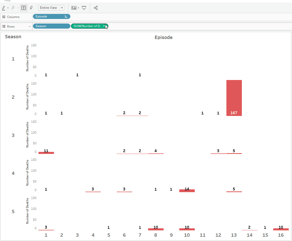
3 – To add labels to the bars, drag the [Number of Deaths] field to the Label card and choose the appropriate formatting.
4 – For this chart I also created dynamic tooltips that show the total number of deaths in each episode and season. You can read about my process for designing dynamic tooltips in this blog post.
5 – To finish formatting the chart, hide the y-axis’ headers, make the font for the numbers representing seasons and episodes larger, and turn off the grid lines.
Creating a set
1 – Now we need to create a set for the cause of death. For this particular dataset, I grouped multiple causes from the [Cause] field into groups based on the similarity of causes, and then created a set by right-clicking on the [Cause (group)] field and selecting Create > Set from the menu.
2 – When creating the set, choose one member of the set only so you can edit the colours for the set members IN the view (when an icon for a particular set is selected) and set members OUT of the view. Once the Cause set is created, add it to the Colour mark and set the colours.
Creating icons-based navigation
1 – Add the Cause (group) field to the Rows shelf and sort this field by [Number of Deaths] field.
2 – Then change the mark type to Shape and add Cause (group) field to the Shape card in the Marks shelf. Click on the Shape card to change the shapes for each cause. This post describes how to create and add custom shapes to your Tableau Repository.
3 – To create labels for the icons, add the [Number of Deaths] field to the Label card and format as needed.
4 – Finally, to enable the icons to drive the highlighting of the bar chart, add the previously created Cause set to the Colour mark.
Adding set actions to the dashboard
Now when we have the navigation bar and the final version of the chart, we can add them to the dashboard and create the set action. To do so, from the Dashboard page go to the Dashboard menu on top, select Actions, click the Add Action button, and select Change Set Values.
In the new dialogue window that appears, name the set action, select the sheets on your dashboard that are going to initiate the set action (in this case it’s the sheet with icons) and—finally—select the target set that you would like to update by this action. Here, it is the Causes set.
And the dashboard is done!
I hope you find these tips useful. Feel free to ask questions and explore the final dashboard on my Tableau Public profile.