Slope graphs are a very neat way to visualise how a measure evolved over distinct time intervals or between distinct categories. That measure might be a numerical value or ranks of that value, but that’s always down to the designer’s preference. In this blog post, I will explain why you might want to consider using a shaded slope chart and how you can create one in Tableau.
Before writing this blog post I’ve first read Matt Chambers Tableau blog on shaded slope charts and I encourage you to do the same; I have used his post as inspiration whilst I tried to offer a more detailed description of what Tableau does and why.
Why to use shaded slope graphs?
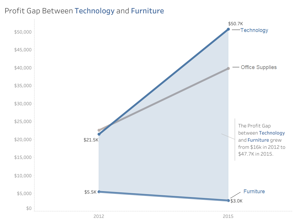
Shaded slope graphs enable you to add more context to your chart at zero real estate cost. A very comprehensive example was given by Matt using the Superstores data set, where he compared the profits of three product categories between 2012 and 2015. The relevant visualisation is attached below, where I have annotated the different product categories on the right hand-side.
In this case, the use of a shaded slope graph allowed for three things:
- Illustrate effectively how the profit gap between Technology & Furniture has grown from 2012 to 2015,
- Highlight that technology products weren’t the most profitable in 2012 but they have well surpassed office supplies products by 2015,
- Make the slope graph visually more attractive, although that’s subjective more or less.
However, shaded slope graphs bear the drawbacks of conventional slope graphs and you should thus be mindful that:
- When used to visualise changes over time, some key parts of the story might be lost. For example, we are unaware if Office Supplies became more profitable than Technology products in 2013 or 2014,
- Using more than three points along our x-axis (in this case years) would make the chart extremely difficult to interpret.
How to create a shaded slope graph in Tableau
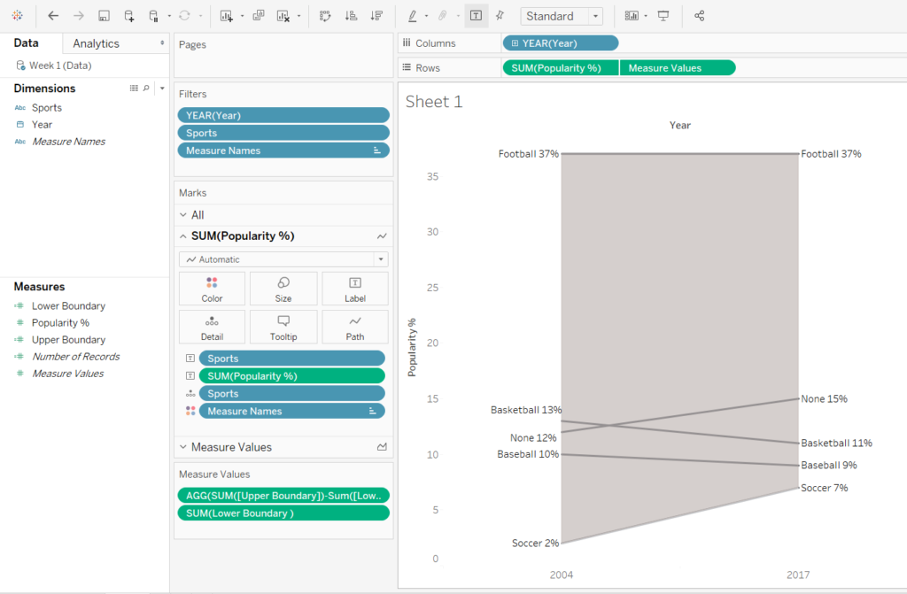
In this example, I will be using the data set released for Week 1/2020 of Makeover Monday covering sports popularity in the US. The data need some data prep by means of column renaming and a pivot which you can do easily in Tableau. You should end up having three columns including Years, Sport names and popularity percentages respectively.
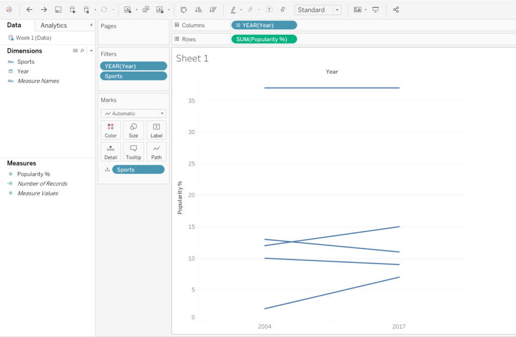
1. Create a conventional slope chart
Drag your Year to the Columns shelf, your measure onto the Rows shelf and add the sports to Detail. Make sure that your Year value is set to discrete and drag that onto your Filters. Filter to two discrete years, in that case 2004 and 2017. As I wanted to focus on the most popular sport categories, I used my sports dimension as a filter and kept only Football, None, Basketball, Baseball and Soccer.
2. Identify your upper-lower boundaries
To create a shaded slope chart we must then identify the extent of the shaded area and define it by creating its upper and lower boundaries. We must hence come up with two calculated fields, one for each boundary. Since in this example the upper boundary is football and the lower boundary is soccer, our new calculated fields include the following expressions:
Upper Boundary : IF [Sports]=’Football’ then [Popularity %] END
Lower Boundary : IF [Sports]=’Soccer’ then [Popularity %] END
3. Create a dual axis and change your Measure Values Chart Type to Area
Create a dual axis and synchronise. Then change your Measure Values chart type into Area, remove Sports from Detail and move the Upper Boundary measure on the top of your measure values list.
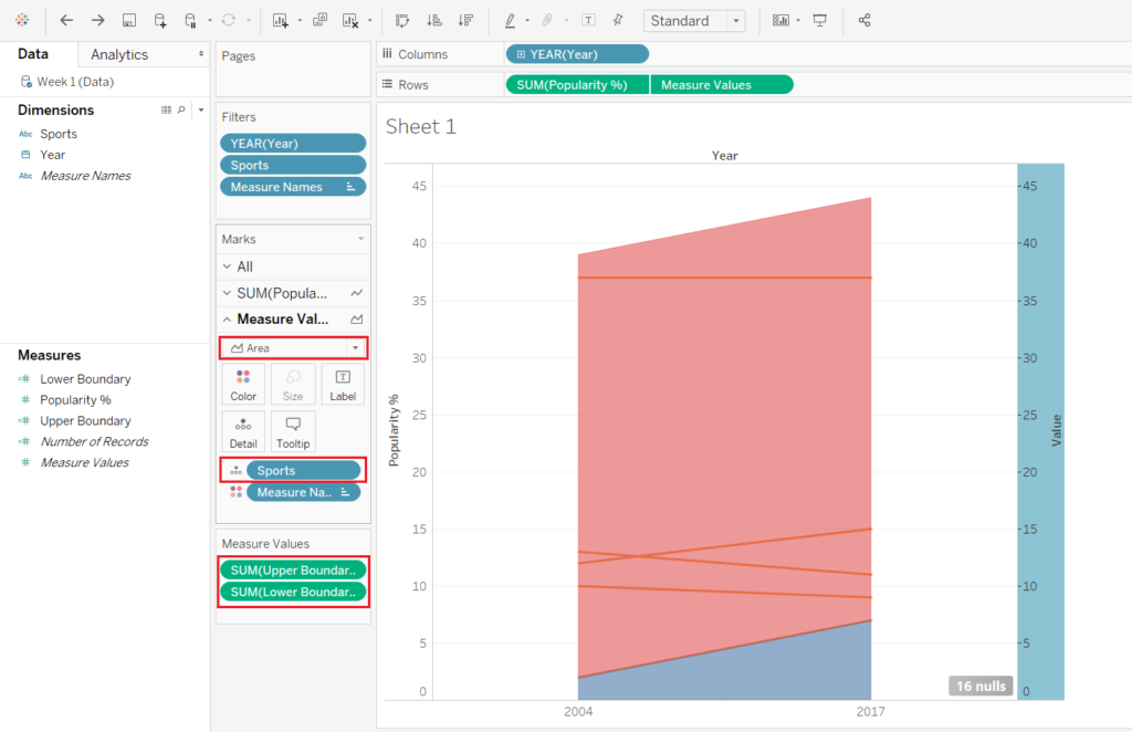
What Tableau did here is creating two area charts (one reaching until the lower boundary and one reaching until the upper boundary) and stacked them on top of each other. That causes the shaded area to extent past the slope chart even though the axes are synchronised.
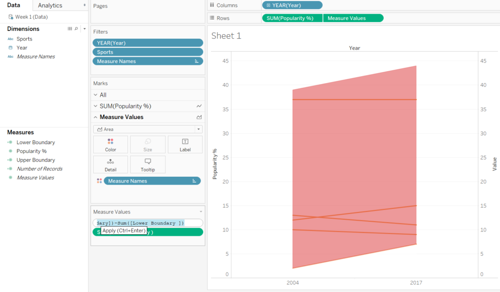
4. Change area colours and subtract the lower area
Then proceed by changing the colour of your lower boundary area into whatever colour your worksheet shading has; in our case, that would be white. Last but not least, we must subtract the lower from the upper area. Go to the measure values shelf and change your upper boundary calculation to be:
SUM ([Upper Boundary]) – SUM ([Lower Boundary ])
5. Format your graph and remove clutter
Hide your secondary axis headers, remove gridlines and column/row dividers. Change the colour of your area chart-lines and drag sports dimension and popularity % onto text marks.
And there you have it! A beautiful shaded slope chart!
If you’ve made it so far, thanks for reading my blog and I hope that it helps you easily create shaded slope graphs in Tableau.