Google “heat map” and you will come across a number of drastically different charts.

I have a slap around the ears from Beth to thank for the inspiration for this blog post, so let’s unpick this hotly debated area by creating a few different chart types in Tableau. Have a look at Katie Wagner’s post for another viewpoint.
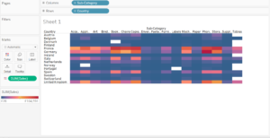
1. An actual heat map
Using the EU superstore data from the Tableau server, drag the Country dimension on to the rows field, the Sub-Category dimension onto the columns field and finally drag the Sales measure onto colour and voila! A simple heat map.
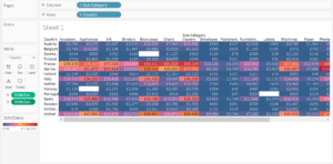
2. A highlight chart
We can quickly turn our above heat map into a highlight chart by dragging the Sales measure over to the marks card, click on the icon of three dots next to one another and change the mark type to Label.
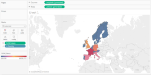
3. A filled map
Often mislabelled a heat map because of its map-like shape and similar colour coding, we can create a filled map by dragging the Country dimension onto the the view, which will automatically generate Longitude and Latitude values for us, and dragging the Sales measure onto colour.
4. A density map
With the eagerly-awaited, but still pending update to Tableau will soon come density maps (which Tableau have confusingly named Heatmaps), which take the form of what most people probably imagine a heatmap looks like:
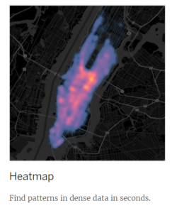
(The above image belongs to Tableau)