Today Andy set us the task of visualising some data about bike traffic around Seattle. The data comes from about 13 spots around the city where bike traffic is measured.
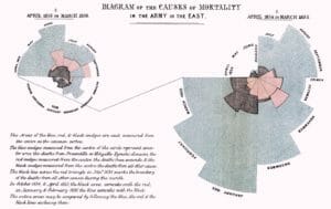
I had a clear idea of what I wanted to achieve in the day. I wanted to make a coxcomb chart, the same chart type invented by Florence Nightingale to visualise casualties during the Crimean war.
The data included whether bikes were travelling North or South past the instruments, and I wanted to present these as four ‘Combs’, with length denoting number of bikes.
I was inspired by some work I saw recently by Ken Flerlage, visualising winds in a number of cities in the USA:
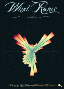
Click the photo to view Ken’s work on Tableau public
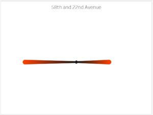
Unfortunately, Coxcomb charts are pretty tricky to build. I looked around quite a bit for tutorials and read a few blog posts, including one by Ken, and others I found by scouring Tableau Forums, however I was unable to get the configuration working properly. I ended up with some polygons that looked like this
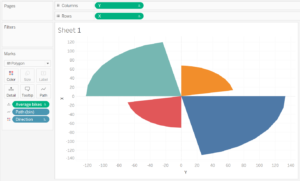
I’m sure I’m almost there, with just some parts of the angles needing a tweak, but I decided to move on so that I would have something done by the end of the day.
Instead I decided to create a radial bar chart of the four directions, it wouldn’t look as striking and impressive as Ken’s roses, but I hoped it would give a nice visual representation of the direction of movement.
I did this by following a tutorial on youtube by SuperDataScience, and reading a couple of blog posts. The chart came together relatively easily, but when I broke it down to the level of individual locations, there were nulls for some directions (eg. roads that run North-South had nulls for East and West). I tried for quite some time to get these data points to go away, rather an appearing as central points as they did on the chart:
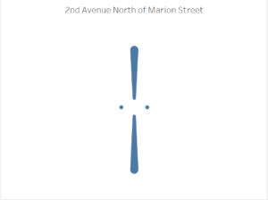
Trying to exclude them or filter them out with calculations broke all of the table calculation which were dependent on them being there. In the end I had to settle for colouring the central points the same colour as the background, which had the affect of seeping into the rest of the bar. Luckily this was the effect I was planning to get in the end, but it’s definitely a fiddly nuisance.
Ultimately I came up with a simple yet striking visualisation, I put hour of the day onto the pages shelf and took a little clip of the animation.