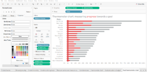
A neat alternative to the bullet chart is to create a thermometer chart to measure your progress towards a goal.
I’ve created mine from sample data comparing profit to overall sales, but this can be done with any data you like.
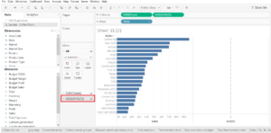
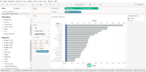
Step 1: establish your goals
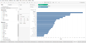
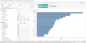
drag the dimension field you’re measuring your progress in (the name of your goal) onto your rows field and the measure that is your end goal onto the measures field (this will make up the full length of your thermometer).
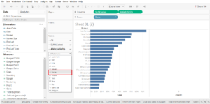
Step 2: create the round end of your thermometer
To create the rounded bottom end of your thermometer chart simply double click in the rows field next to (in my case) sum of sales to create a new calculated field (if you don’t fully understand what these are, don’t worry – neither do I). Type AVG(0) into this field.
Hit enter.
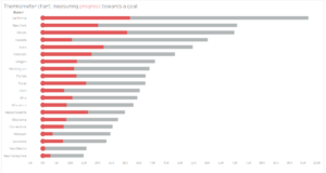
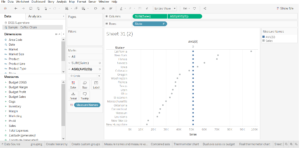
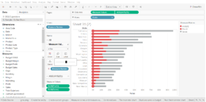
Your view will now look like this:

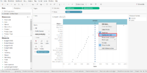
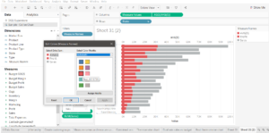
The next step is to click on the newly created AVG(0) marks card on the bottom left of the graph…
…and to convert the mark type to circle.
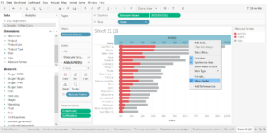
To make the circles sit at the base of the bars you need to combine the axes – do this by right clicking on the AVG(0) pill in the rows field and tick the dual axis option.

This will probably change the look of your view dramatically, but we can fix that in a moment.
To get the circles to sit at the zero line we need to synchronise the axis. Right click on the AVG(0) axis at the top and select synchronise axis from the drop-down menu.
Now we can tidy up the view. Click on the sum of sales (or your equivalent) mark card and change the mark type back to bar. While you’re here you can also change the colour of the bar – this will be your background thermometer colour – I prefer a neutral grey.
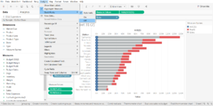
Step 3: add your progress towards goal measure
Click and drag the measure you want to be your progress towards goal (the mercury in your thermometer) and drag it onto your bottom axis – two parallel green lines will appear when you hover over the axis.
Your new measure will be added to the same axis, but the values will be stacked so we have to turn off mark stacking under the analysis menu:
Step 4: finishing touches
The final stage is to bring all the visuals of your chart together.
Make the colours of your progress towards goal (in my case profit) and the bowl of your thermometer the same colour…
…hide your secondary axis…
…tweak the sizing of your bars…
…and finish off by giving your chart a title and removing any unwanted grid lines to give your chart a clean look.