Data visualisation for noobs (like me)
Best practices in data visualisation, a review of ‘Storytelling with Data’ and my before and after.
One of the biggest mistakes I made when applying for my position at the data school (well at least in my opinion) was that I made my visualisations far too complicated. I fell into that trap that I think all Tableau noobs fall into, where I was so impressed with all the things that I could do with Tableau, that I just wanted to cram in everything I had done.
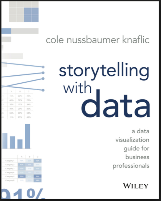
The first week in the data school was all about best practices in data visualisation and one of the books that I read was ‘Storytelling with Data – a data visualization guide for business professionals’, written by Cole Nussbaumer Knaflic. Here is a review of that book:
Storytelling with Data: A book review ****/*
‘Storytelling  with Data’ is a great book for anyone who is just starting their data visualization journey. The basic gist of the book, is to keep your visualisations simple and to the point, a message that has now been thoroughly homed in, via this book and every other form of data visualisation best practice advice I have received.
The book is broken down into 10 chapters, of which 5 make up what I would consider the the core of the book. These teach you how to put your data into context, guide you through choosing effective visuals, teaching you that ‘clutter is your enemy’, how to focus the attention of your reader and to ‘think like a designer’, using size, colour, positioning and most importantly, simplicity to make an effective visual. Chapter 6 walks you through how to tie a story together and the rest put the lessons learned in the first 5 chapters into play.
What I appreciated most about this book, is that it practices as it preaches. Storytelling with Data is written well, in a very easy to follow manner, thoroughly driving home the points that it wishes the reader to take home, which as a results does make the book rather lengthy. Because the book implements all the highlighting or rather ‘leveraging preattentive attributes’ that it describes, it makes it very easy to get all of the important information, without having to take too long to read the book and also makes it easy to find the tips you have learned and want to revisit.
My second favourite things about this book is the graphic examples. Nothing brings home the point about best practices of visualisation better than a visualisation! In particular I enjoyed the before and after visualisations, which not only brought home what I could be doing better and also became a fun game towards the end, seeing how much I had learned and if I could find all the elements that needed improving! The book even gives you a treasure trove of great sources of ‘inspiration through good examples’ by data viz gurus.
In closing, this book is great data visualization noobs like me. It gave me a fresh, concise and effective way to tackle the data visualisation challenges that have and are still to come my way!
In the second week of the data school, we were asked to make a ‘reviz’ of the data we had submitted for our initial applications. I was able to apply so many of the tips I had learned from ‘Storytelling with Data’. Have a look for yourself here: https://public.tableau.com/profile/amanda.patist#!/vizhome/PricePaidData2015/UKPricePaidData vs. https://public.tableau.com/profile/amanda.patist#!/vizhome/Reviz-PricePaidData2015/Makeover.
