Data Visualisation for Noobs (like me)
Alteryx – How to Customise your Workflow for your Viewing Pleasure
Doing any work is always more pleasant when you can optimise your canvas to what works for you. Clarity and cleanliness in my Alteryx workflow helps me make sense of what I’m working on. Here are a few tips on how to customise your work flow.
To customise your workflow, go to ‘options’ from your workflow window, go into ‘user settings’ and then into ‘edit user settings’ and you will be faced with this window:
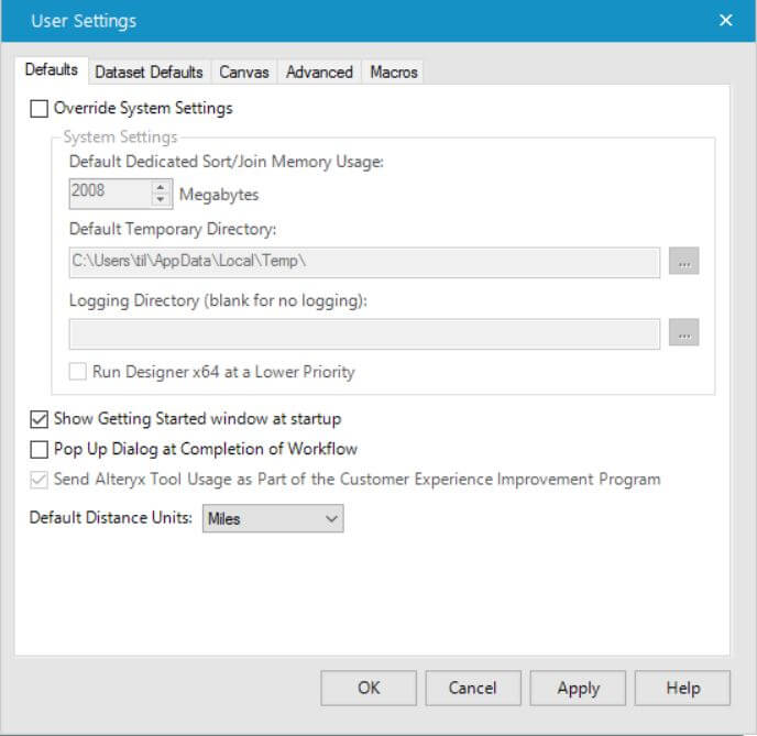
From here, navigate into the ‘canvas’ tab.
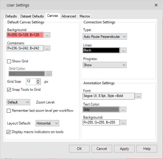
Here you can change the your canvas background colour, the colour of your containers and choose to show or not show a grid and customise the colour and shape of this.
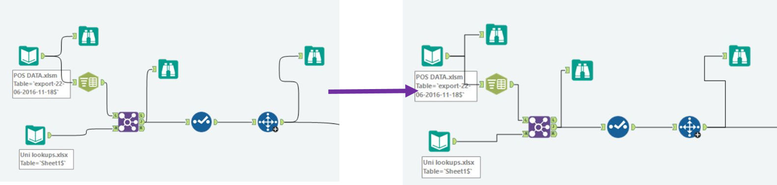
One of the things that enhanced my viewing pleasure greatly, was changing the ‘connection settings’. Here I could change the lines that connect the tools on the canvas from the default ‘Auto Route Bezier’ (the curvy lines, which can get confusing when you have more than a small handful of connections) to ‘Auto Route Perpendicular’, as shown below.
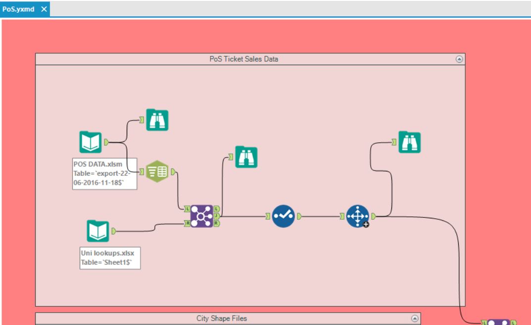
Another setting change, that really made my life easier, was showing the ‘progress’ on the work flow. This shows (when you are not zoomed out) the number of records (and size of the file) that your tool outputs, without you having to look into the data pane at the bottom of the app.
Hope this blog on customising your workflow helps make your work more clear and just a little bit easier!